TypeWest 2022 Specimen Site
TypeWest 2022 Specimen Site
TypeWest 2022 Specimen Site
Winter 2023
Winter 2023
In the beginning of 2023, graduated the TypeWest postgraduate program with a certificate in Type Design. In December 2022, I responded to a call for volunteers to build the specimen microsite and worked alongside two other students to design and build the site. The project spanned January through February 2023.
In the beginning of 2023, graduated the TypeWest postgraduate program with a certificate in Type Design. In December 2022, I responded to a call for volunteers to build the specimen microsite and worked alongside two other students to design and build the site. The project spanned January through February 2023.
Deliverables
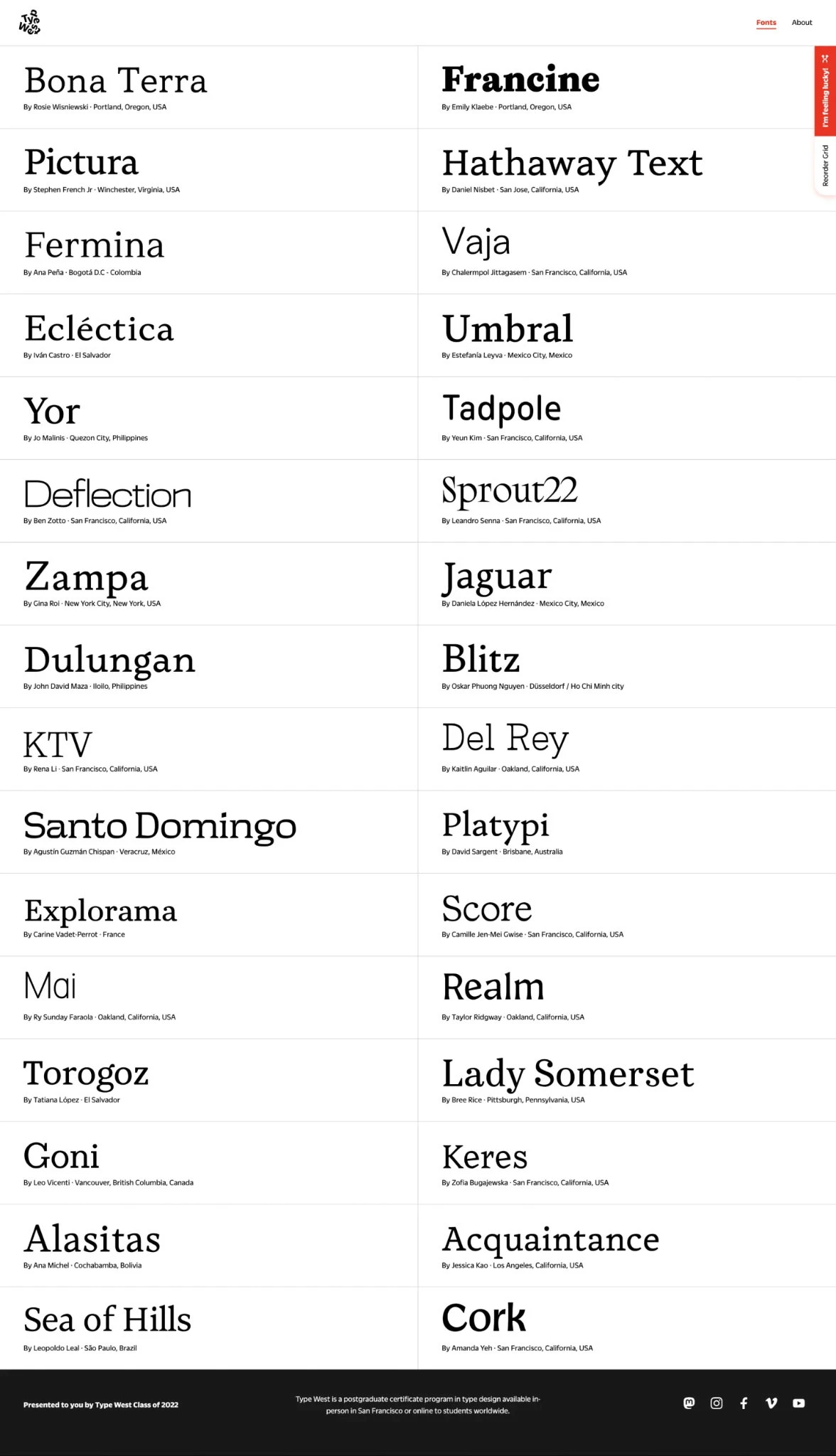
Homepage showing 32 student fonts
Individual specimen pages to showcase student work
About page with thank you note(s)
Homepage showing 32 student fonts
Individual specimen pages to showcase student work
About page with thank you note(s)
Impact: Web design
Impact: Web design
Visual design, user experience
Visual design, user experience
Collaborators
Collaborators
Visual design, user experience
Visual design, user experience
We started by setting goals
We started by setting goals
Main goals:
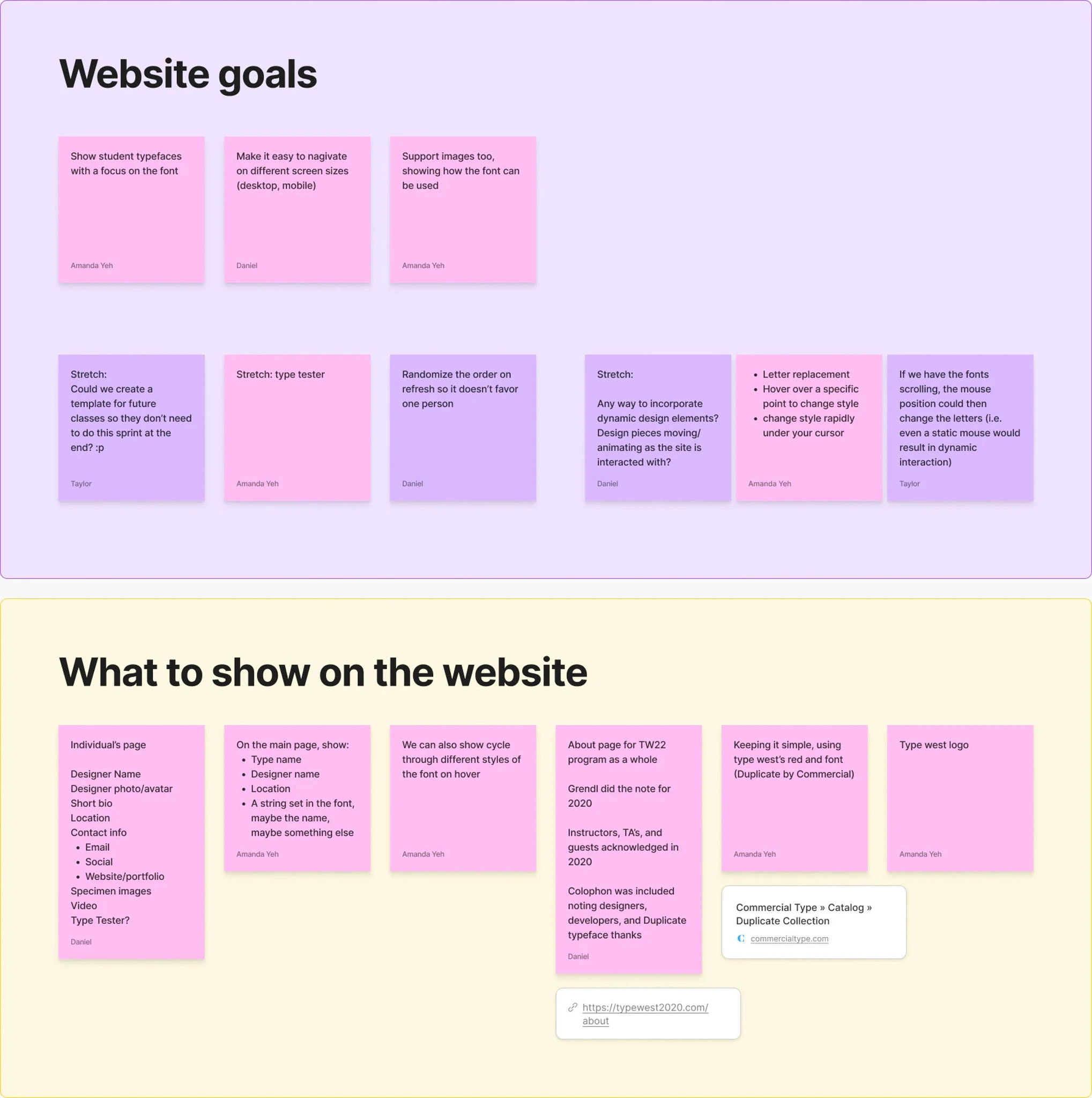
Main goals:
Show student typefaces
Keep focus on student work (not site design)
Support images: show intended use of the fonts
Site is useable for different screen sizes
Homepage doesn’t favor one person (grid order)
Show student typefaces
Keep focus on student work (not site design)
Support images: show intended use of the fonts
Site is useable for different screen sizes
Homepage doesn’t favor one person (grid order)
Stretch goals:
Stretch goals:
Dynamic design elements (Accomplished)
Include a type tester for specimen pages (Accomplished)
Potentially create a template for future classes (Nixed)
Dynamic design elements (Accomplished)
Include a type tester for specimen pages (Accomplished)
Potentially create a template for future classes (Nixed)
Research

We audited past TypeWest sites and other type foundries to understand
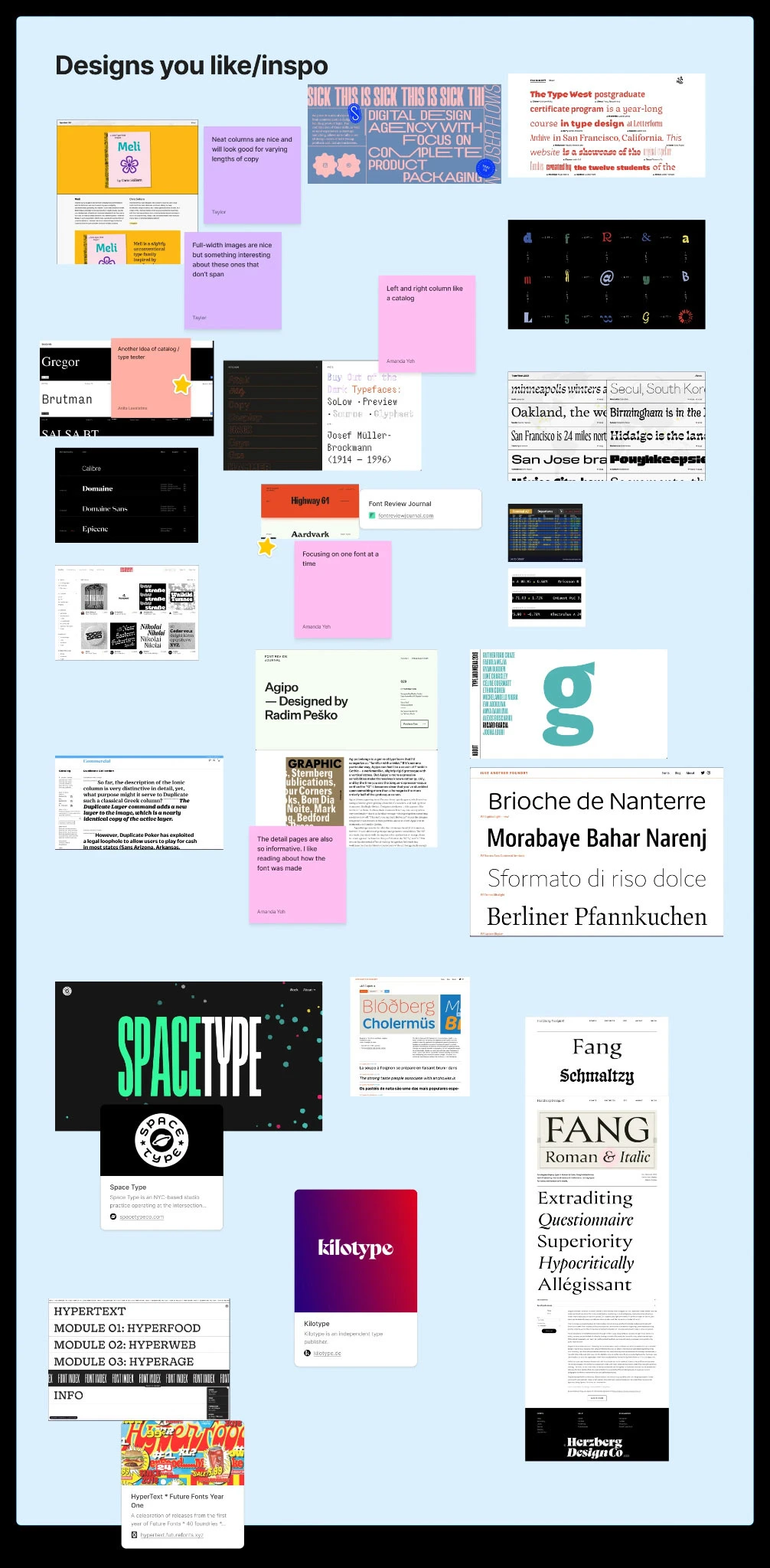
We audited past TypeWest sites and other type foundries to understand
What do we like and why?
What do typical type showcases looked like?
What are typical features of type showcases?
What do we like and why?
What do typical type showcases looked like?
What are typical features of type showcases?
Audit discoveries
Audit discoveries
We gravitated towards specimen sites that referenced traditional, physical specimens. Each cohort spent significant time looking at these specimens during history classes, so it felt like something that tied us together.
With 32 students' work to reference, we also gravitated toward pages that showed a lot of fonts as large as possible. Studying sites from previous TypeWest classes revealed a solution we liked: a 2 column grid.
Lastly, we learned that micro-interactions and motion really helped to capture our attention on a page.
Curious what previous years looked like?
Curious what previous years looked like?
Design iteration
Initial design concepts. Top: Mine | Bottom Left: Amanda's | Bottom right: Collaborative iteration
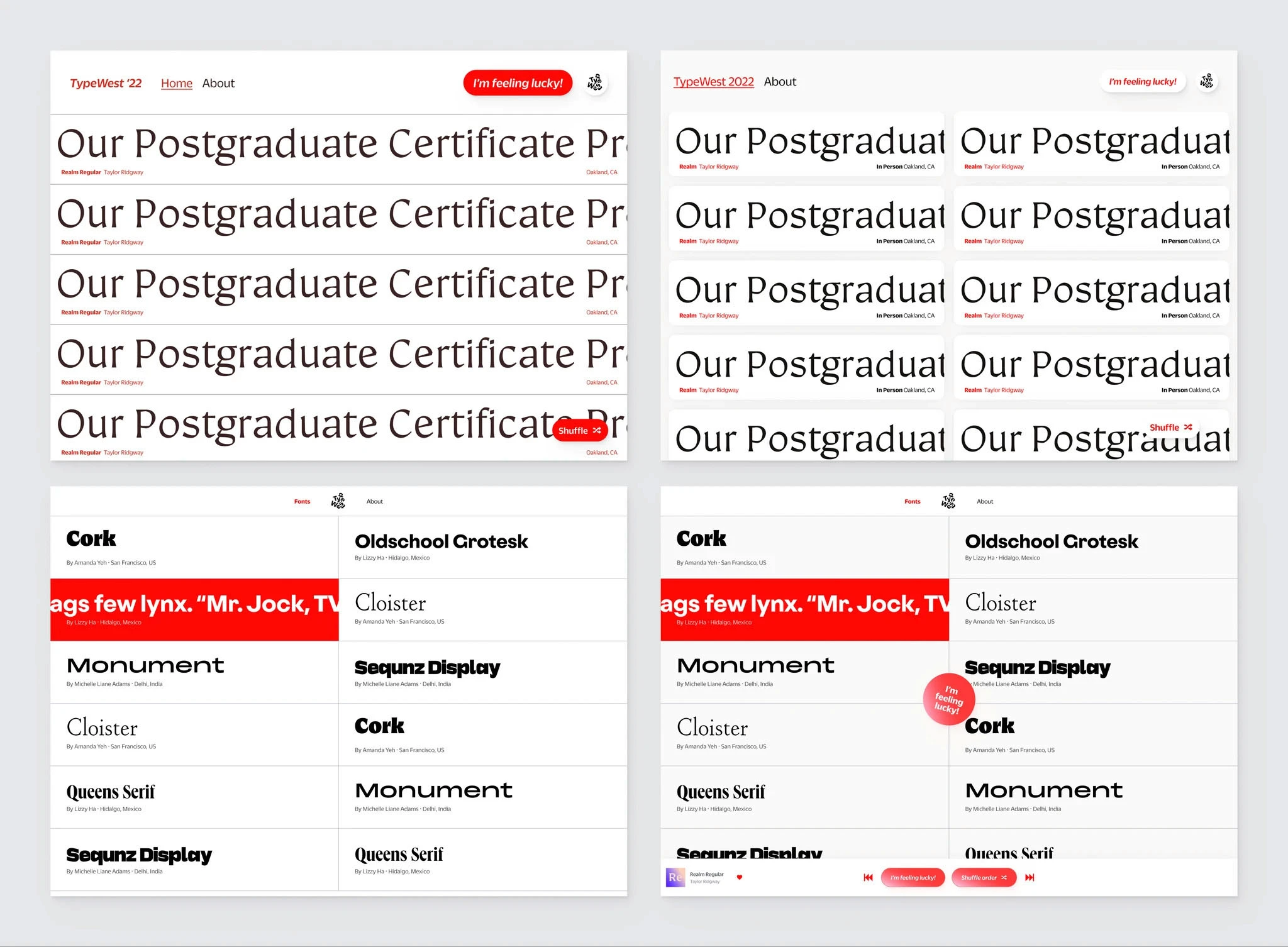
Initial design concepts. Top: Mine | Bottom Left: Amanda's | Bottom right: Collaborative iteration
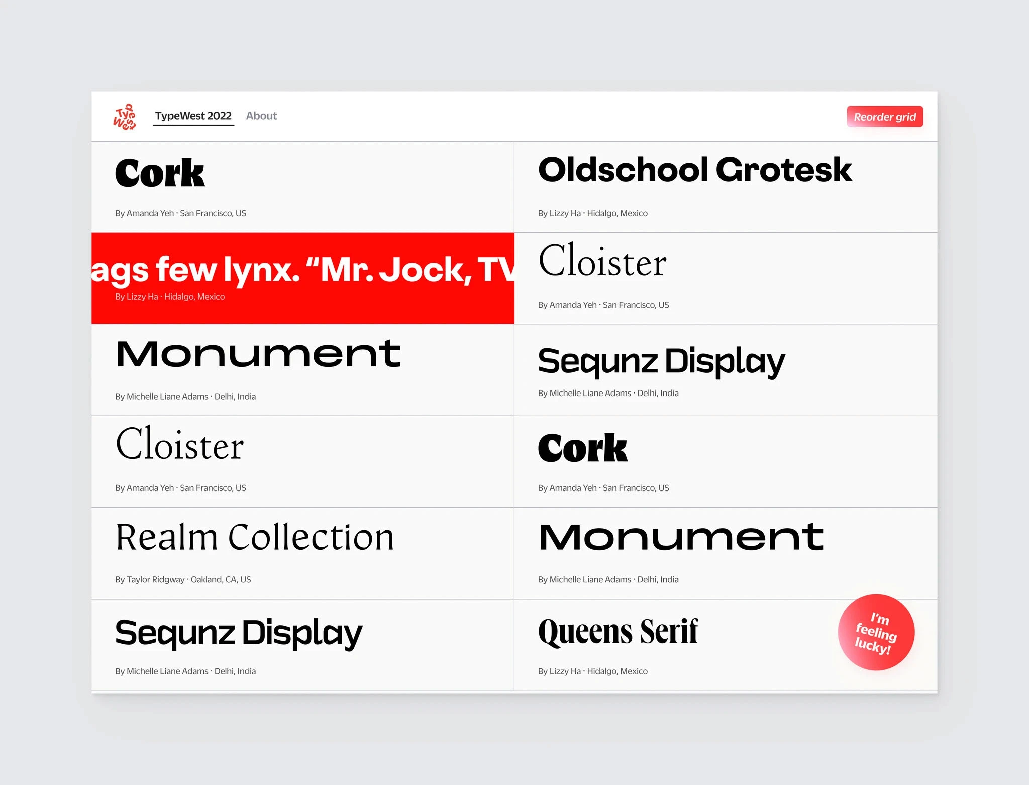
Final result of our first meeting collaboration
Final result of our first meeting collaboration
Homepage design
Homepage design
For our first design review, we came with relatively similar layouts. We chose Amanda's layout for its space efficiency and the way it put the focus on students' work. We iterated more on the layout and merged some of the functionalities from my concepts during the meeting.
We built in a randomizer on refresh to ensure that all 32 students would have a chance to be at the top of the page. We brought in my Reorder Grid button as an extra affordance, ensuring the grid could be shuffled without refresh. We also added my I'm feeling lucky as an opportunity for surprise, nostalgia, and delight. During the meeting we also aligned on adding a hover scrolling effect to each grid cell to show off more type.
We also explored incorporating a media-player style navigation to allow visitors to switch between fonts or randomize from specimen pages, but it was too complicated to explore successfully in our limited timeline.
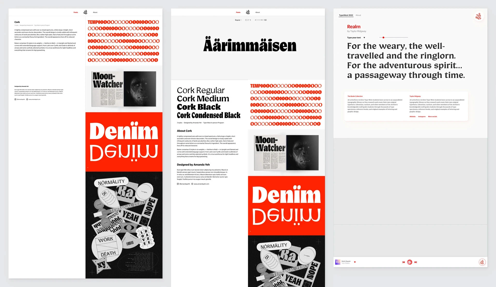
For individual specimens, we evaluated three options
For individual specimens, we evaluated three options
A 2-column layout with a sticky left column with text and scrolling right with imagery
A version of that layout with a static type tester as a hero
A single-column layout which focused more on the testing of the type
A 2-column layout with a sticky left column with text and scrolling right with imagery
A version of that layout with a static type tester as a hero
A single-column layout which focused more on the testing of the type
We moved forward with the single-column layout
We moved forward with the single-column layout
It centered the ability to test the type and really get to know it
It allowed students' specimens to be displayed larger
The light gray background reduced screen brightness, aiding evaluation of the type
It centered the ability to test the type and really get to know it
It allowed students' specimens to be displayed larger
The light gray background reduced screen brightness, aiding evaluation of the type
Final design
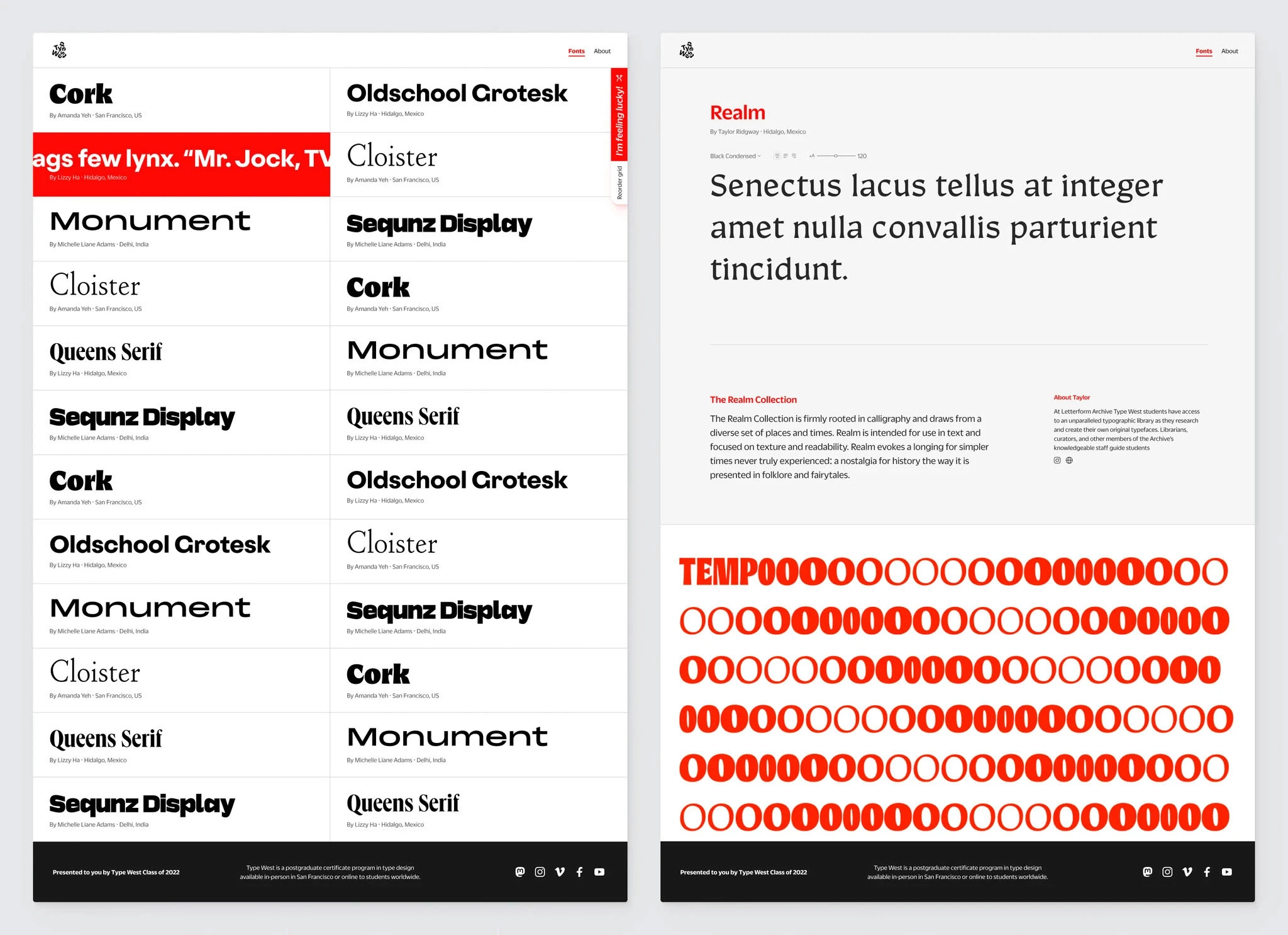
Our final design puts TypeWest 2022 students' work front and center
Our final design puts TypeWest 2022 students' work front and center
It effectively showcases students’ typefaces while adding some interactivity to keep visitors’ interest. Meanwhile, students’ design personalities are centered on their specimen pages via full-width images.
We chose to minimize the Reorder grid and I’m feeling lucky buttons on the homepage buttons to reduce the overlap of students’ type.
The final design was the result of close collaboration between Amanda, Daniel and myself. It was built on a short timeline as an extracurricular project for all of us. While Amanda and I collaborated on design, Daniel’s provided critical design feedback as well as context for how he would build the site and what was possible.
Font credits: IBM Plex | Bruphy Text by Very Cool Studios