Realm Collection
Realm Collection
Realm Collection
2022 – 2023
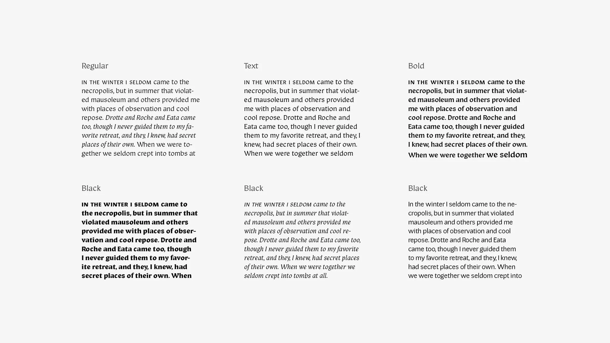
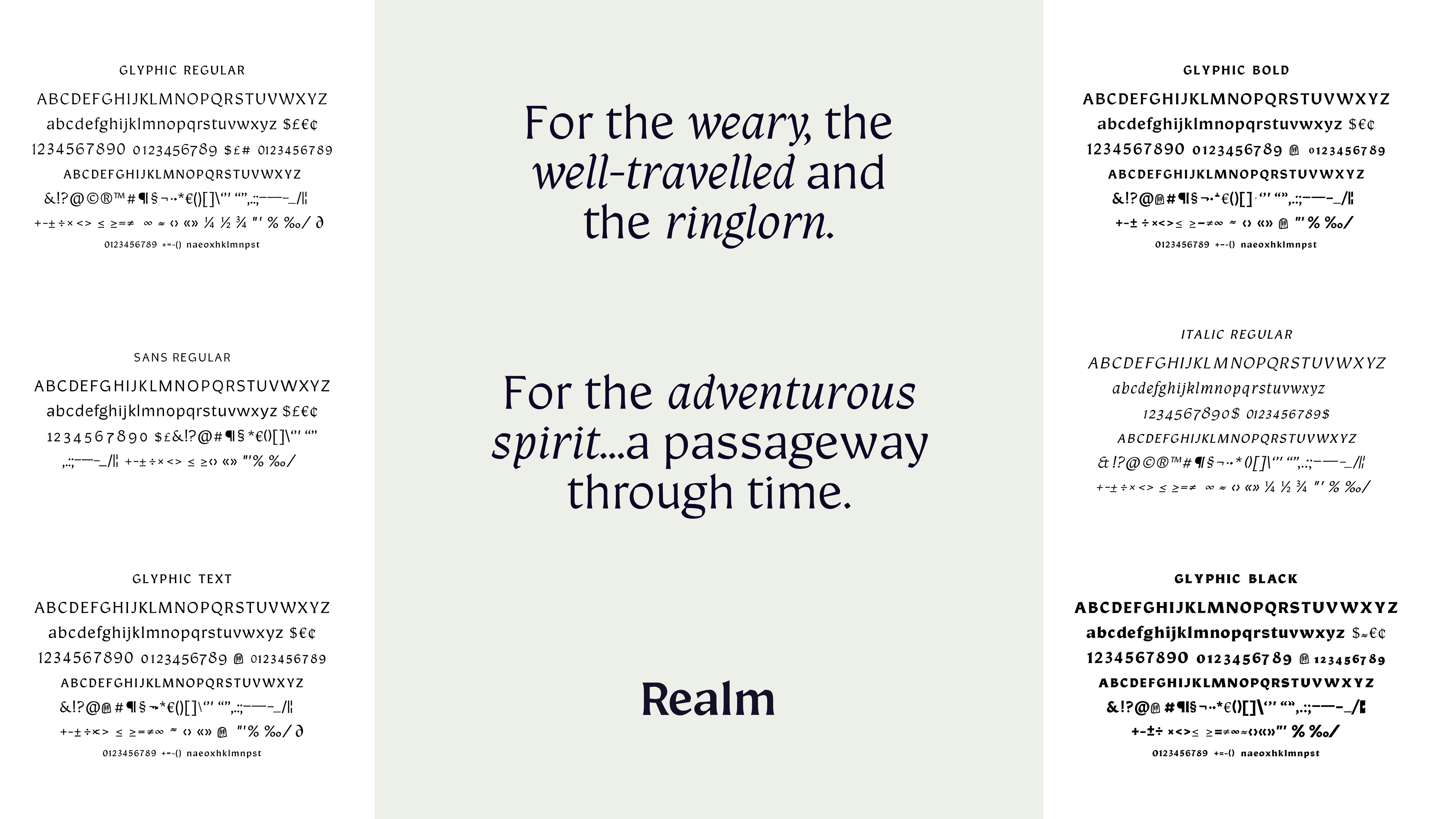
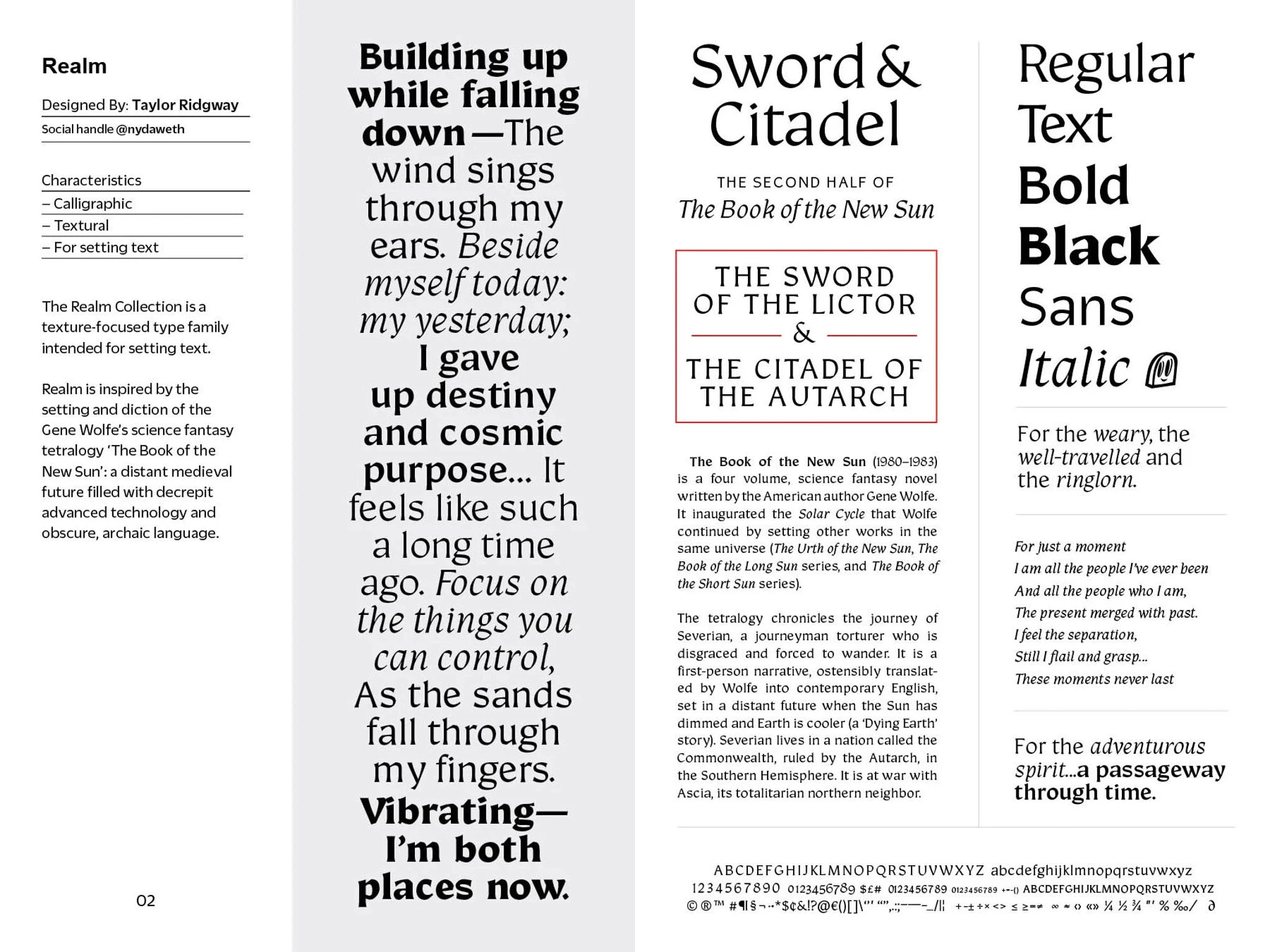
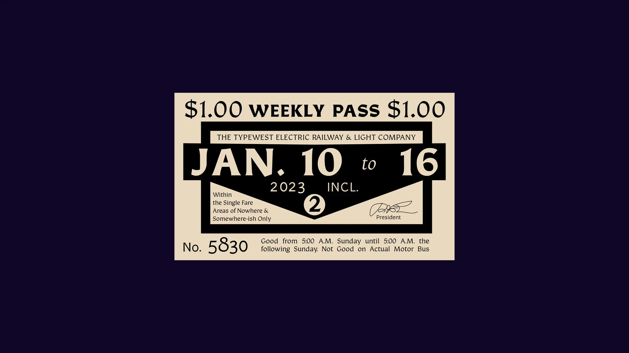
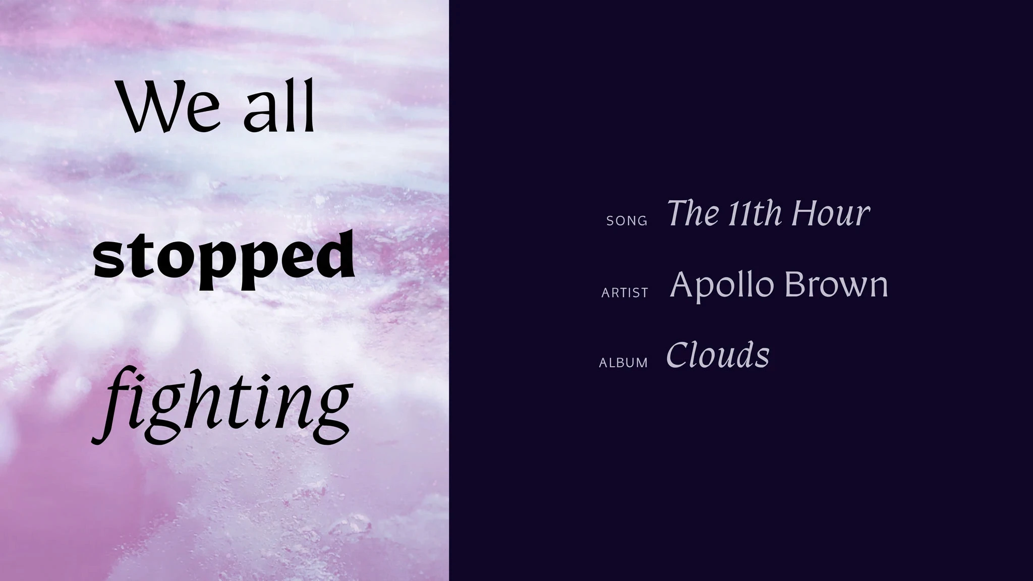
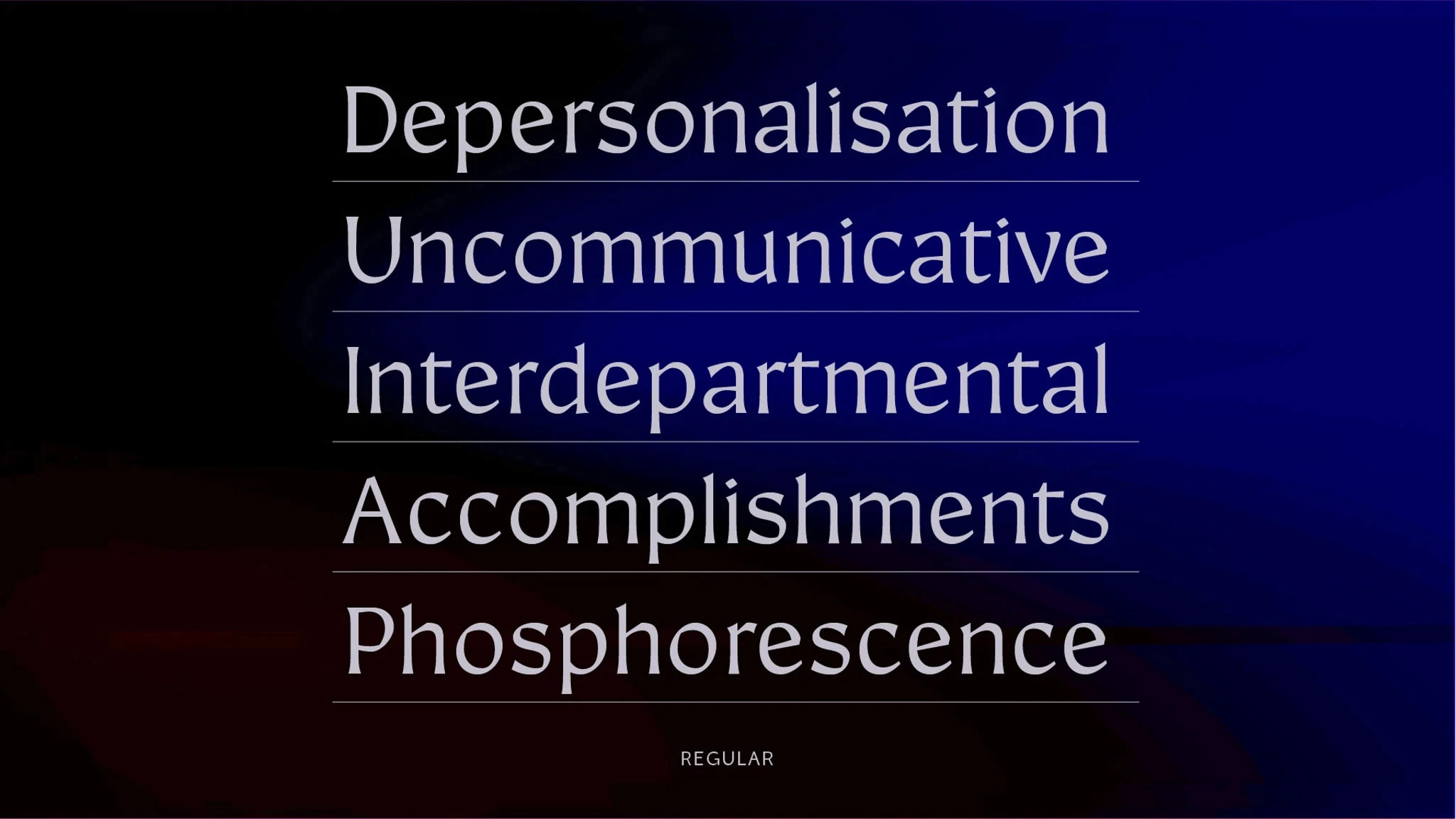
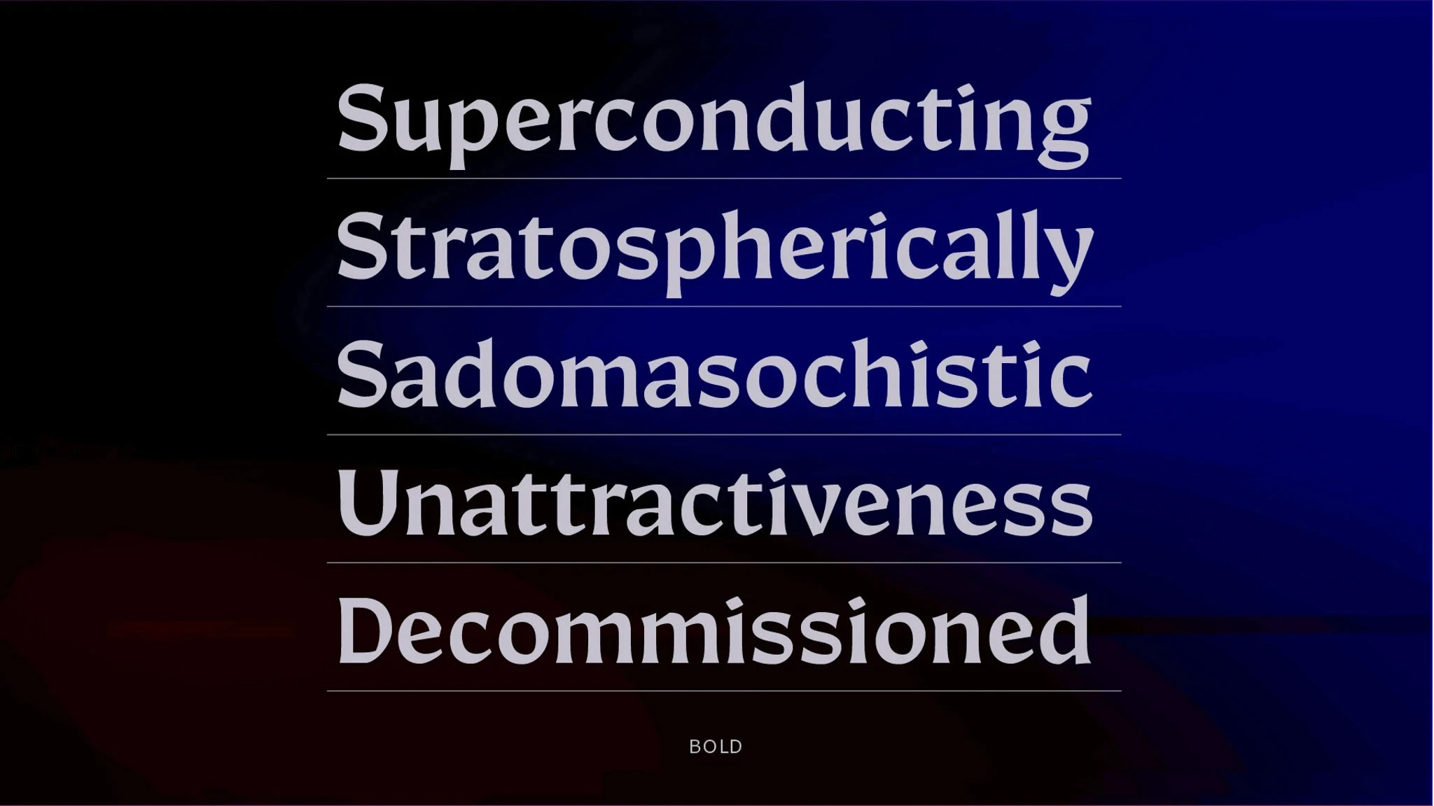
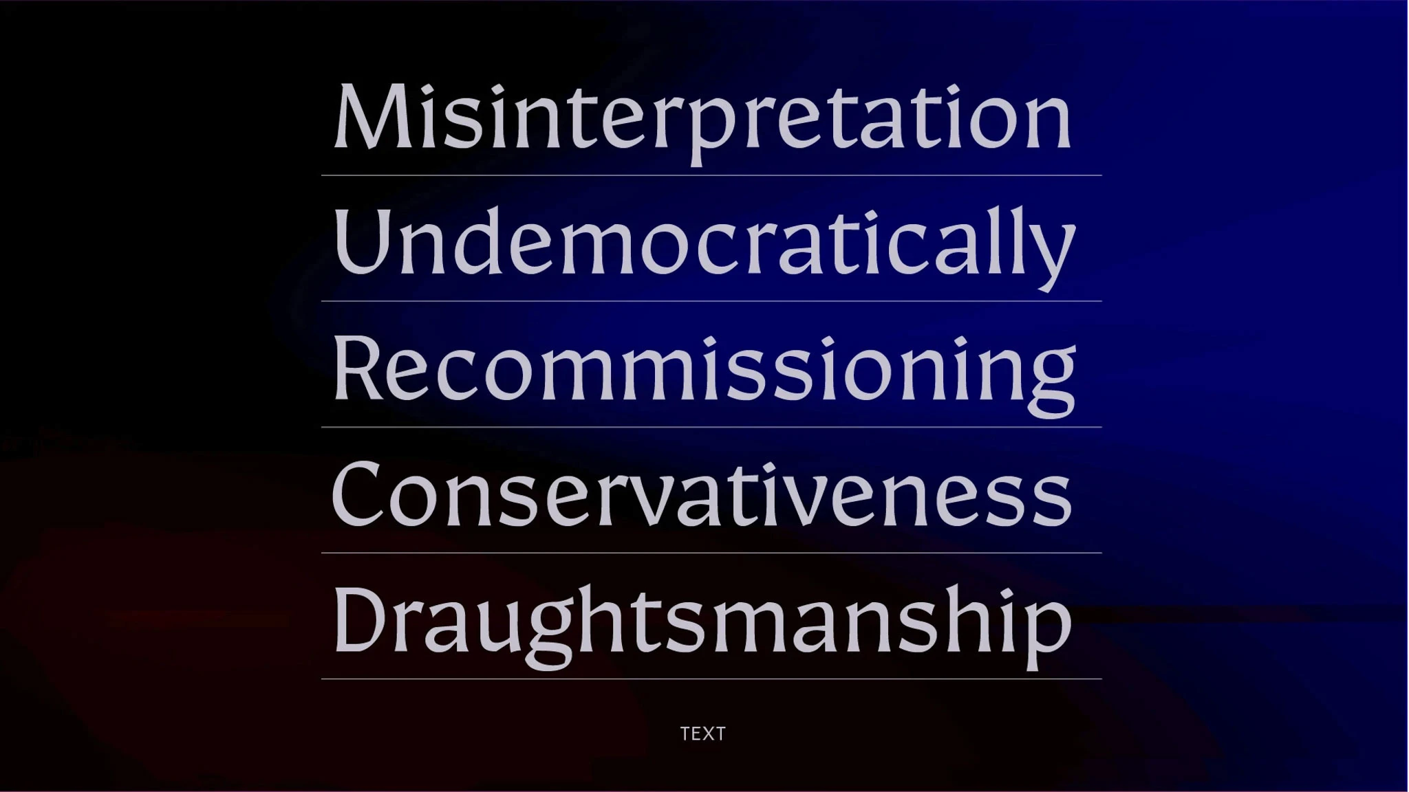
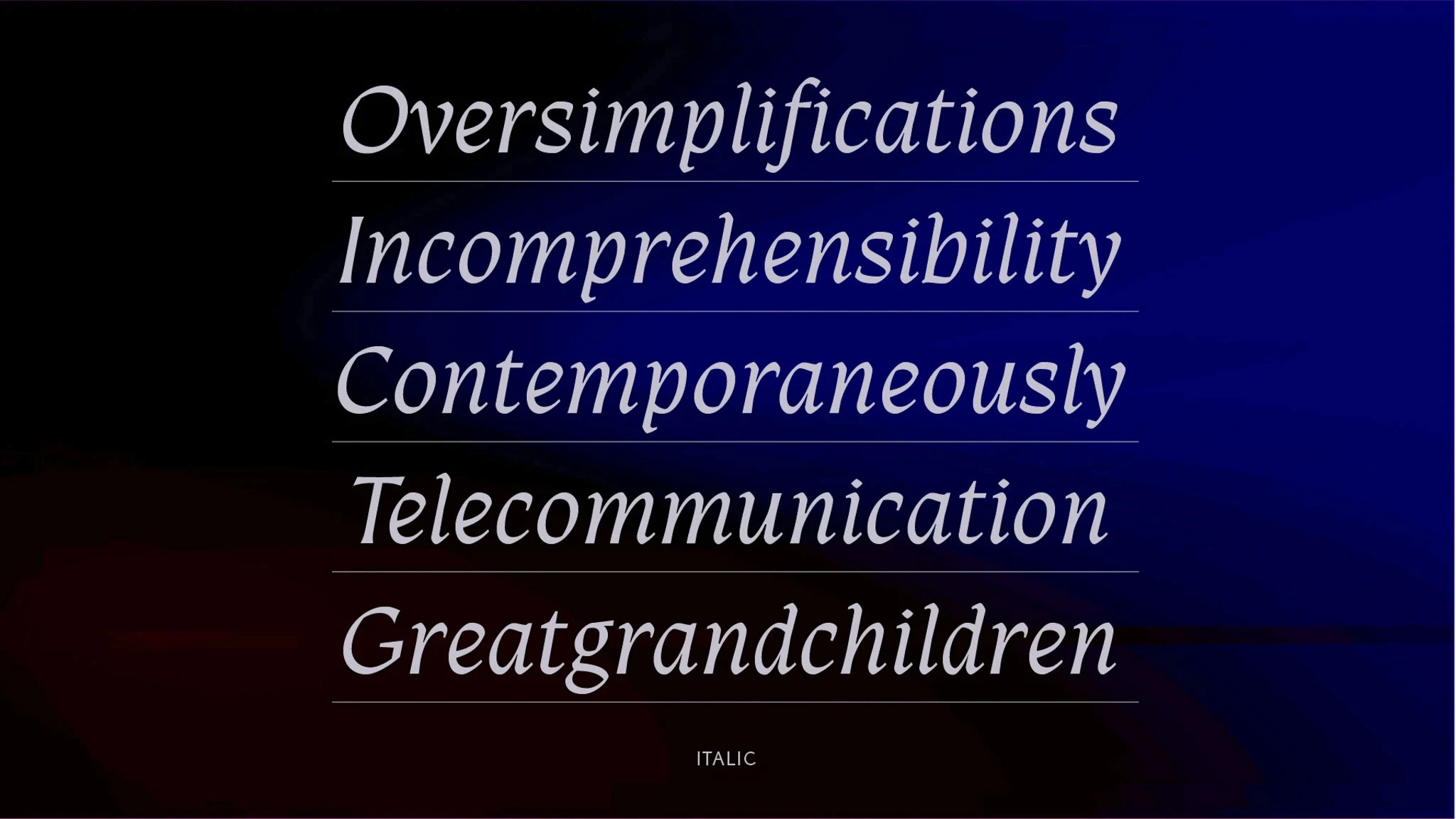
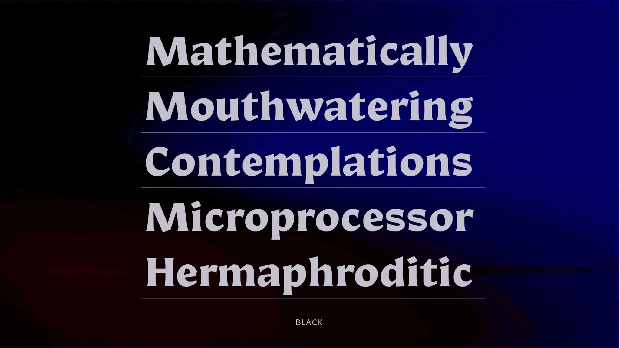
Designed for my TypeWest 2022 graduation project, Realm began as an experiment to find the boundaries of a typographic family. Though it evolved over time into something more cohesive, small hints of the drawings and pen models referenced can still be seen between the three different styles.
Beta trial fonts are available by request.
Want a quick rundown without the read?
Want a quick rundown without the read?
This is an in-depth look into the process and a results; you can check out my final presentation video for a quicker look
This is an in-depth look into the process and a results; you can check out my final presentation video for a quicker look
Due credit
Due credit
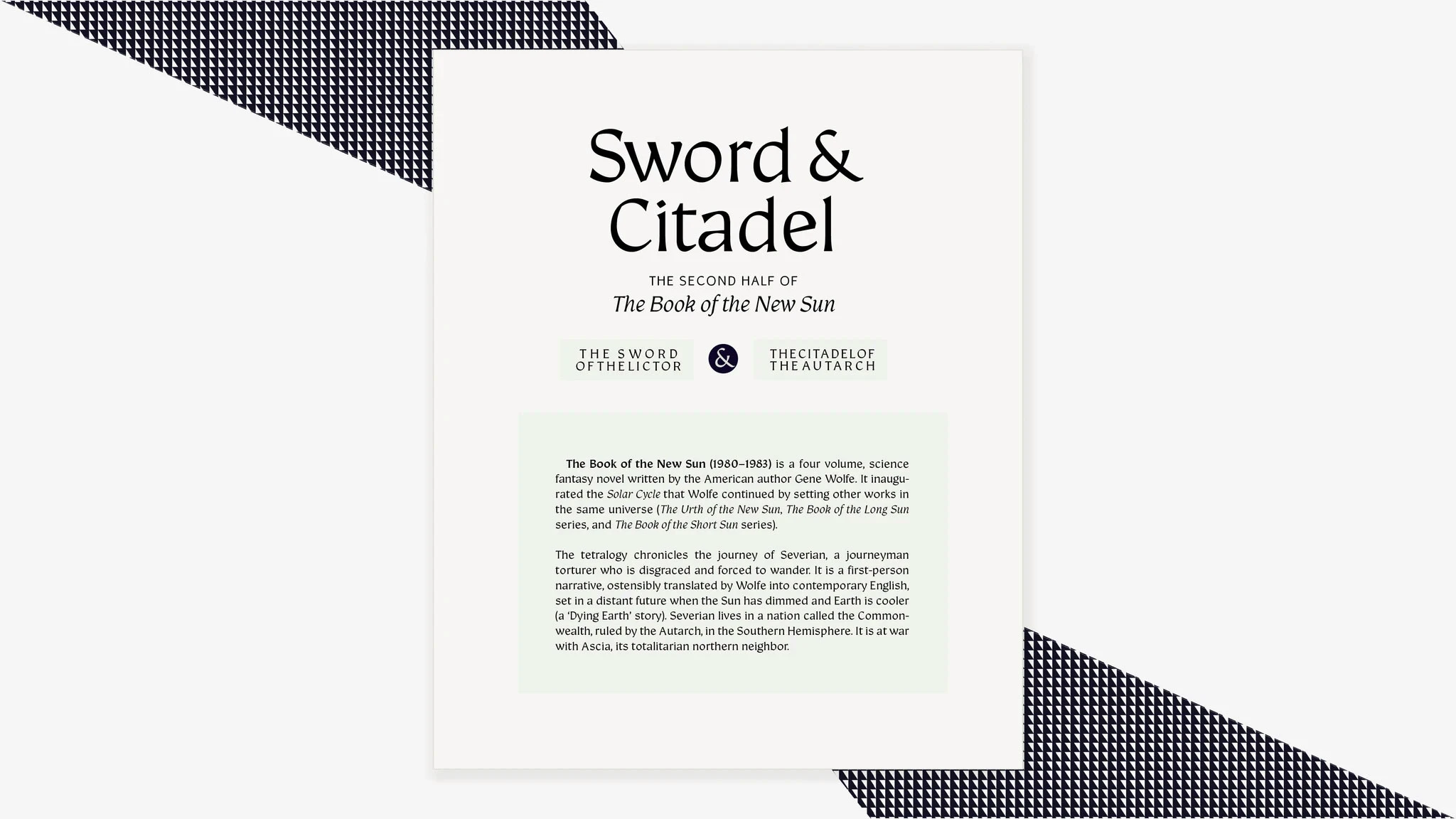
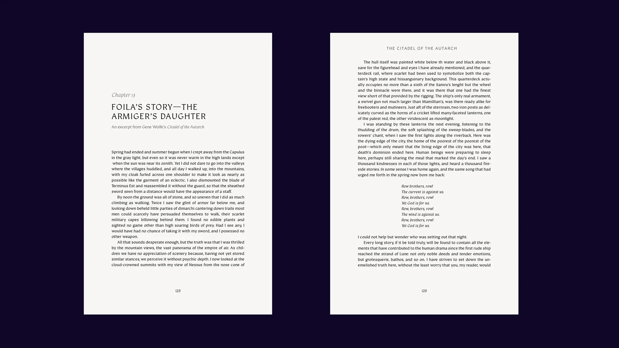
Specimens for Realm take several excerpts from the Book of the New Sun by Gene Wolfe; the design of Realm was heavily inspired by the science fantasy, medeival setting and the exposition from this series.
Specimens for Realm take several excerpts from the Book of the New Sun by Gene Wolfe; the design of Realm was heavily inspired by the science fantasy, medeival setting and the exposition from this series.
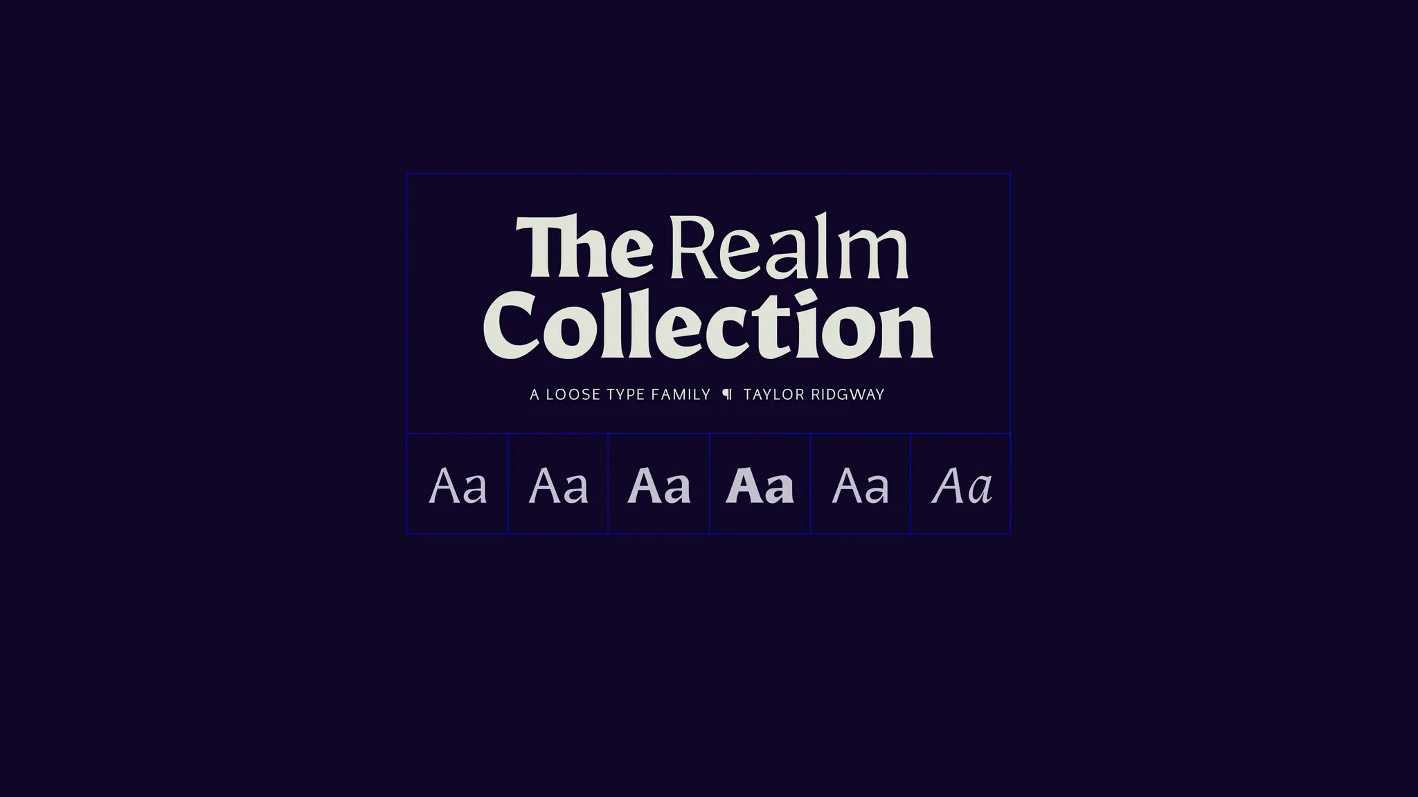
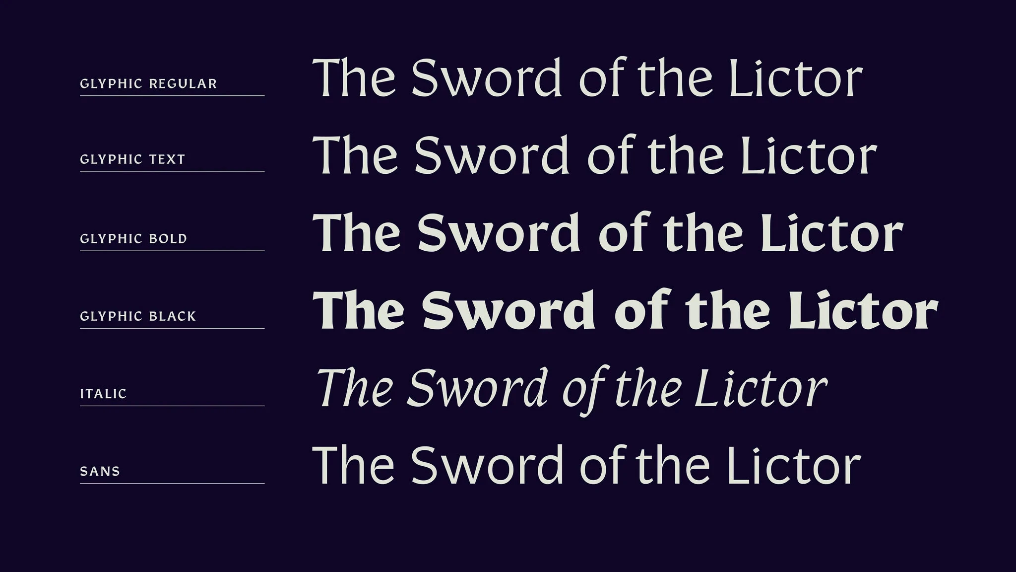
The assignment: an original type family
The assignment: an original type family
After exploring a revival font in the first term (I digitized an 1800’s cut of DeVinne Compressed by Caslon), our final two terms at TypeWest were focused on an original type family with a minimum of three styles.
Everyone’s process for discovering what they wanted to design was different; mine involved a lot of research into what interested me and why.
Impact: Type Design
Impact: Type Design
Design of the font and all related specimen materials
Design of the font and all related specimen materials
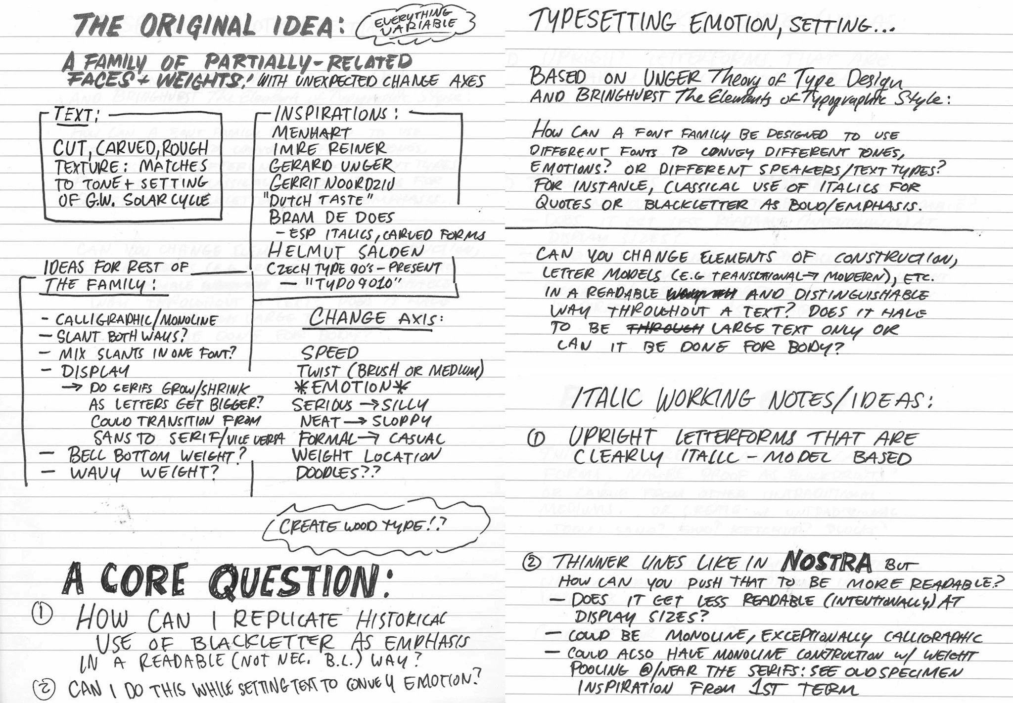
Our first task was to do research and bring back a moodboard
Our first task was to do research and bring back a moodboard
I had many interests and a few ideas for potential paths
I had many interests and a few ideas for potential paths
Something rough-hewn, like the logos of Milwaukee and Makita
Something that pushed the boundaries of what is or isn't a type family
Something that payed homage to analog methods and tools
Something rough-hewn, like the logos of Milwaukee and Makita
Something that pushed the boundaries of what is or isn't a type family
Something that payed homage to analog methods and tools
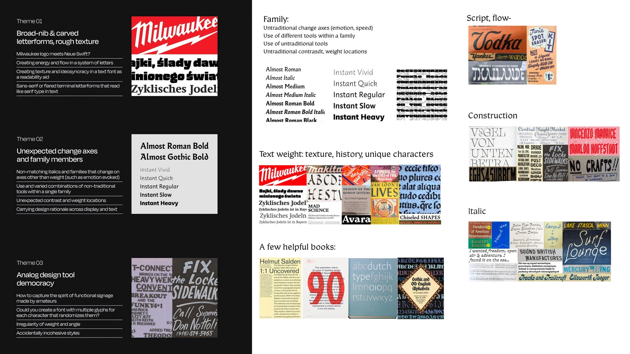
I spent my break and the beginning of Term 2 researching these ideas, discovering new typefaces and comparing other typefaces that I admired. I focused on a few categories:
Typefaces for long-form text that had texture
Typefaces with high x-heights
Dutch type
Czech type design
Other type families with unexpected pairings
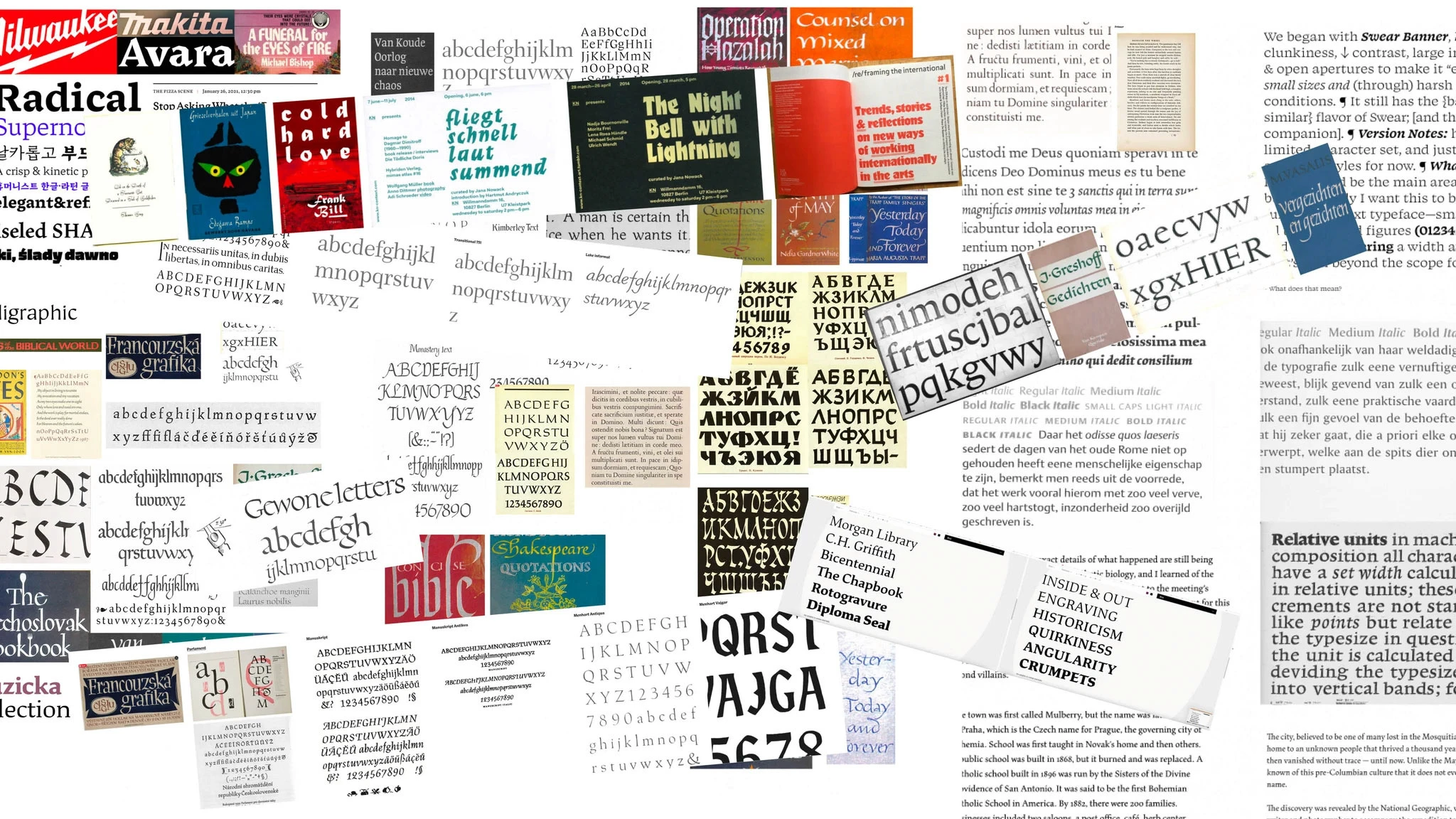
As the breadth of my research expanded, I learned a lot but also became overwhelmed
As the breadth of my research expanded, I learned a lot but also became overwhelmed
I needed to focus—now that I had studied a myriad of typefaces and lettering, I took time to narrow down to what interested me the most right now. I shifted my focus from the family to what my first, core style would look like. The final core references focused on pen-techniques, history, and ways that designers were creating texture within a readable system.
I needed to focus—now that I had studied a myriad of typefaces and lettering, I took time to narrow down to what interested me the most right now. I shifted my focus from the family to what my first, core style would look like. The final core references focused on pen-techniques, history, and ways that designers were creating texture within a readable system.
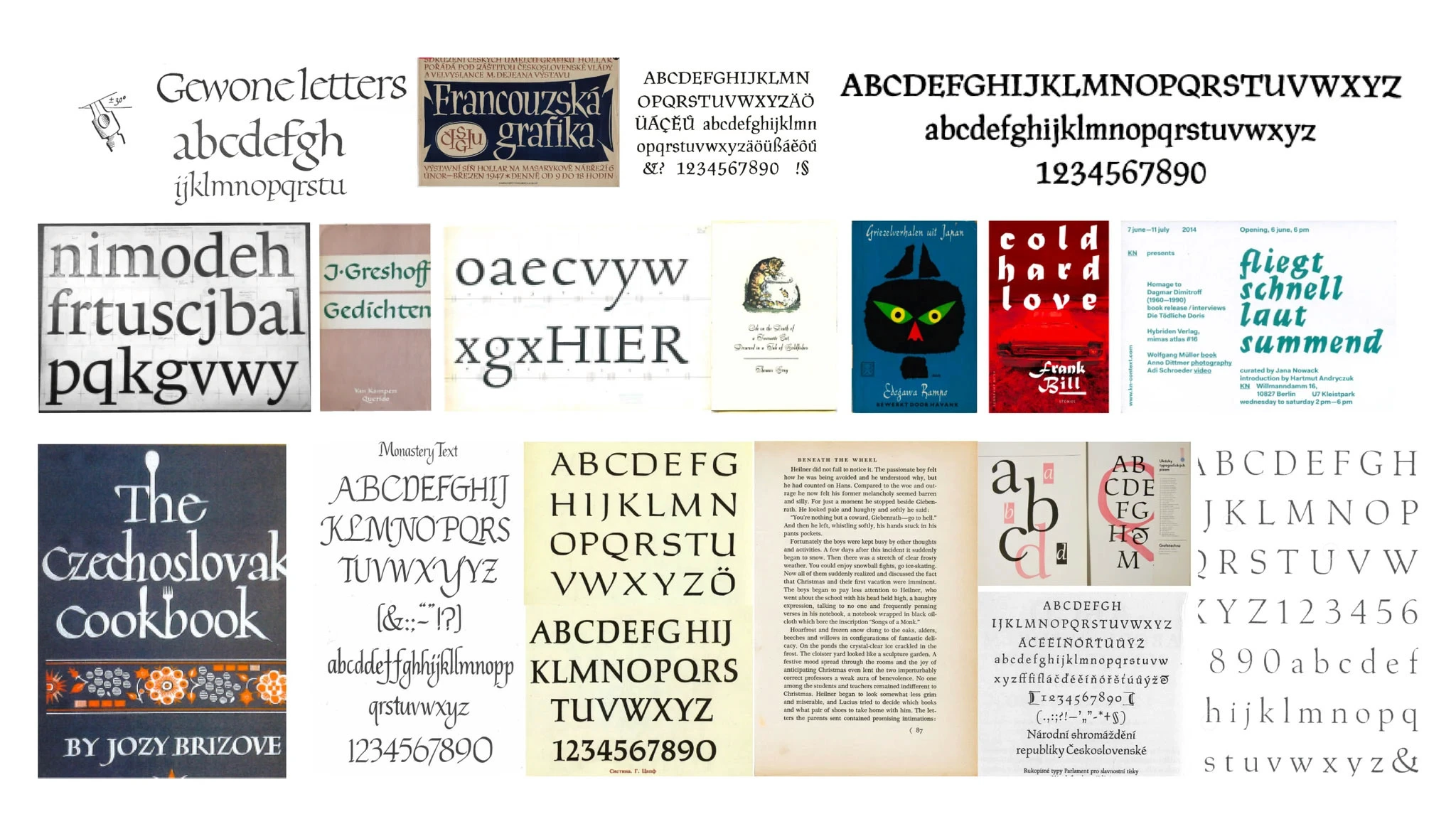
Gerard Unger's lettering (top left) and the Monastery Text were a couple of my most-referenced inspirations
Gerard Unger's lettering (top left) and the Monastery Text were a couple of my most-referenced inspirations
Want to see more process and research?
Want to see more process and research?
Despite my massive library of reference, I lacked a solid direction
Despite my massive library of reference, I lacked a solid direction
Despite my massive library of reference, I lacked a solid direction
I had a few questions and ideas, but didn't know how they translated to actual designs.
I had a few questions and ideas, but didn't know how they translated to actual designs.
The family should be primarily for running text
Probably a serif?
How can emphasis be created without use of italic or bold?
Should I explore the main reading face first, or the fonts intended for emphasis?
If I want to combine pen models, which should I start with?
The family should be primarily for running text
Probably a serif?
How can emphasis be created without use of italic or bold?
Should I explore the main reading face first, or the fonts intended for emphasis?
If I want to combine pen models, which should I start with?
These ideas were all very interesting—but also competed with each other
These ideas were all very interesting—but also competed with each other
I didn't have the time to explore deeply enough to answer all of these questions at once—and maybe it wasn't possible even with time. What I did have was deadlines. The result was three unsatisfying concepts born out of the need to have something to show:
I didn't have the time to explore deeply enough to answer all of these questions at once—and maybe it wasn't possible even with time. What I did have was deadlines. The result was three unsatisfying concepts born out of the need to have something to show:
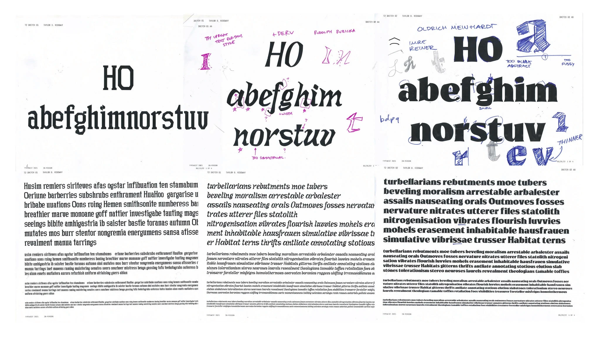
Silver lining: Rudolph Ruzicka and Oldrich Meinhardt would become very important references for me
Silver lining: Rudolph Ruzicka and Oldrich Meinhardt would become very important references for me
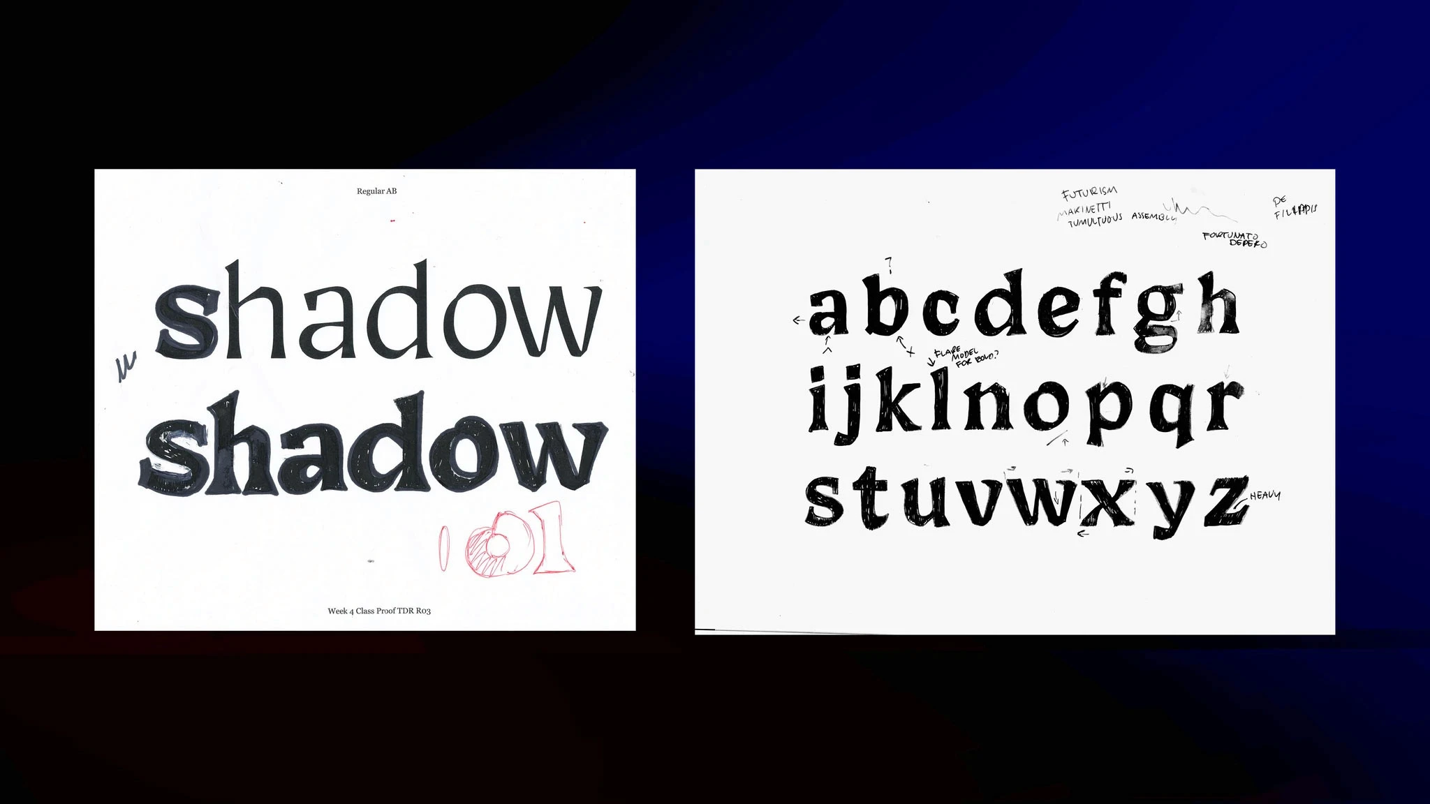
Eventually, a workshop with Lynne Yun of Space Type helped me to loosen up and just explore letters and shapes. By being loose with various implements such as chipped wood and pipe cleaners, I was able to get out of my head and move forward.
Under Lynne’s guidance, my first experiments turned into an iterative process of drawing and redrawing letters:
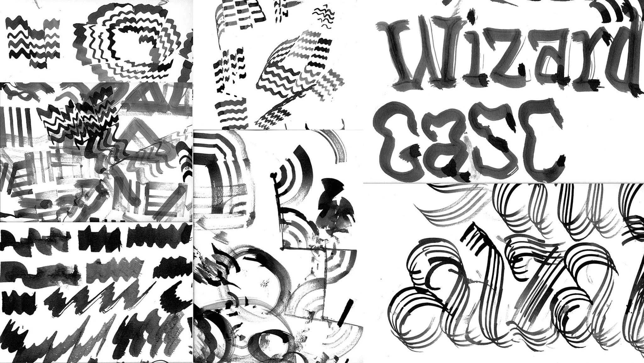
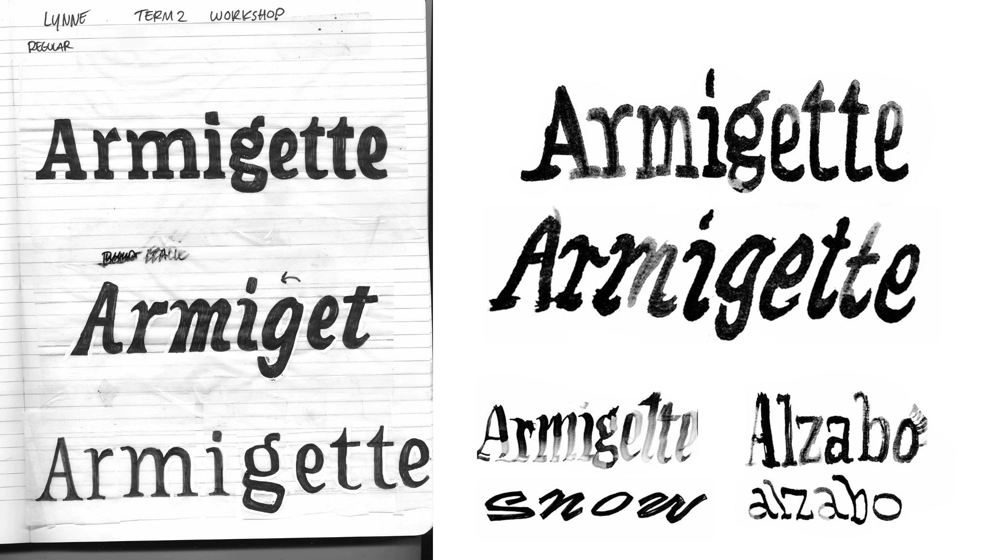
While I didn't produce something that fit my vision, I did finally get out of my creative rut
While I didn't produce something that fit my vision, I did finally get out of my creative rut
The next time I entered my studio, I was able to output a lot of sketches without worrying if they were the one. Being more warmed up on the brush and having a reference of different lettering styles and tools helped me to produce the drawings that evolved into my core style.
The next time I entered my studio, I was able to output a lot of sketches without worrying if they were the one. Being more warmed up on the brush and having a reference of different lettering styles and tools helped me to produce the drawings that evolved into my core style.
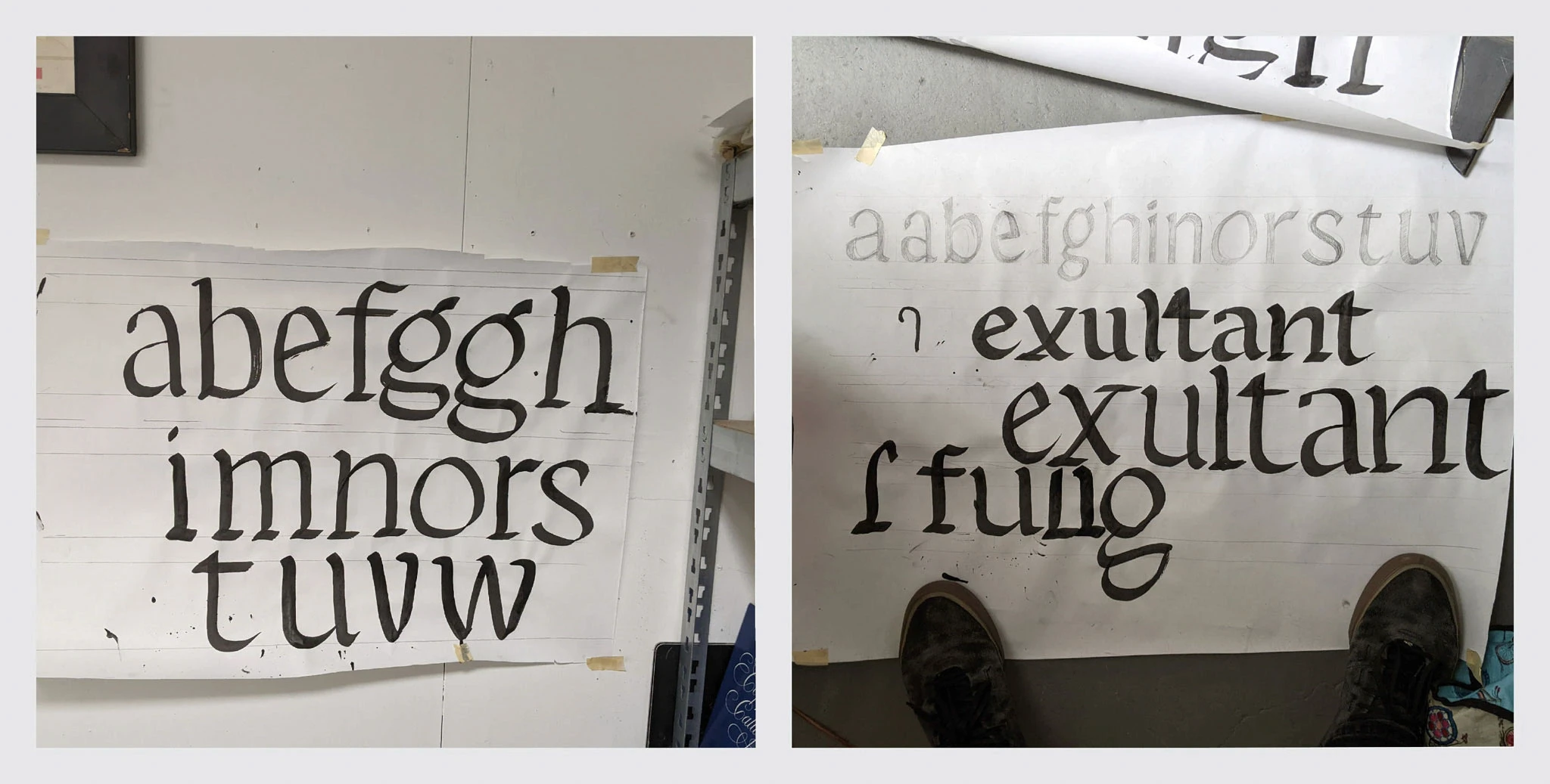
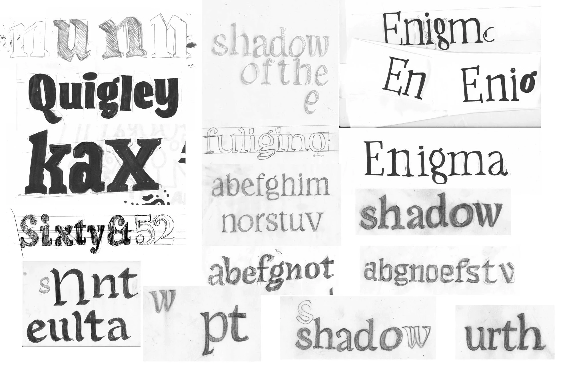
A core style emerges
A core style emerges
Creating a system of letters rather than a composition of letters turned an interesting sketch into a concept I was really interested in. Jumping back into Robofont, I was able to bring together two concepts interpreting the same drawings in different ways.
Creating a system of letters rather than a composition of letters turned an interesting sketch into a concept I was really interested in. Jumping back into Robofont, I was able to bring together two concepts interpreting the same drawings in different ways.
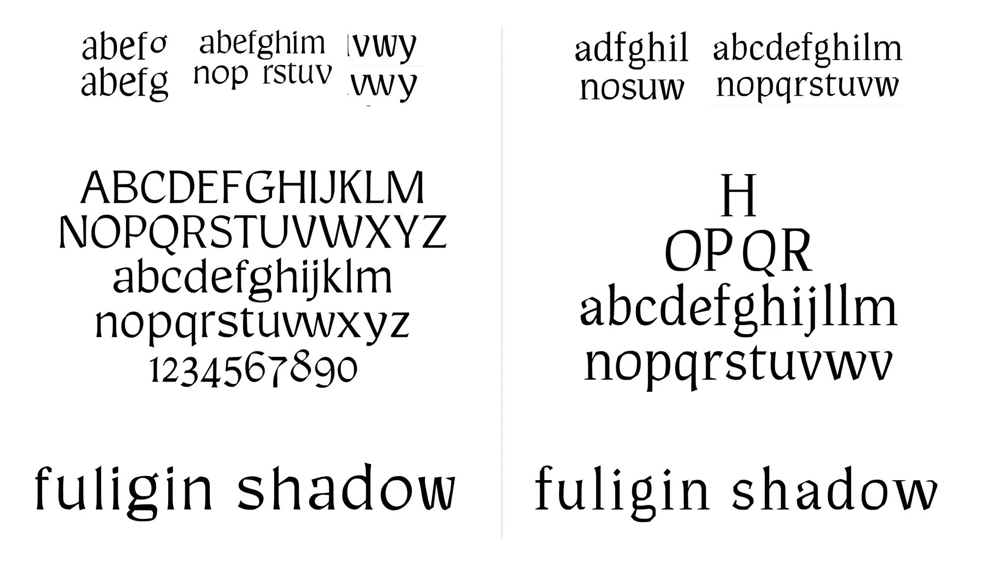
My own intuition on feedback from class aligned: I chose to focus on the left-hand concept
My own intuition on feedback from class aligned: I chose to focus on the left-hand concept
Now I needed to produce at least two more styles
Now I needed to produce at least two more styles
Just when I was in a flow and was ready to build out this core style more, we were assigned to explore what our two additional styles would be. Again, I went so wide I wasn’t sure what to do. But this time, my instructors and classmates helped me to quickly focus
Just when I was in a flow and was ready to build out this core style more, we were assigned to explore what our two additional styles would be. Again, I went so wide I wasn’t sure what to do. But this time, my instructors and classmates helped me to quickly focus
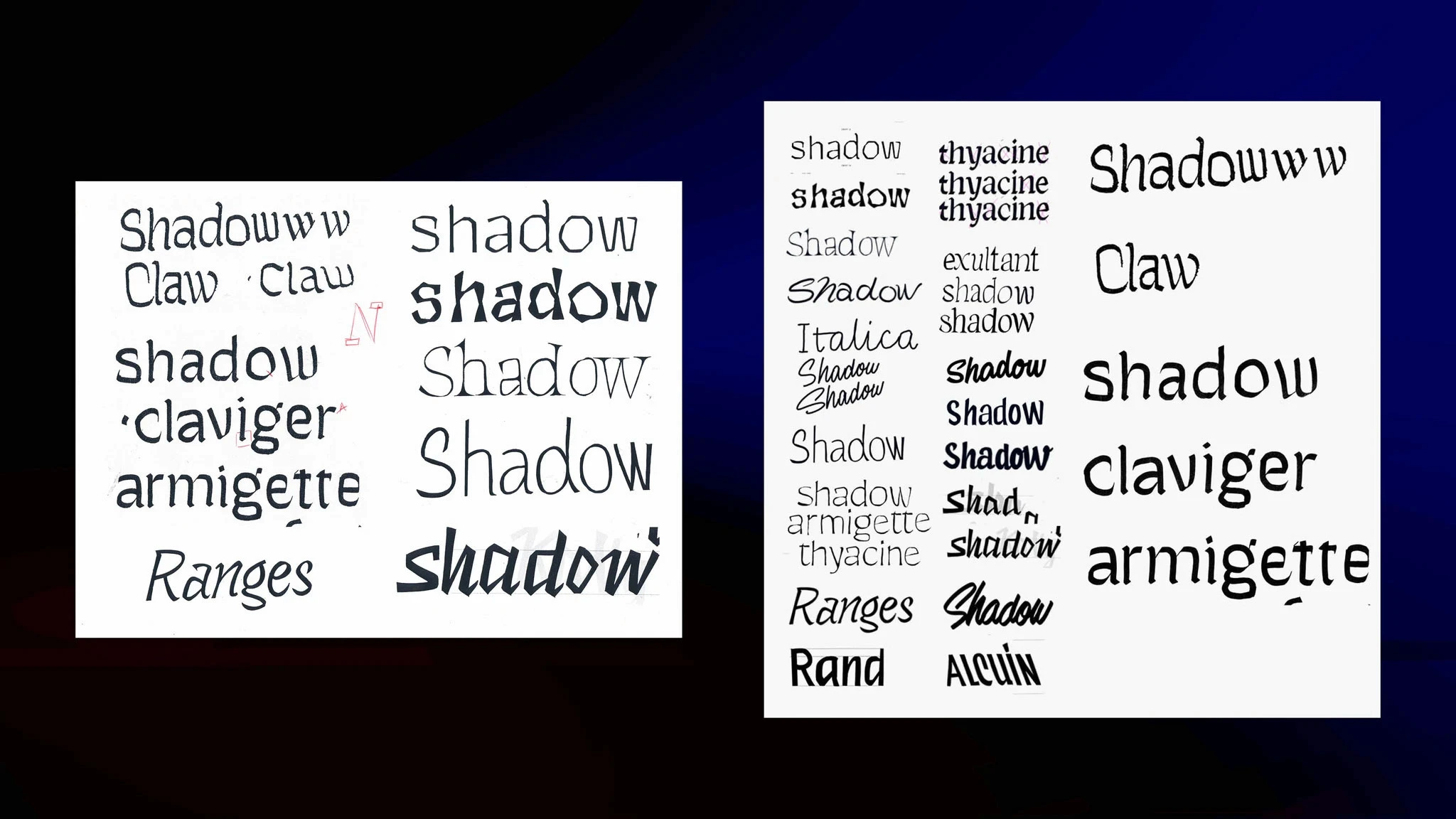
Creating these sketches would prove to be one of my favorite parts of the process
Creating these sketches would prove to be one of my favorite parts of the process
Initial explore provided many future ideas, and a few that would work now
Initial explore provided many future ideas, and a few that would work now
These concepts were interesting and had potential, but started off very rough. Based on a rotational broad-nib pen model, I created what I hoped could be an upright italic or casual style and a sans to pair with the serif. My ambition at the time was to create a variable font that could morph between these three styles.
These concepts were interesting and had potential, but started off very rough. Based on a rotational broad-nib pen model, I created what I hoped could be an upright italic or casual style and a sans to pair with the serif. My ambition at the time was to create a variable font that could morph between these three styles.
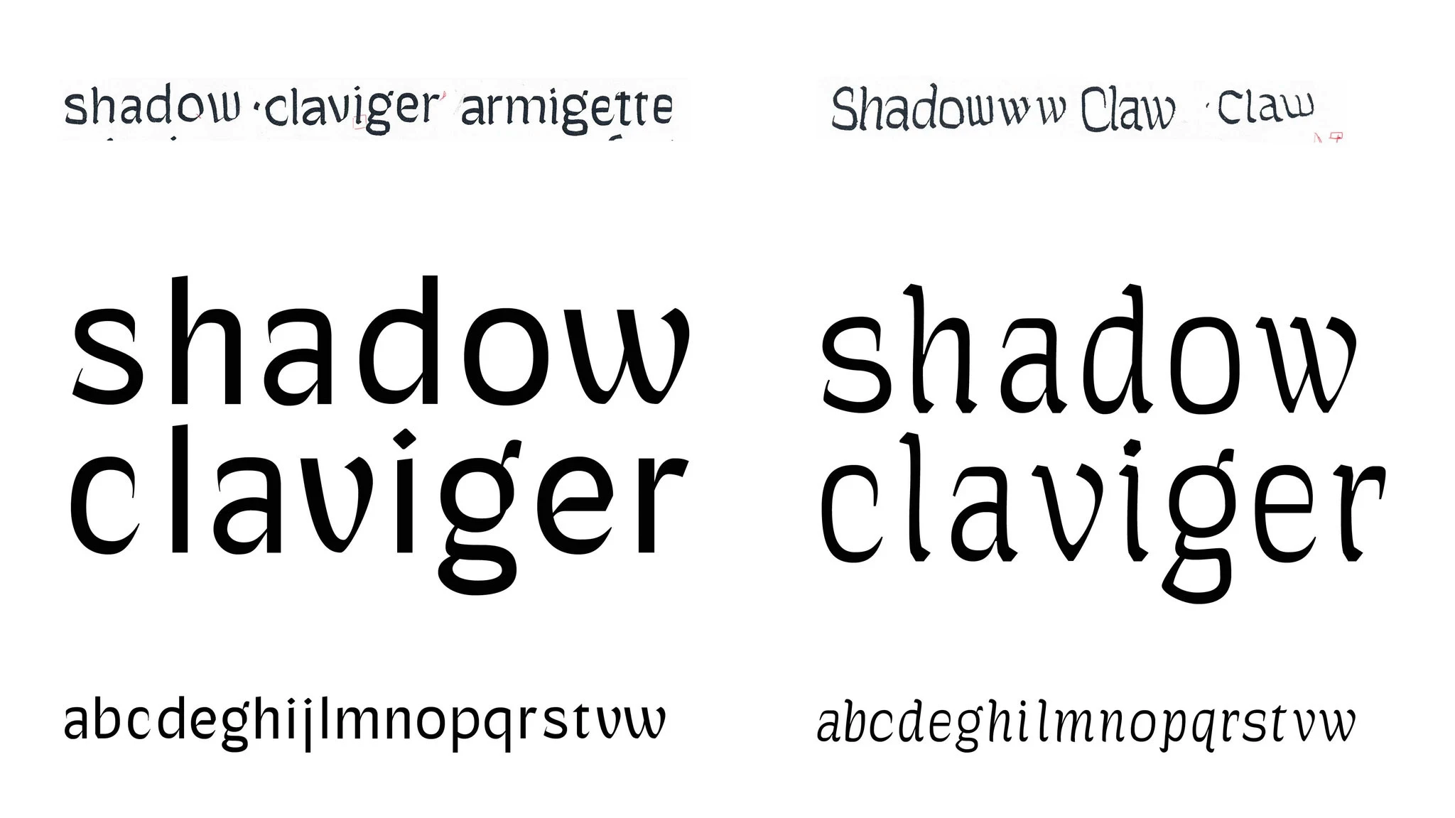
Two of the drawings were natural pairs for the core style
Two of the drawings were natural pairs for the core style
By this time I had a rough idea of what I wanted the feel of the family to be: medieval but not; between and outside of time, a call back to romanticized past yet also a reminder of the documented history of the pen. These styles helped to emphasize pen technique, yet also subverted into something more fantastical.
By this time I had a rough idea of what I wanted the feel of the family to be: medieval but not; between and outside of time, a call back to romanticized past yet also a reminder of the documented history of the pen. These styles helped to emphasize pen technique, yet also subverted into something more fantastical.
An interesting collection of letters, not a collection of interesting letters
An interesting collection of letters, not a collection of interesting letters
Studying each new style alone and in paragraphs with the core style revealed that I had some problems. Each style had too many unique things going on, causing uneven textures and distraction. Meanwhile, despite their obvious differences at large sizes, they were difficult to distinguish from the core style in text sizes. I had still not discovered what variables—other than weight and angle—would help to visually separate the styles.
Studying each new style alone and in paragraphs with the core style revealed that I had some problems. Each style had too many unique things going on, causing uneven textures and distraction. Meanwhile, despite their obvious differences at large sizes, they were difficult to distinguish from the core style in text sizes. I had still not discovered what variables—other than weight and angle—would help to visually separate the styles.
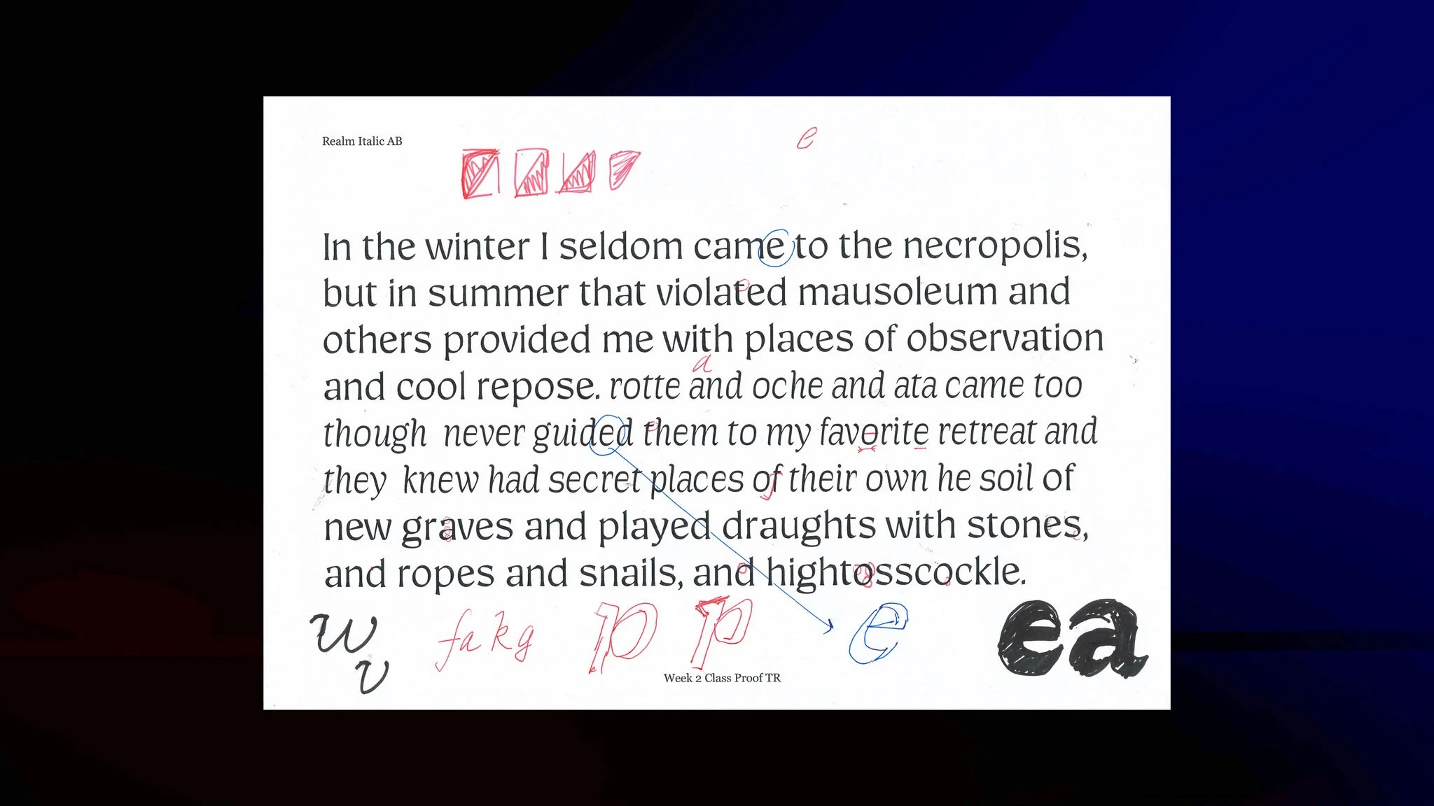
I went back to the drawing board for the italic
I went back to the drawing board for the italic
I needed to create something that both fit the feel of the core style better and differentiated more; based on feedback from my instructors, Maria Doreuli and Graham Bradley, I experimented with adding more italic angle and bringing in the rougher-hewn texture of the core style.
The new style worked much better and was a simpler to accomplish, helping bring it into scope. While the new italic had shades of the original drawing. the casual style became another addition to the 'for later' pile. Eventually, I decided I'd like them to be axes of a variable font—but that was far out of scope.
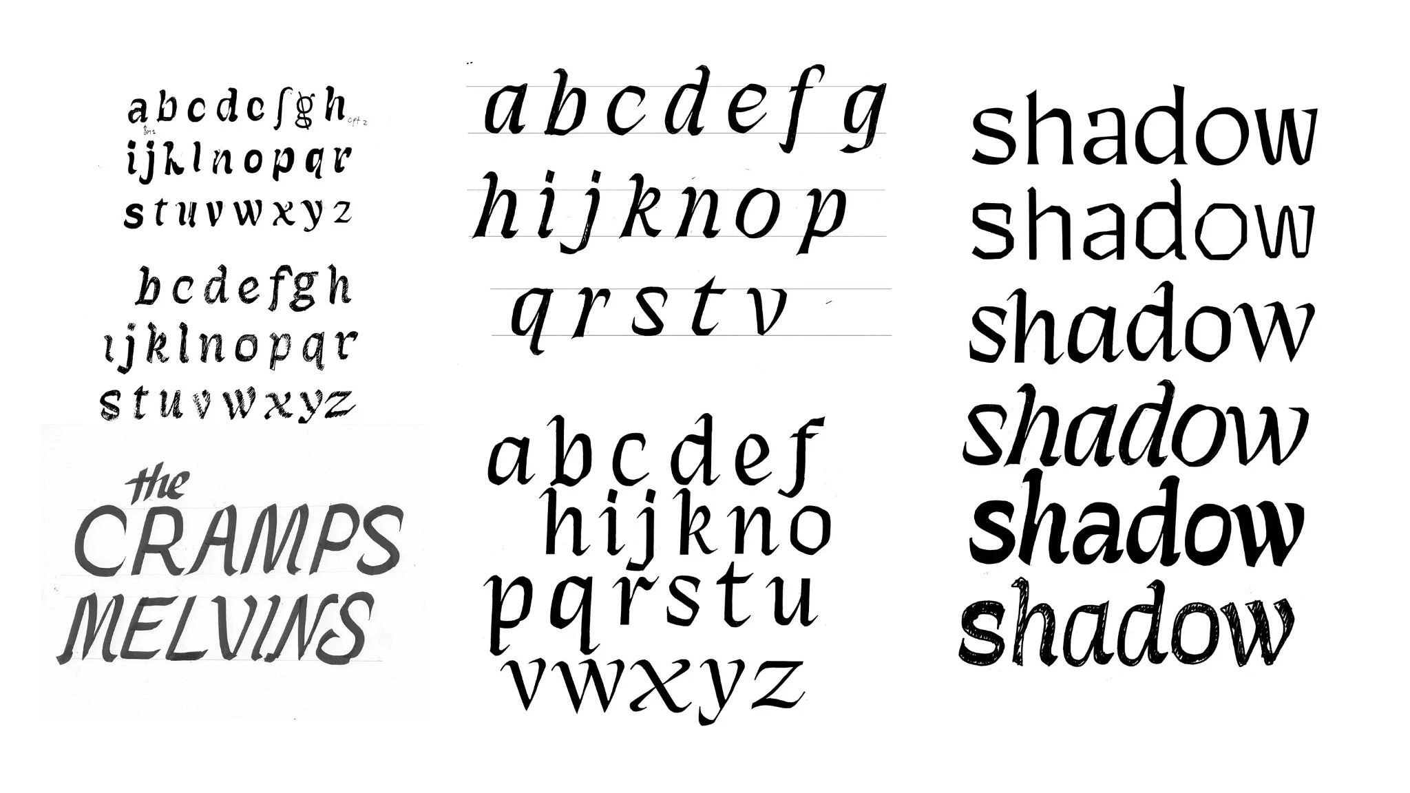
This time, I worked to be more intentional: the italic was created iteratively out of the core style
This time, I worked to be more intentional: the italic was created iteratively out of the core style
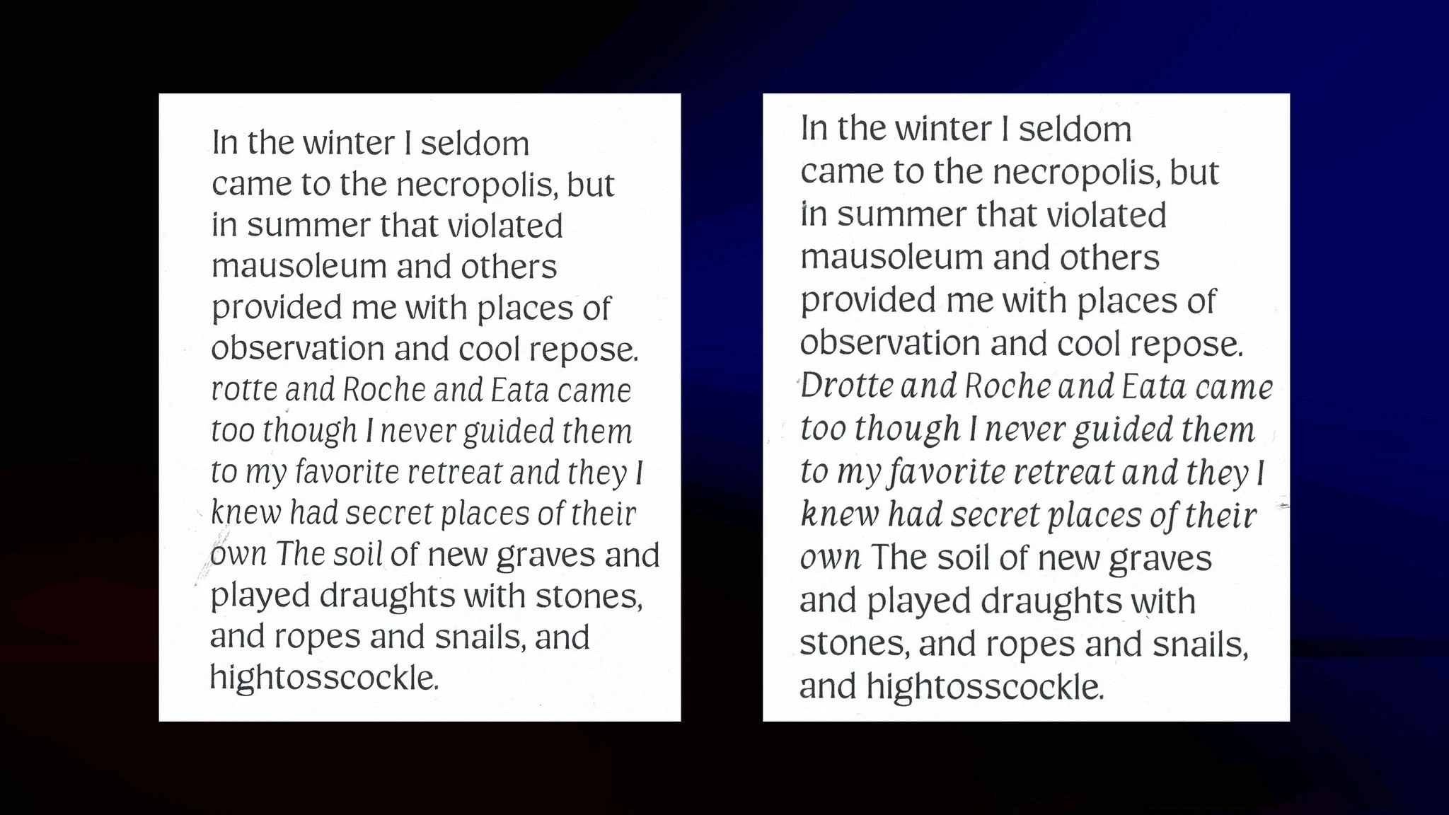
Left: casual style | Left: true italic; the new italic was immediately more distinguishable in text. It took some experimentation with angle to make it really stand out.
Left: casual style | Left: true italic; the new italic was immediately more distinguishable in text. It took some experimentation with angle to make it really stand out.
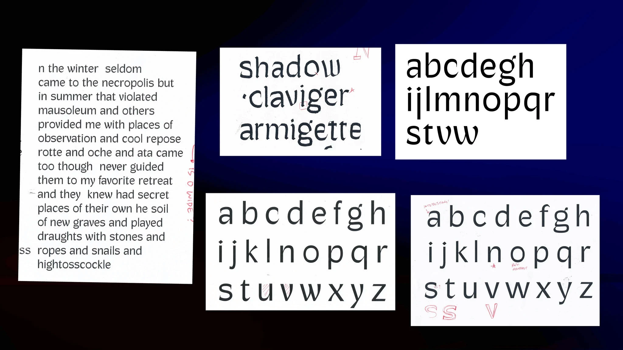
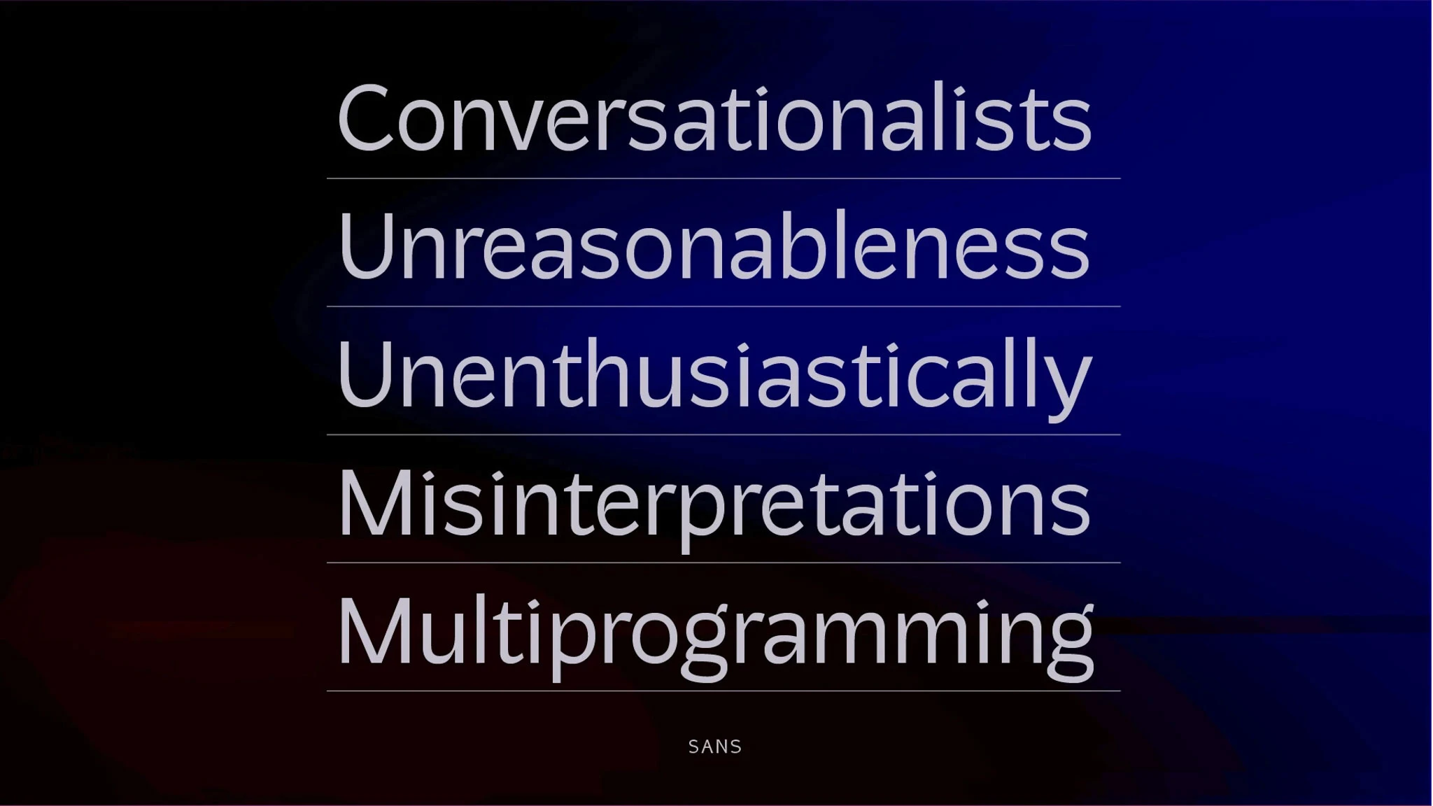
Evolving a readable sans that evoked the personality of the original sketch would prove extremely difficult
Evolving a readable sans that evoked the personality of the original sketch would prove extremely difficult
Next up—or so I thought—was the Sans.
Next up—or so I thought—was the Sans.
This style really needed to be simplified to work as a system; the number of unique characters was distracting and the relationships of thick-to-thin made it an uncomfortable read in running text. I began to explore creating a more true-to-style sans with hints of the pen rotation and some of the features from the original.
This style really needed to be simplified to work as a system; the number of unique characters was distracting and the relationships of thick-to-thin made it an uncomfortable read in running text. I began to explore creating a more true-to-style sans with hints of the pen rotation and some of the features from the original.
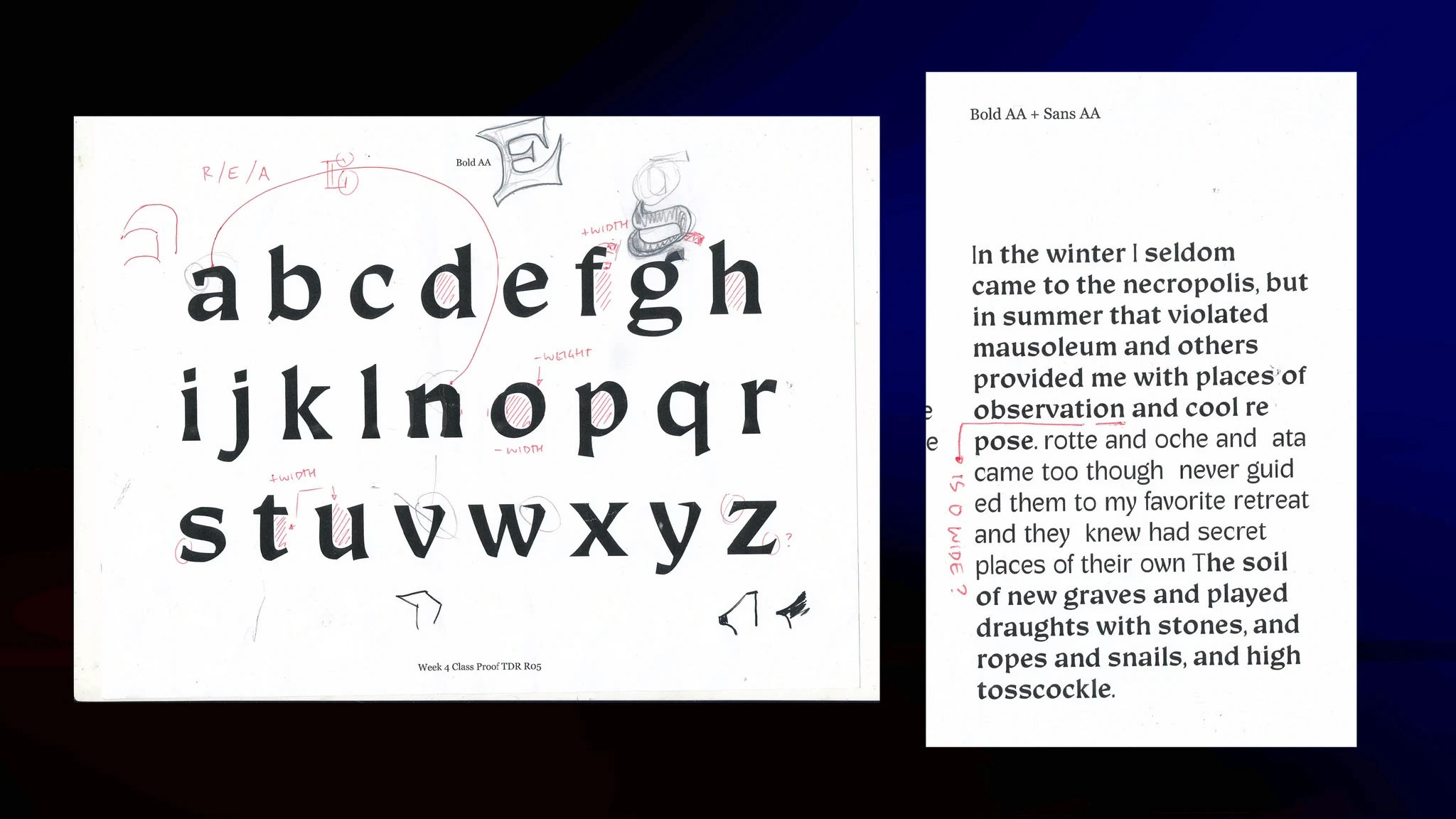
'I really think you should explore a heavier version of your Regular'
'I really think you should explore a heavier version of your Regular'
It took a little bit for it to sink in—Maria may have had to repeat herself once or twice—but she was absolutely right. This was a critical learning moment for me: I was stubbornly trying to avoid using heavier weight as an emphasis.
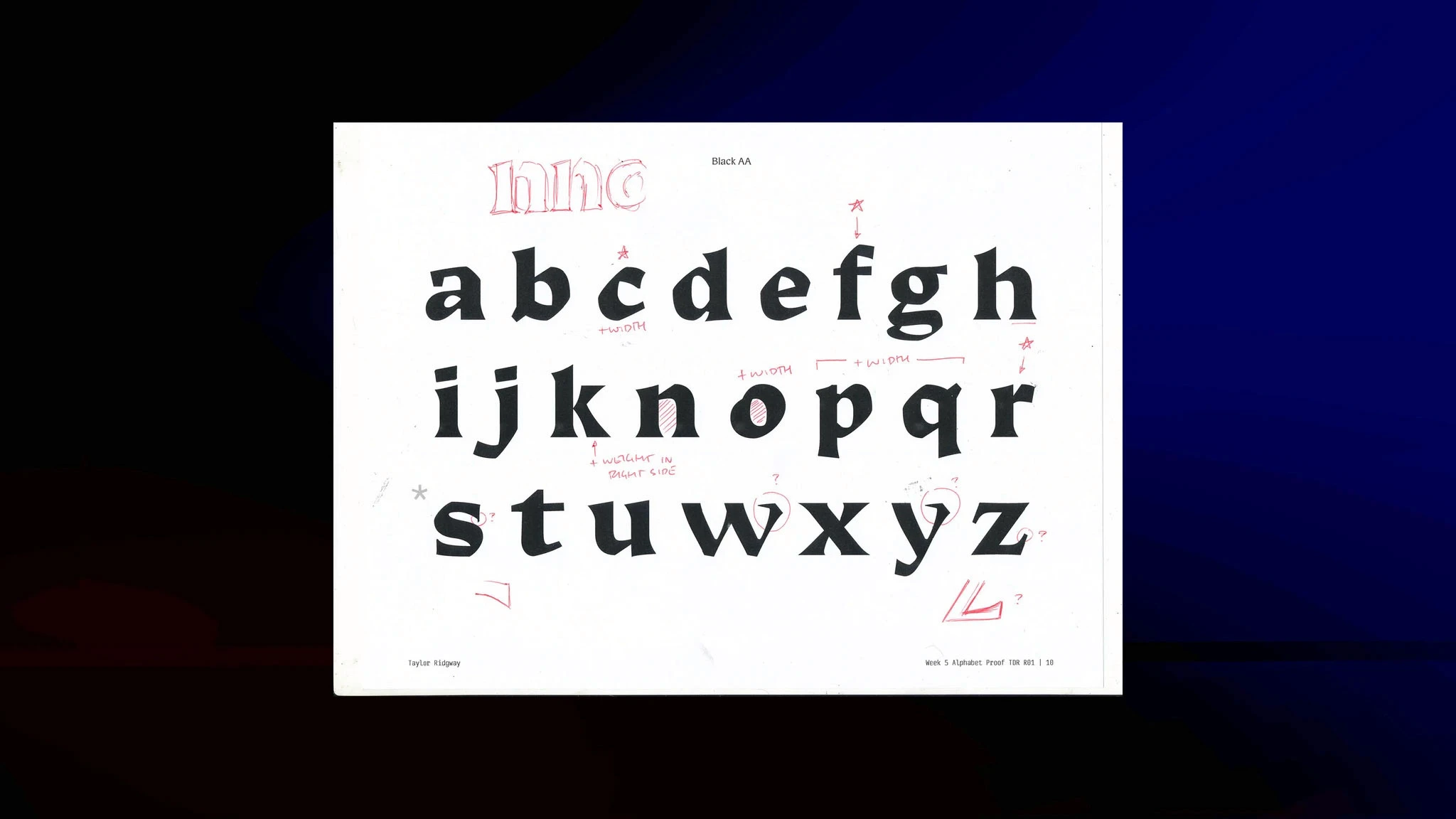
Exploring heavier styles allowed me to think about the positive and negative space differently, and brought awareness to the type as a larger system. My next experiments brought a lot of insight to my core style and helped me to look at the system in a new light.
They also allowed me to think differently about change axes: instead of avoiding a heavier weight, I began to explore how type could change its reference as it got heavier. What if it became more black-letter referential than roman?
Exploring change axes
Exploring change axes
At this point, I had four unique fonts in the works; the core style and its heavier sibling also shared enough in common to use them as source files for interpolation, leading to even more experimentation. The process became about filling in missing glyphs and slowly but surely aligning glyphs within each system and between systems to feel like a larger system. To help gain perspective and break up the deeper work of close refinements, I stepped back and looked at the change axes.
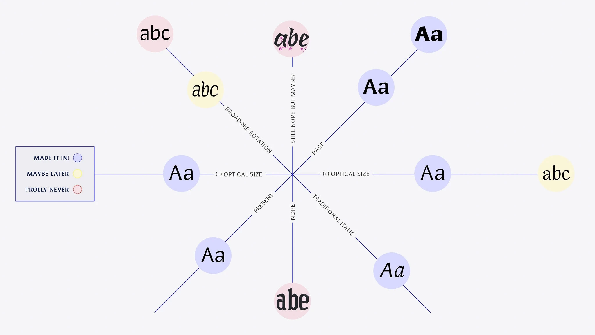
I created duplicates of fonts as experiments and aligned their points so I could use Robofont plugins to visualize interpolation between regular and bold; italic, casual and sans; and regular and sans. This helped me to understand their similarities and differences, and how to connect them mentally.
I also used this time to use interpolation to experiment with how changes in weight and construction impacted readability of the core style, eventually landing on a new, more readable optical size for text. The final text version started as an interpolation and then was modified for readability, adding a new source to the interpolation matric.
Finally, I mapped out a mental model of the axes for each of the final styles and my experiments:
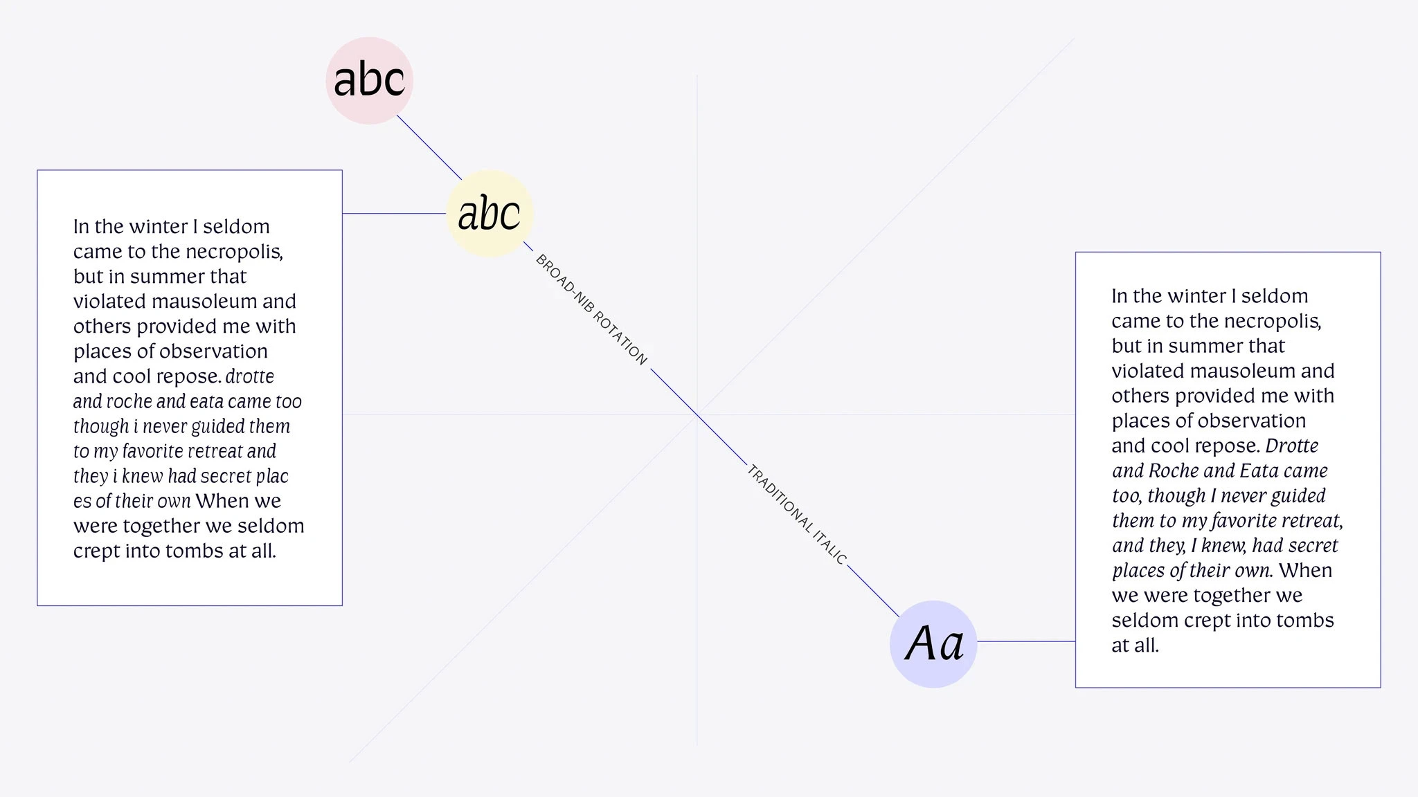
Evolution of the collection
Evolution of the collection
After many late nights and more refinement, the final collection of six fonts was ready to be turned in. Although I abandoned the Sans in the middle of the final term, I was able to revive it during the break between our final term and our last deadline and public presentation.
After many late nights and more refinement, the final collection of six fonts was ready to be turned in. Although I abandoned the Sans in the middle of the final term, I was able to revive it during the break between our final term and our last deadline and public presentation.
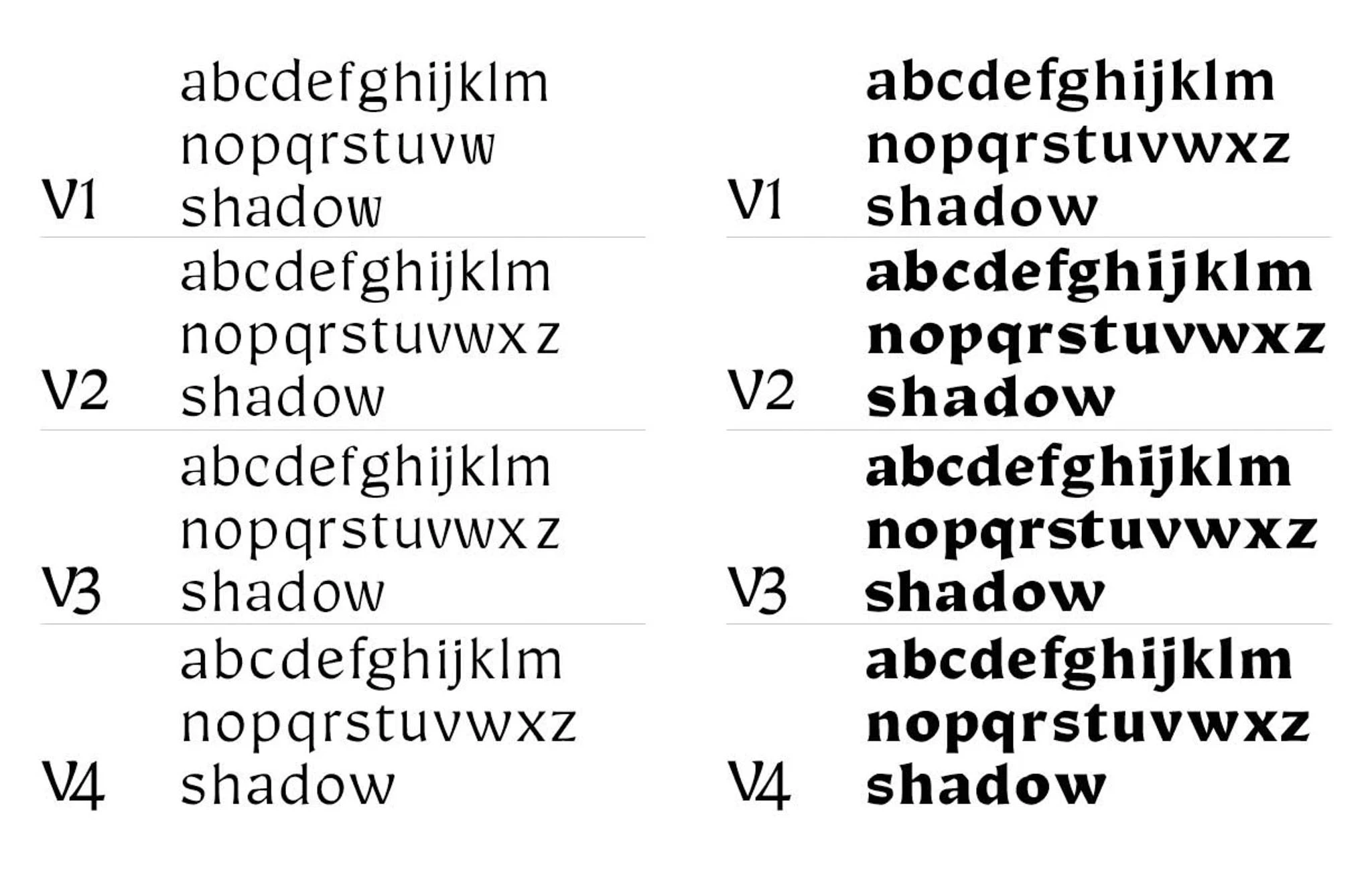
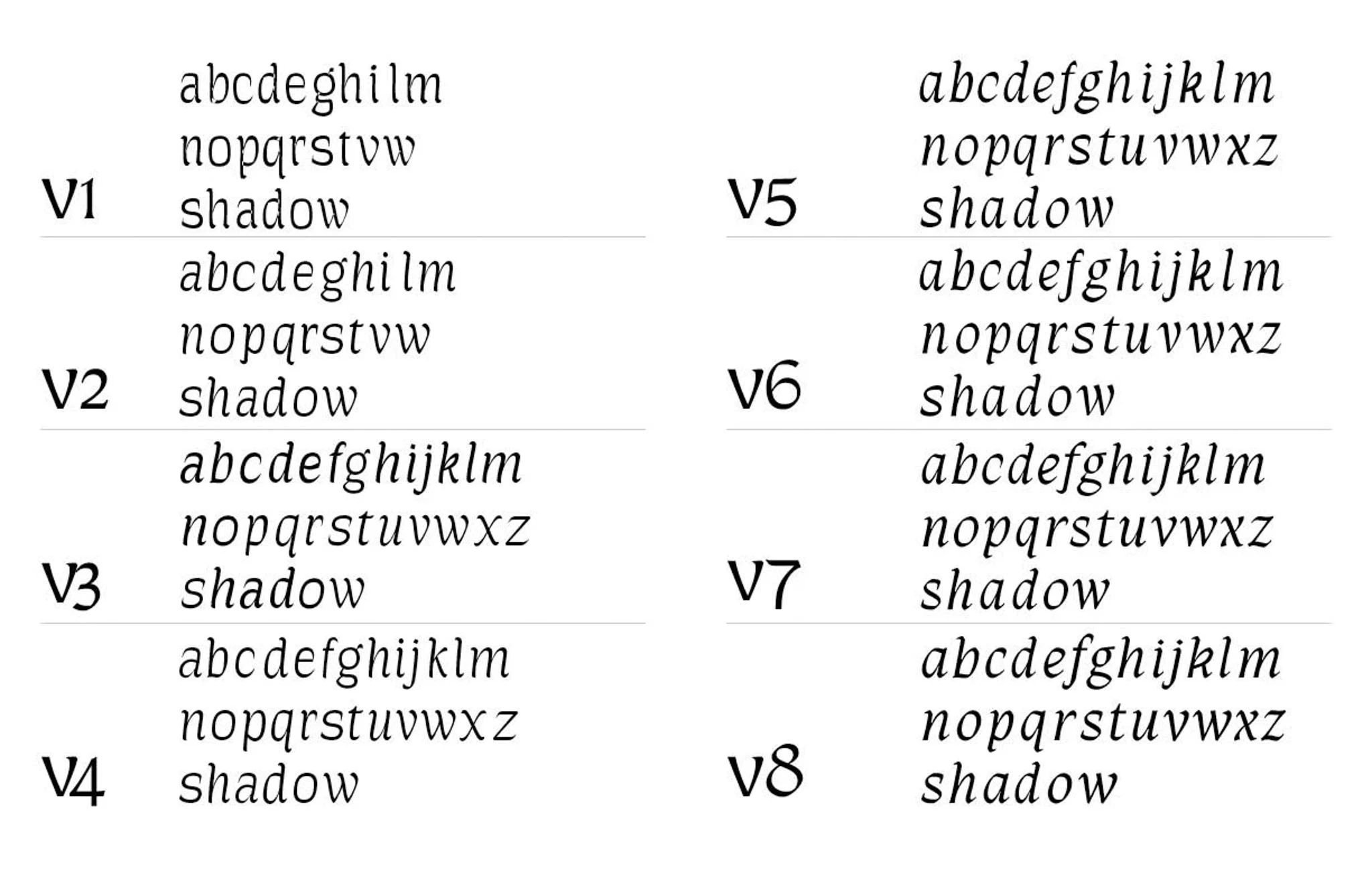
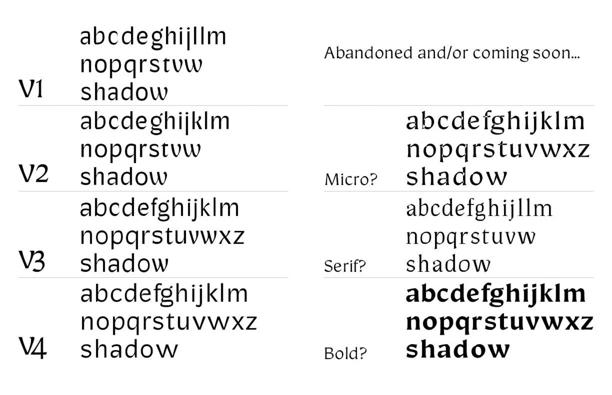
Evolution of the Realm Collection
Evolution of the Realm Collection
Final results
Final results
The evolution of the collection was a very pleasant surprise, and I am excited to continue to refine until it is ready for a public release.
The evolution of the collection was a very pleasant surprise, and I am excited to continue to refine until it is ready for a public release.
Fonts as systems; type as a product
Fonts as systems; type as a product
During my time designing Realm I was also taking on new product and visual design responsibilities for the Odyssey Design System at Okta. The similarities between type design and design systems were striking: glyphs are an analog for components and reusing and modifying glyph shapes such as serifs and corners is similar to updating primitive system styles like radius and spacing. As the number of designed glyphs or components increase, it becomes critical to create changes with intention and systematically update base styles, preventing exceptions and one-off changes from going unnoticed.
Working in both spaces at once helped me to understand my personal strengths as a designer: practicing patience, moving systematically and understanding network effects of design decisions. I love taking the time to focus on the minutiae and excel at creating and maintaining the smaller pieces that make up the whole.


Font credits: IBM Plex | Bruphy Text by Very Cool Studios