Odyssey Design System
Odyssey Design System
Odyssey Design System
March 2021 to August 2023
March 2021 to August 2023
The Odyssey Design System enables cross-functional partners to build and design consistent, efficient and accessible UIs for all Okta Workforce users. Odyssey offers robust, accessible, and globalization-ready components, guidelines, and documentation to Okta Admin designers for the first time.
Version 1 of Odyssey Design System launched in August 2023.
You can check it out live at the Documentation site, check out the code at Odyssey GitHub or test components at the Odyssey Storybook.
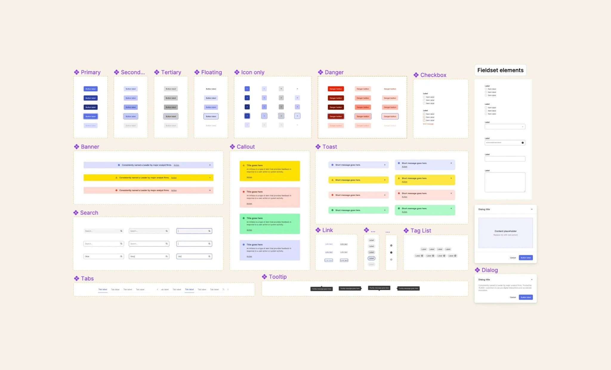
Wrangling disparate patterns
After years of rapid growth, Okta’s Workforce designers and developers were struggling with disparate patterns and systems. In 2022, after an Okta rebrand and fresh investment in design systems, the Odyssey Design team set out to elevate the existing design and component library.
In August of 2023, we introduced Odyssey Design System: an accessible, globalization-ready system including design, documentation, tokens, a component library and a Figma UI Kit.
Impact: Product design
Impact: Product design
User experience, visual design, documentation, token schema, UI Kit management, color system design, translation between functions
User experience, visual design, documentation, token schema, UI Kit management, color system design, translation between functions
Challenges
Low adoption rates
Disparate patterns and prevalence of one-offs
No centralized team responsible for UI
Unmerged acquisition products
Unmet accessibility needs
No documentation or clear guiding principles
Okta Admins have to learn multiple competing patterns in different surface areas
Low adoption rates
Disparate patterns and prevalence of one-offs
No centralized team responsible for UI
Unmerged acquisition products
Unmet accessibility needs
No documentation or clear guiding principles
Okta Admins have to learn multiple competing patterns in different surface areas
Opportunities
Centralized libraries will allow designers to focus on solving problems
Clear standards and documentation will increase adoption of desired patterns
Documentation site can double as an adoption pitch: save resources, focus on your problems
As teams migrate to Odyssey, Okta will become easier to use as Admins gain familiarity
Accessibility will be a default behavior for Okta foundations and components
Clear content design of code and design libraries will help propagate a shared vocabulary
Aligning acquisition products with core Okta will defragment the Okta experience
Color system
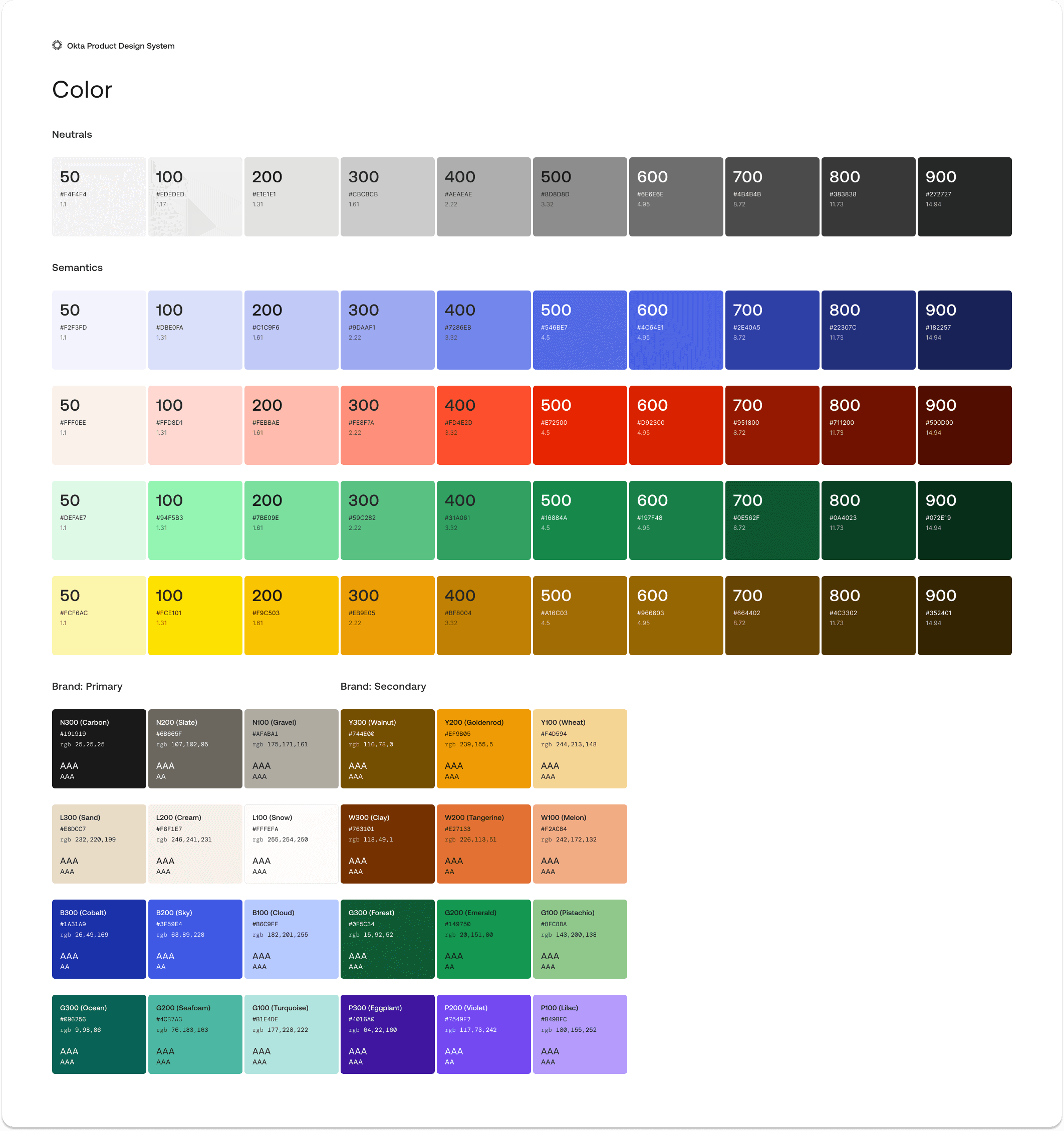


Previous palettes were limited, and diverged between product areas
The full 0-900 palettes of neutrals and semantic colors in previous versions were too similar to be used: they had been developed without use-cases in mind. About ~6 neutral colors and ~3 semantic colors made it into the final product palette, and these diverged between different product areas. With such limited colors to select from, few combinations of background and foreground colors were accessible.
The full 0-900 palettes of neutrals and semantic colors in previous versions were too similar to be used: they had been developed without use-cases in mind. About ~6 neutral colors and ~3 semantic colors made it into the final product palette, and these diverged between different product areas. With such limited colors to select from, few combinations of background and foreground colors were accessible.
Built with emerging standards in mind
The Odyssey color system is built using open-source color tools (colorbox.io and Leonardo Color) to ensure that contrast remained predictable across values while also maintaining awareness of relative luminance and emerging WCAG 3.0 drafts and research.
We tested rigorously to ensure accessibility between background and foreground colors, creating uniformity between hues; for example, all 500 values are accessible for controls on 50 and 100, while all 600 values are the minimum accessible level for text.
The new system makes it easier to design for accessibility, lays the groundwork for theming and introduces new flexibility for the use of non-white backgrounds in the product.
More backgrounds help to create structure
Additional options for neutral and semantic color values creates the ability to visually differentiate UI functions from one-another and create more structure in the product.
Additionally, the new color system was tested for use with a global grey background—unlocking capabilities to add a 'dim mode' which reduces eye-strain without negatively impacting readability (see this Andrew Somers article for more information).
Developing Odyssey token schema
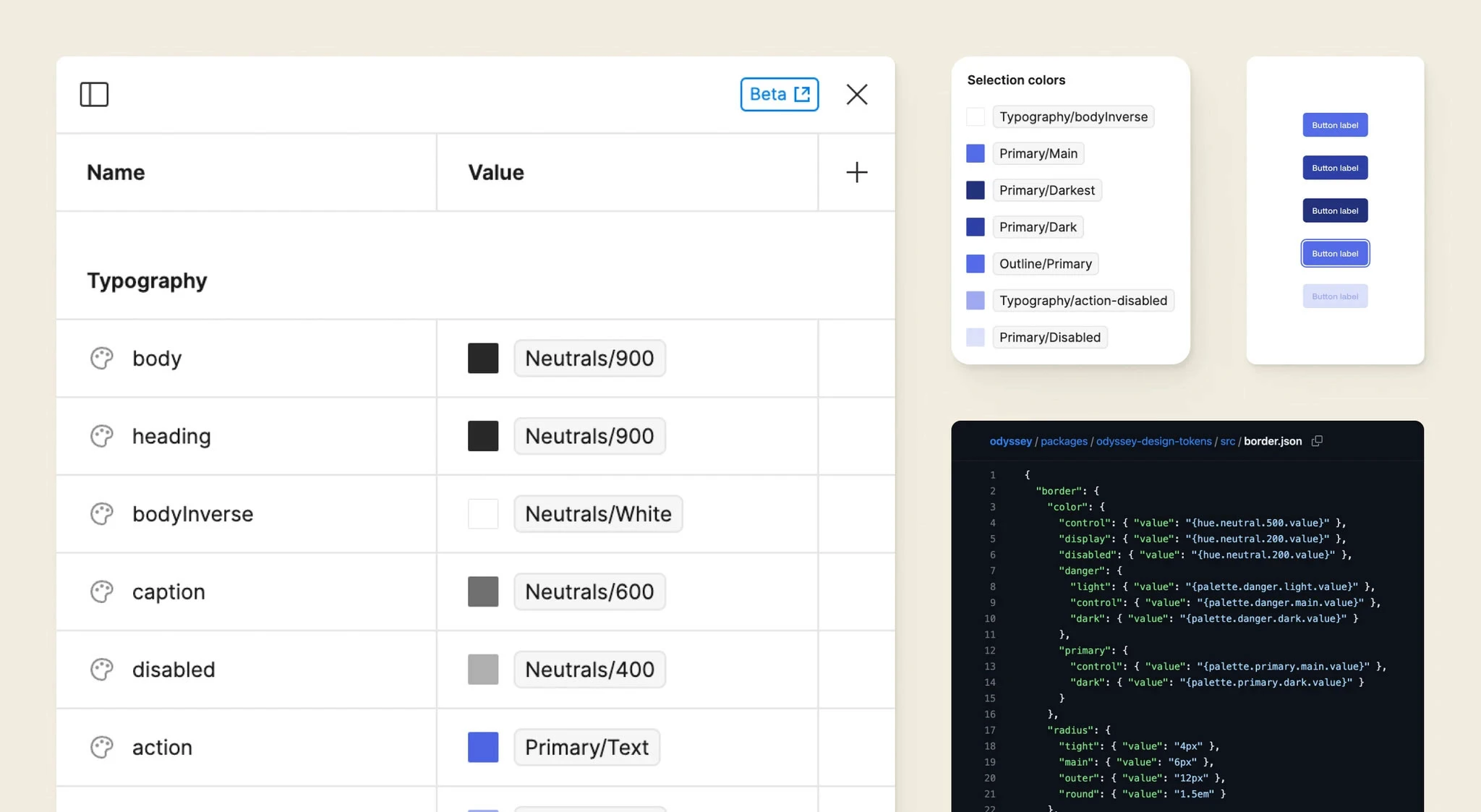
Semantic values serve as in-situ documentation
Rather than relying exclusively on a heavy documentation site, Odyssey Tokens are designed to clearly guide consumers' use of color. By introducing tokens such as border-control and border-display, Odyssey allows its consumers to focus on their work.
The goal of Odyssey Tokens is to eliminate arbitrary values wherever possible; assigning semantic tokens and avoiding referencing primitive or value-based tokens allows Odyssey to be themeable while still maintaining accessibility standards and retaining the ability to be opinionated where necessary.

Transitioning to a more semantic future
Due to a compressed timeline, the first version of Odyssey Tokens relies on a value-based palette system. To maintain the flexibility to reach our desired state while upholding our promise of no breaking changes in Odyssey 1.0, I created a transition plan.
Due to a compressed timeline, the first version of Odyssey Tokens relies on a value-based palette system. To maintain the flexibility to reach our desired state while upholding our promise of no breaking changes in Odyssey 1.0, I created a transition plan.
Removing duplicity, creating clarity
The value-based system was originally put in place to follow Material UI's convention—it seemed natural, because Odyssey is built on Material UI. However, as it was implemented we discovered that the system's weaknesses outweighed the benefits of staying true to MUI.
While the palette still serves to create a theme-able primitives layer, it is otherwise redundant. If anything, 'blue.500' is more clear than 'lighter'.
A value-based system obscures token purpose.
We began to comb through uses of each value-based color token in its system and evaluate use-cases, replacing references to the value-based tokens with new semantic tokens as clear use-cases emerged.
We began to comb through uses of each value-based color token in its system and evaluate use-cases, replacing references to the value-based tokens with new semantic tokens as clear use-cases emerged.
The transition plan
At launch, the system was mixed between value-based and semantic naming; however, eventually, we planned to migrate completely away from the value palette.
By leaving it available in the system until the next major version, we were able to prevent breaking changes without being stuck in a suboptimal system.
The present state of Odyssey Tokens can be found on GitHub here
Iconography
Creating and maintaining meaning behind icons
Before Odyssey 1.0, Okta relied on icons both to convey functional meaning and to serve as spot illustrations. There were hundreds of one-off icons and many attempted to convey overly-complex concepts, often without any labels. The resulting experience led to interactions where it was difficult to tell what action was being initiated or what meaning was being conveyed.
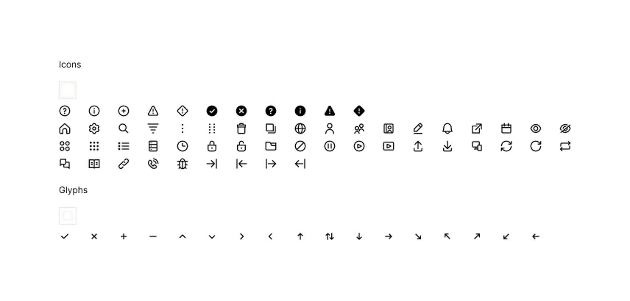
Working with a our principle system designer and senior product designer, I evaluated the many uses of icons at Okta to narrow down to a smaller system below. We removed complex concepts and icons that combined concepts such as add user, encouraging consumers to use a simple concept such as plus with a clear label.
We also elected to eliminate many icon concepts altogether, requesting that our consumers instead rely on labels, existing components or create new patterns to communicate effectively.
Design library
In Spring of 2023 I took over management of the Odyssey Design System Figma UI kit
During Spring and Summer of 2023 I served as the Odyssey team's Figma specialist: I overhauled the UI kit to match our new rebrand, implemented Variables to match to tokens, and partnered with our front-end specialist and content designer to make sure that naming conventions for layers and props were clear and matched closely to Odyssey code.
I worked with our Visual Design Director and Principle Visual Designer to implement their component designs, ensuring that they had necessary props and would be useable for Odyssey consumers. I worked as a translation layer between visual and front-end design and helped develop component schema. Working with our principal systems designer, I stood up a new collaborative process for designing and developing components, significantly reducing time spent per component.
Introducing flexibility
A core challenge we encountered in our beta testing of the Odyssey libraries was including enough flexibility in components to prevent them from becoming detached from the system. We solved this in two ways:
Ensure that the components are designed for the eventuality that they will sometimes be broken.
Child components, Variables and styles will remain attached even as the parent component is modified.
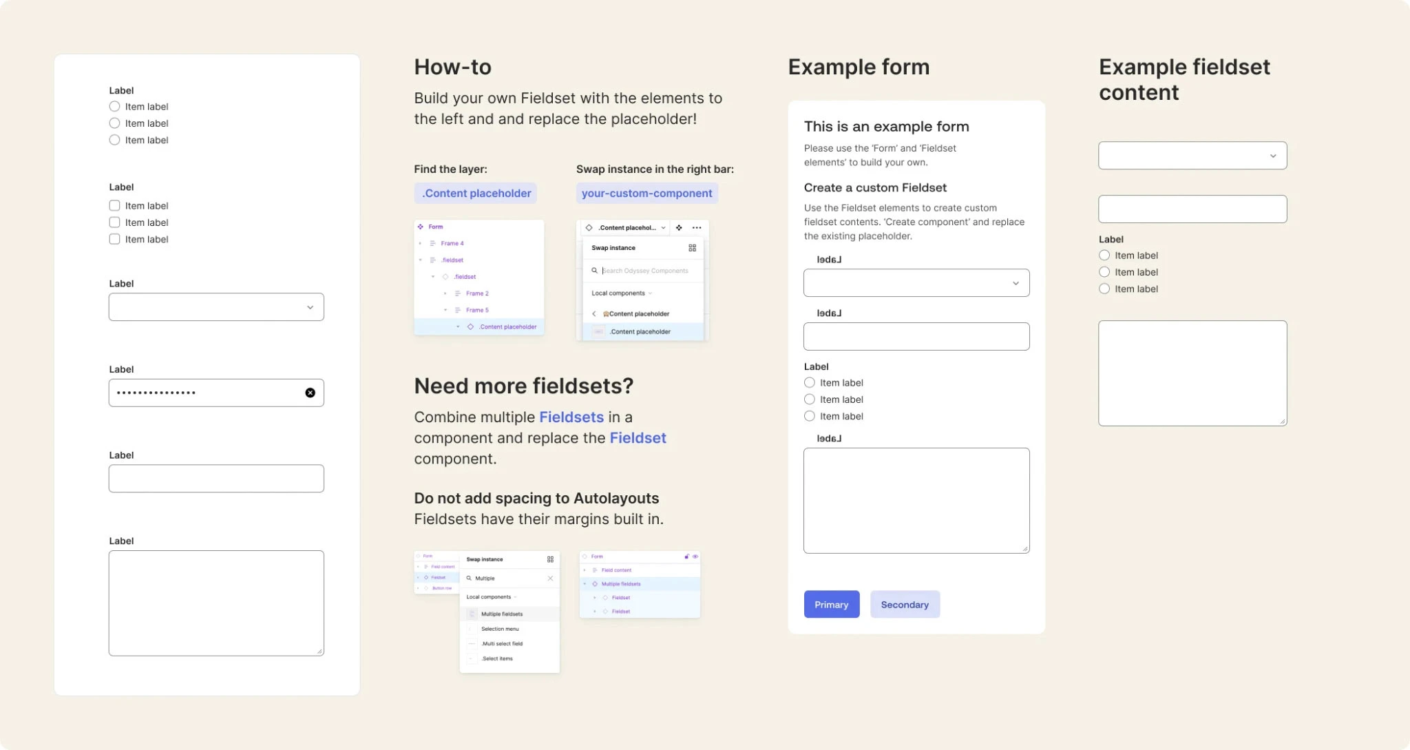
For complex components, build replaceable components and allow designers to build their own.
Because this increases complexity, I also included in-Figma guidance and example components.
For complex components, build replaceable components and allow designers to build their own.
Because this increases complexity, I also included in-Figma guidance and example components.
Documentation
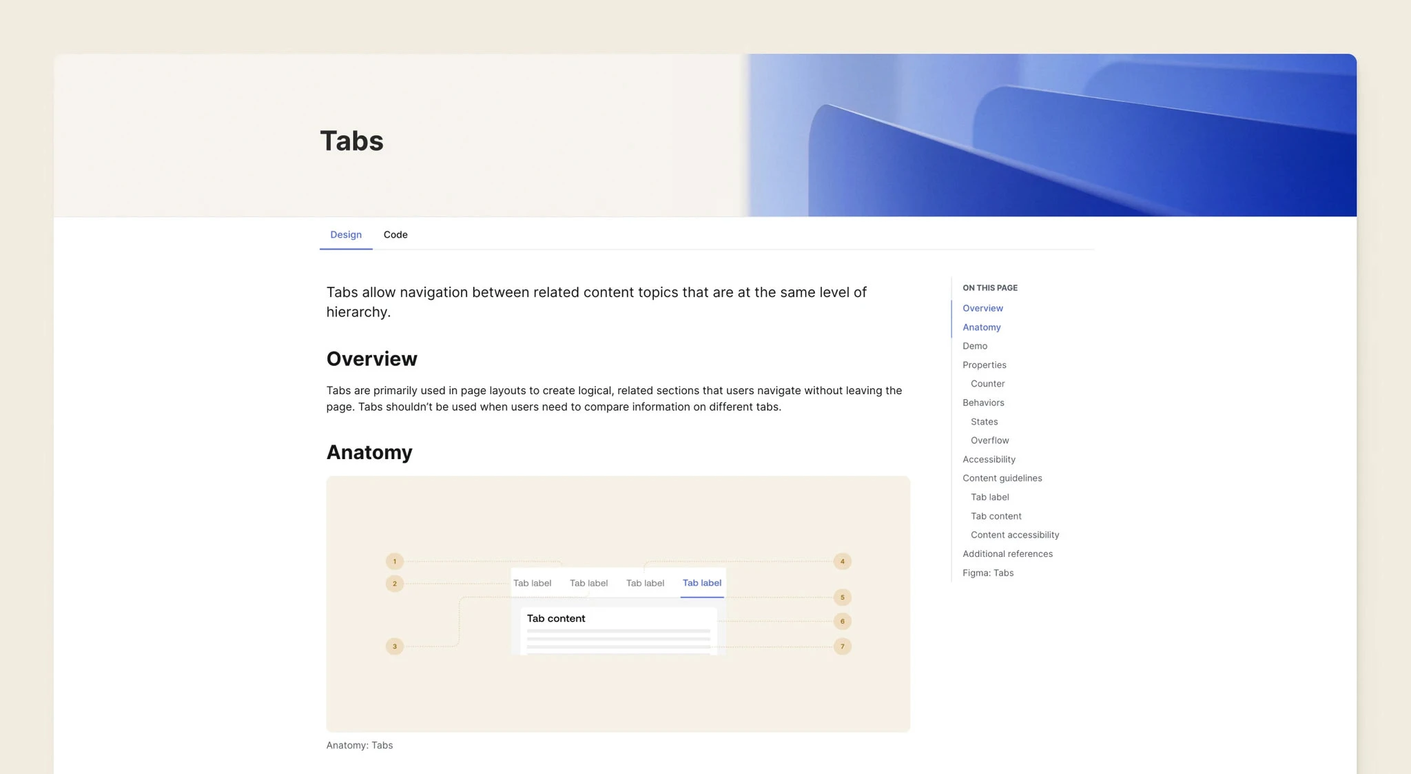
For the Odyssey 1.0 launch, we worked to create the first public, live Odyssey Documentation site.
The site is a collaborative effort managed by our Principle Content Designer. My contributions included:
The site is a collaborative effort managed by our Principle Content Designer. My contributions included:
Drafted, edited and provided feedback for Foundations and Components pages
Partnered with Content Design to ensure that component functionality was reflected accurately in docs
Collaborated with Visual Design to create anatomy images
Drafted, edited and provided feedback for Foundations and Components pages
Partnered with Content Design to ensure that component functionality was reflected accurately in docs
Collaborated with Visual Design to create anatomy images
Font credits: IBM Plex | Bruphy Text by Very Cool Studios