Okta Identity Engine: Self-service upgrade
Okta Identity Engine:
Self-service upgrade
Okta Identity Engine: Self-service upgrade
Q1 2023
Q1 2023
Q1 2023
An effort to upgrade customers from the legacy Admin Portal experience to our new tech, the self-service upgrade initiative began in February 2022.
The technical difference between the old and new meant that Support had to provide customers with white-glove upgrades; this project alleviated that by allowing some customers to upgrade automatically and others with significantly reduced assistance from support.


What is self-service upgrade?
What is self-service upgrade?
The self-service upgrade project worked in phases to allow organizations to upgrade on their own without the help of Okta Support.
My role in the project was initially scoped for visual design; however, I worked closely with the product designer and product manager leading the product and impacted the user experience and content design as well. Toward the end of the process, Content Design consulted for us and gave the experience its final polish.
Impact: Visual design
Impact: Visual design
Visual design of the widget, art direction of the illustrations, content design and UX of the end-to-end experience.
Visual design of the widget, art direction of the illustrations, content design and UX of the end-to-end experience.
Visual design engagement
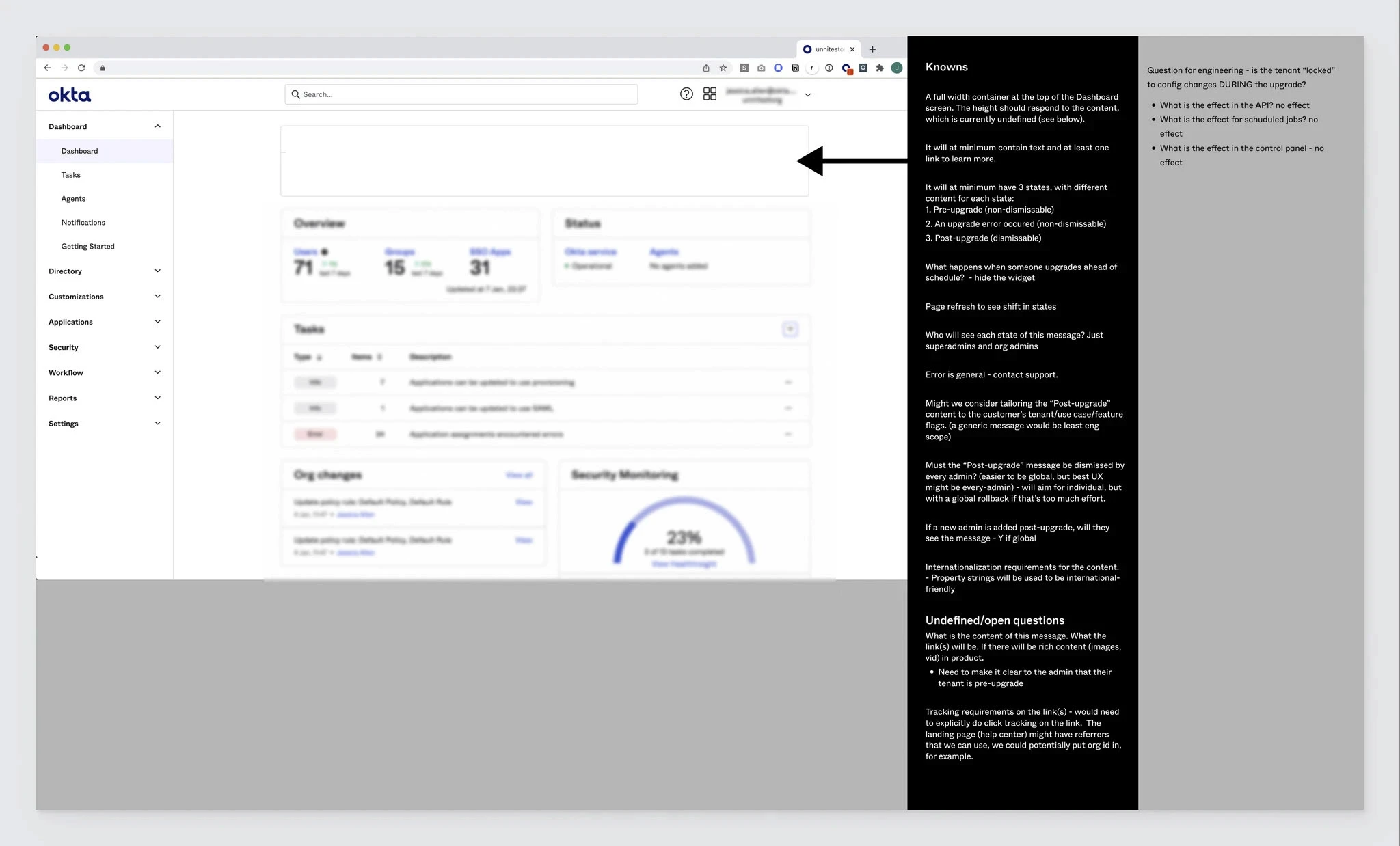
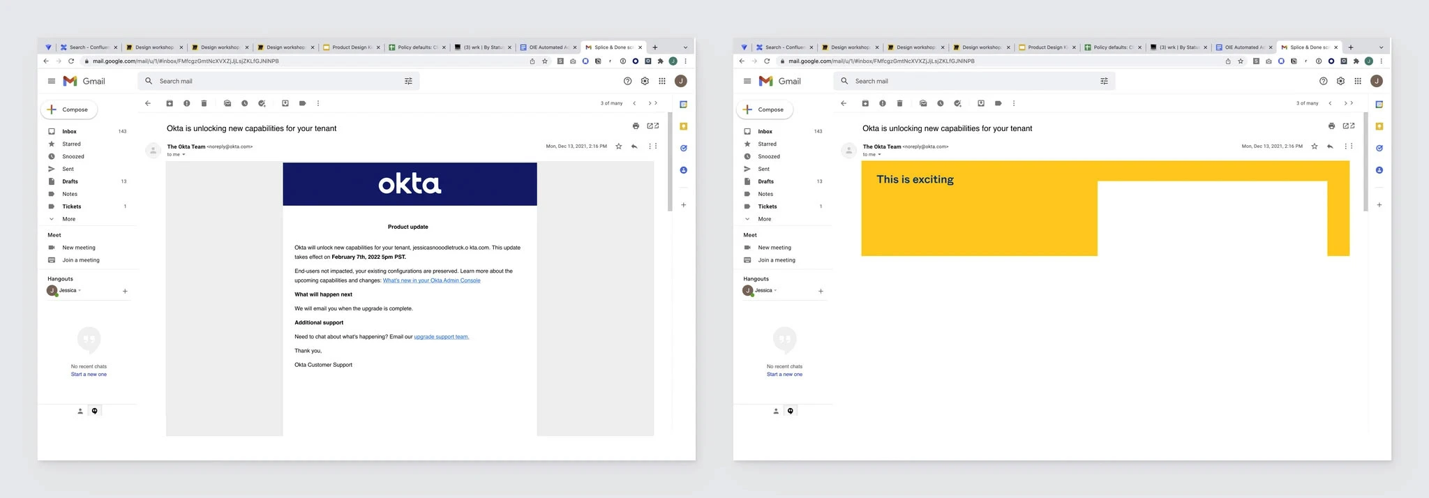
When I was approached, the team had rough wireframes and an idea of the project requirements.
When I was approached, the team had rough wireframes and an idea of the project requirements.
The project had an in-product experience and an email experience. As I completed the initial visual design of the widget—which would be displayed in the Okta Admin Dashboard—we worked through drafting content and user experience in weekly meetings. In addition to design, I helped revise content and worked to help discover needs versus wants and solidify requirements for the project.
The project had an in-product experience and an email experience. As I completed the initial visual design of the widget—which would be displayed in the Okta Admin Dashboard—we worked through drafting content and user experience in weekly meetings. In addition to design, I helped revise content and worked to help discover needs versus wants and solidify requirements for the project.
The self-service upgrade was split into several cohorts
The self-service upgrade was split into several cohorts
For this first cohort, we focused on customers without known conflicts to upgrades. For more complex organizations and organizations using sunsetted features, there were potential conflicts that would still need white-glove support for now.
For this first cohort, we focused on customers without known conflicts to upgrades. For more complex organizations and organizations using sunsetted features, there were potential conflicts that would still need white-glove support for now.
Requirements
Requirements
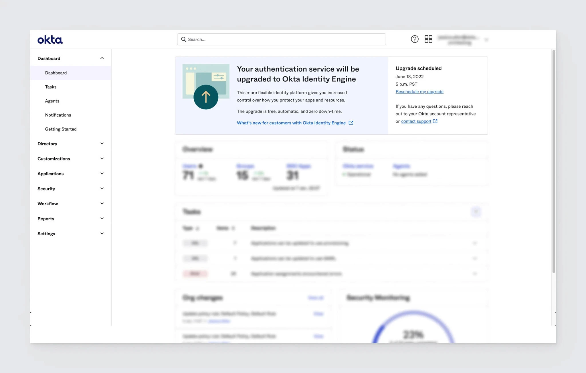
Pre-upgrade state (non-dismissible)
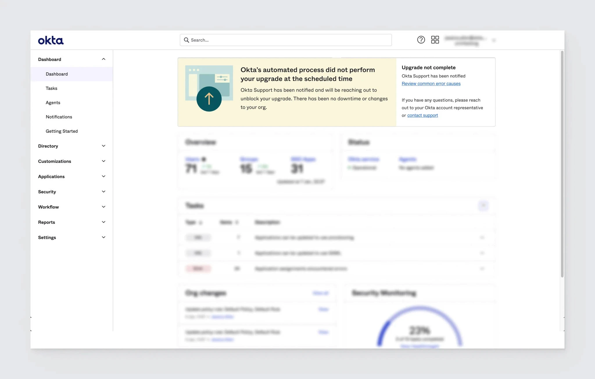
Error state (non-dismissible)
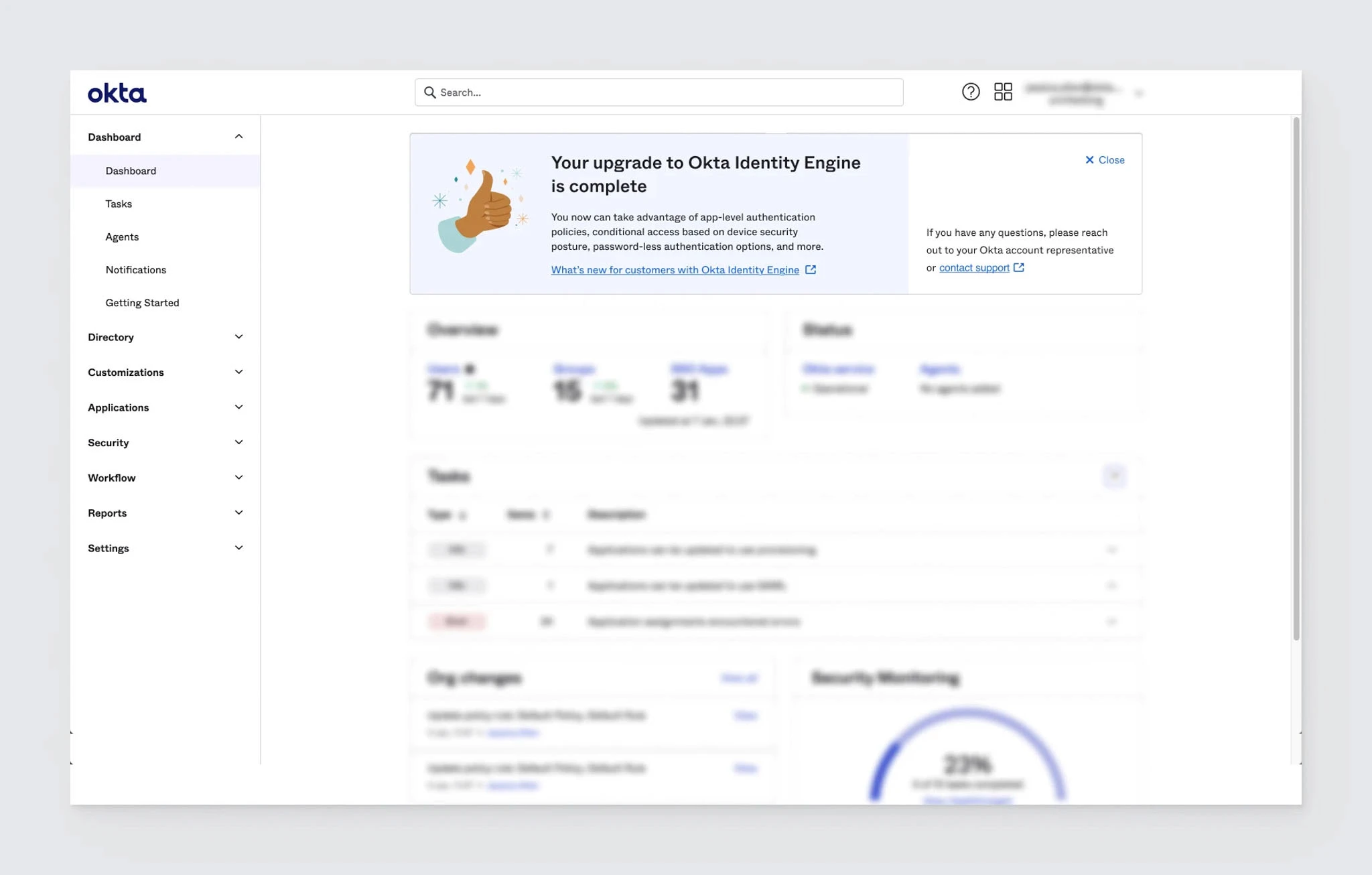
Post-upgrade state (dismissible)
Learn more link
Height responsive to content
Pre-upgrade state (non-dismissible)
Error state (non-dismissible)
Post-upgrade state (dismissible)
Learn more link
Height responsive to content
Challenges
Challenges
Must use legacy design/existing components
Admins are risk-averse; won’t want to upgrade
Admins are sensitive to communications: need to be alerted but not alarmed
Admins lose access to new features without upgrade
Must use legacy design/existing components
Admins are risk-averse; won’t want to upgrade
Admins are sensitive to communications: need to be alerted but not alarmed
Admins lose access to new features without upgrade
Opportunities
Opportunities
Help Admins understand Okta Identity Engine
Create an end-to-end upgrade experience that reduces need for support
Create a calm, clear experience for Admins
Add illustrations for a more delightful experience
Help Admins understand Okta Identity Engine
Create an end-to-end upgrade experience that reduces need for support
Create a calm, clear experience for Admins
Add illustrations for a more delightful experience
First iterations
First iterations
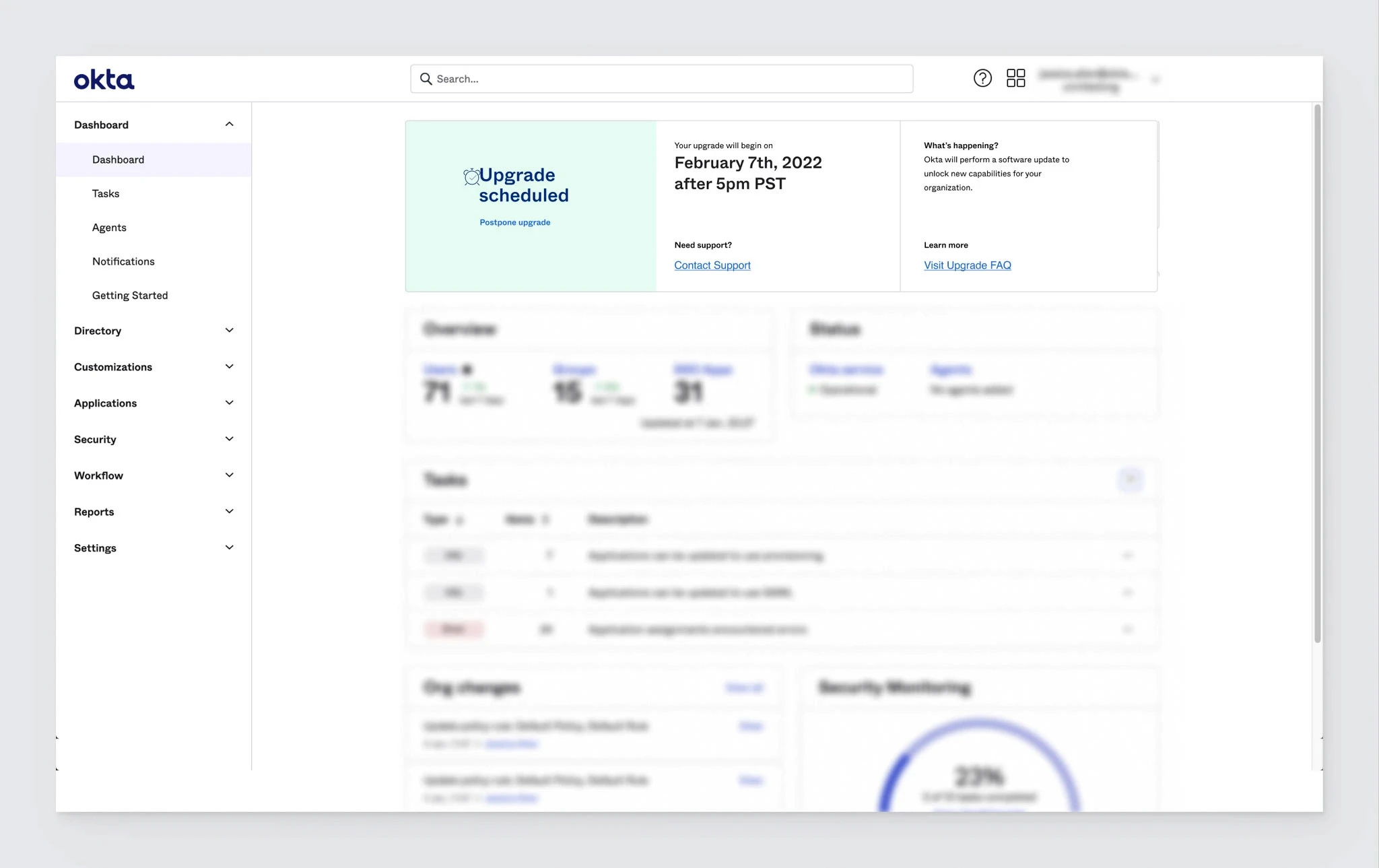
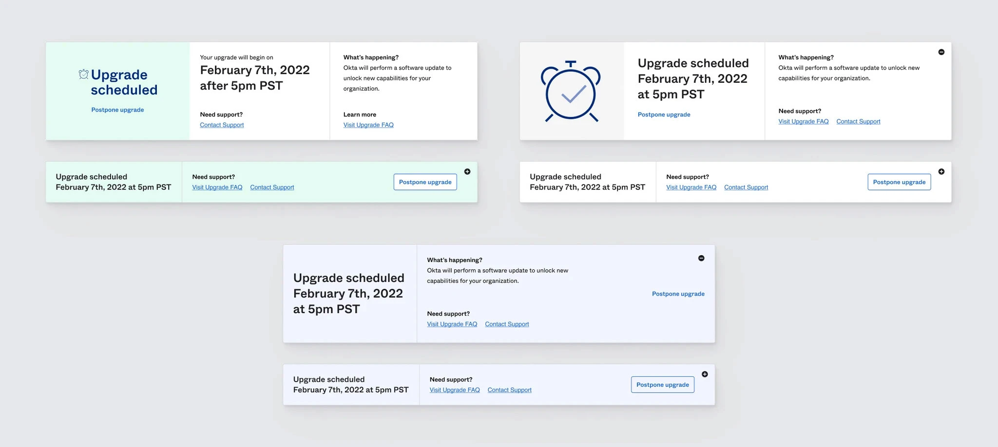
Initially, we focused on layout and content
The layout goals were straightforward
The layout goals were straightforward
Minimal disruption to Admins' dashboard experience. As a stretch goal, we also wanted to create a banner that would add a new, joyful design experience to the Dashboard.
We proposed a version which Admins could expand and collapse; however, it wasn’t in scope.
Minimal disruption to Admins' dashboard experience. As a stretch goal, we also wanted to create a banner that would add a new, joyful design experience to the Dashboard.
We proposed a version which Admins could expand and collapse; however, it wasn’t in scope.
Content goals were more complicated:
Content goals were more complicated:
Admins can easily find all necessary information
Admins understand clearly any actions needed
Content is as digestible as possible
Content is not alarming
Content reassures Admins about risk and impact
Right level of detail and tone
Admins can easily find all necessary information
Admins understand clearly any actions needed
Content is as digestible as possible
Content is not alarming
Content reassures Admins about risk and impact
Right level of detail and tone
There was a lot of necessary information:
There was a lot of necessary information:
The upgrade is free and automatic
The upgrade is safe, with no downtime
There are no impacts to admins or end-users
There are no impact to settings or organization behaviors
Where to go for more information about the upgrade
Who to contact with questions
Date and time the upgrade is scheduled for
Upgrading unlocks new features and capabilities
After drafting content and layouts, we explored adding illustration
After drafting content and layouts, we explored adding illustration
We wanted to make the widget feel less threatening and add some delight to the experience, letting Admins know this is something to be excited about. After creating layouts with placeholder banners, it was clear that the illustrations effectively uplifted the widget, and we engaged an external illustrator.
We wanted to make the widget feel less threatening and add some delight to the experience, letting Admins know this is something to be excited about. After creating layouts with placeholder banners, it was clear that the illustrations effectively uplifted the widget, and we engaged an external illustrator.

But what if there's a problem with the upgrade?
But what if there's a problem with the upgrade?
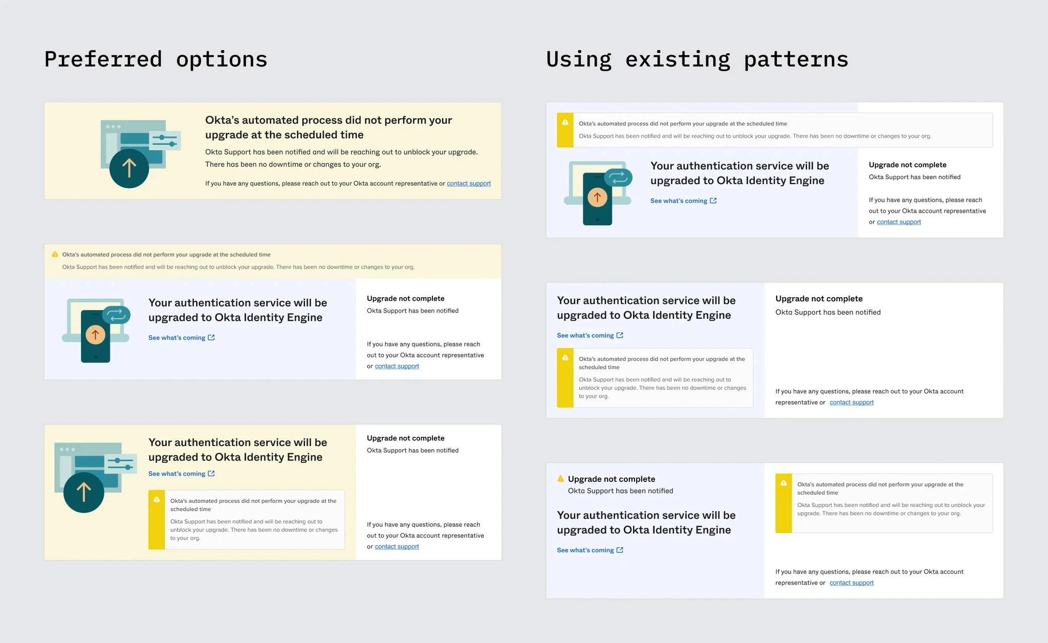
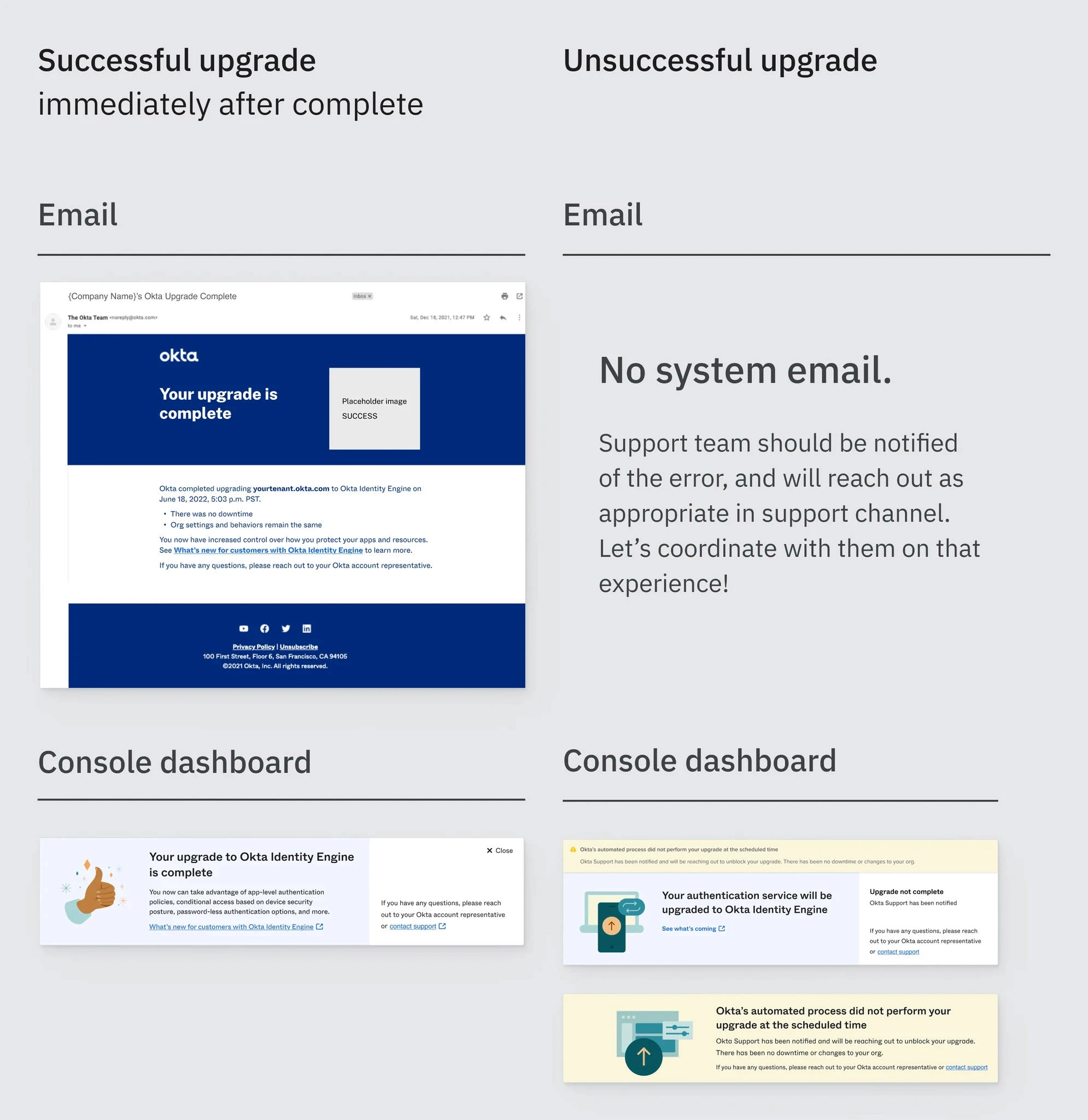
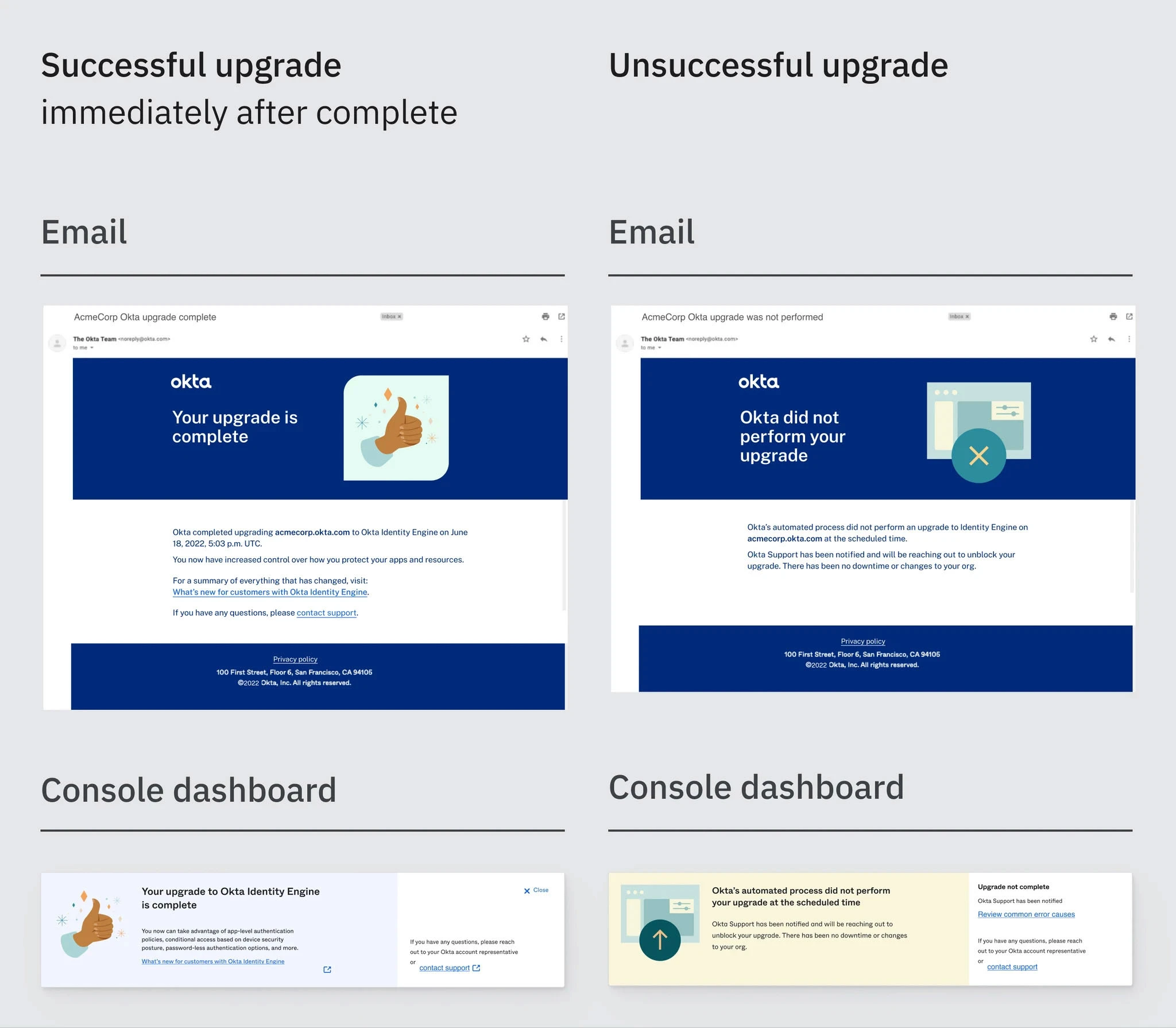
During design review with our partners in Support and Engineering, we learned that the automated upgrade could be unsuccessful.
During design review with our partners in Support and Engineering, we learned that the automated upgrade could be unsuccessful.
We needed to design an error state that flagged the upgrade as unsuccessful while also reassuring admins that:
The organization is still operational
The organization cannot currently be upgraded
Support will provide assistance resolving the conflict
We explored using net-new designs to help flag the interruptions as well as keeping the banner in the ‘scheduled upgrade’ state to make it clear that the upgrade would still take place.
We decided that the semantic change was more clear about the current state and less likely to be missed.
New user flow
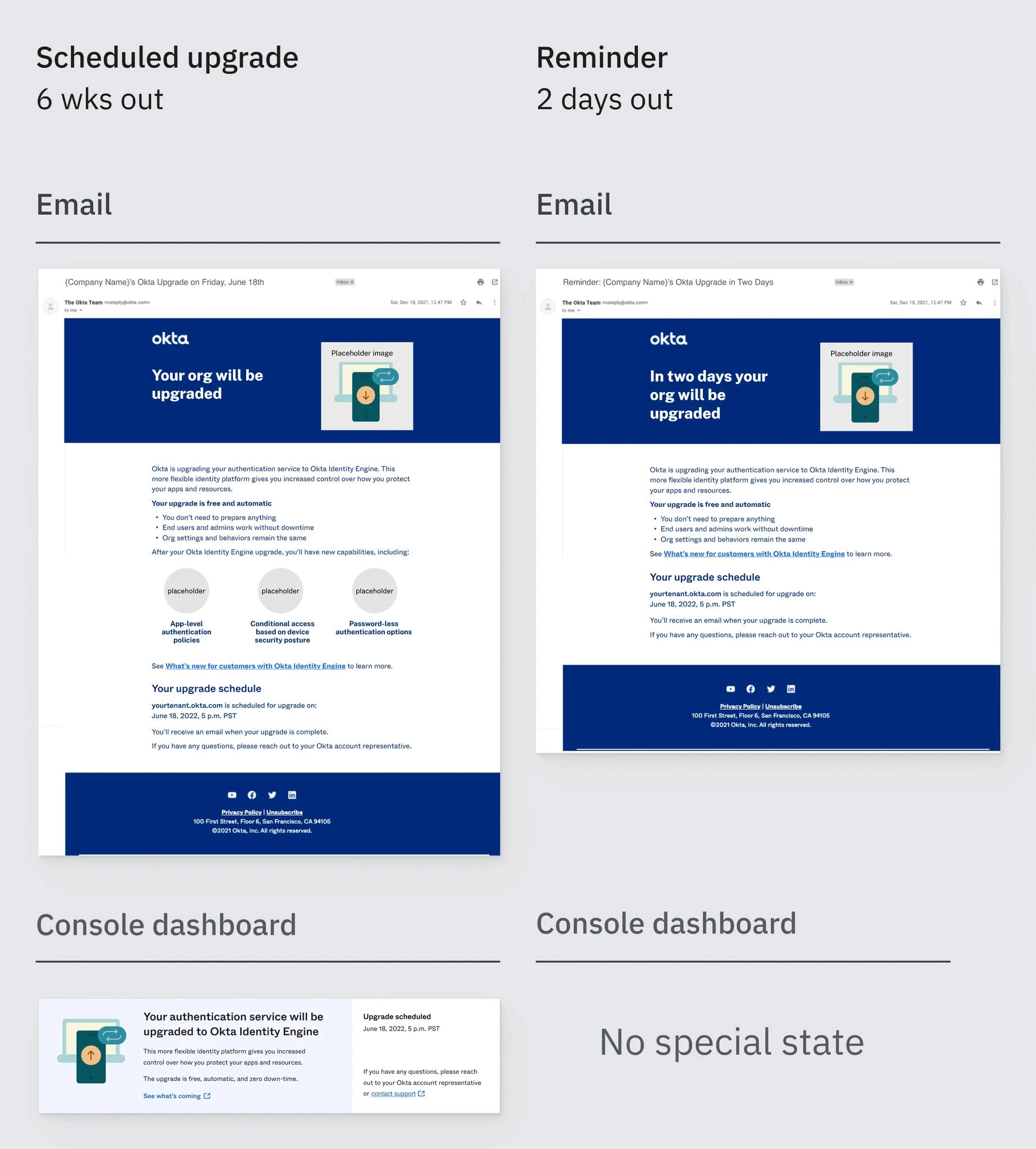
With a user flow established, we engaged Content Design
With a user flow established, we engaged Content Design
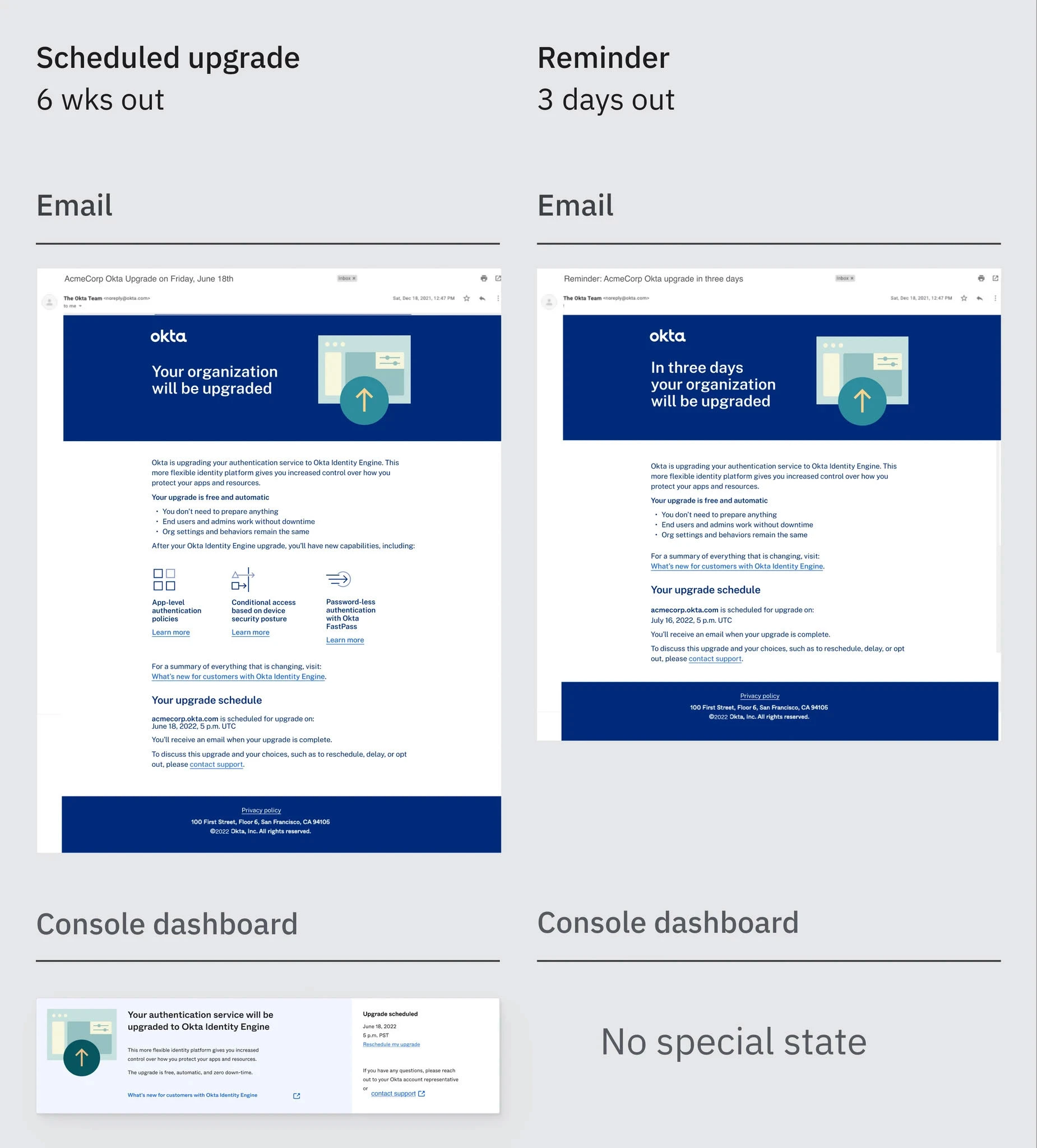
Our goals were roughly accomplished and we had added reminders via email to ensure that Admins would have many points of contact to potentially alert them. Content Design helped to align the voice and tone and to add clarity and brevity to our language.
Our goals were roughly accomplished and we had added reminders via email to ensure that Admins would have many points of contact to potentially alert them. Content Design helped to align the voice and tone and to add clarity and brevity to our language.
Late requirement added: reschedule
Late requirement added: reschedule
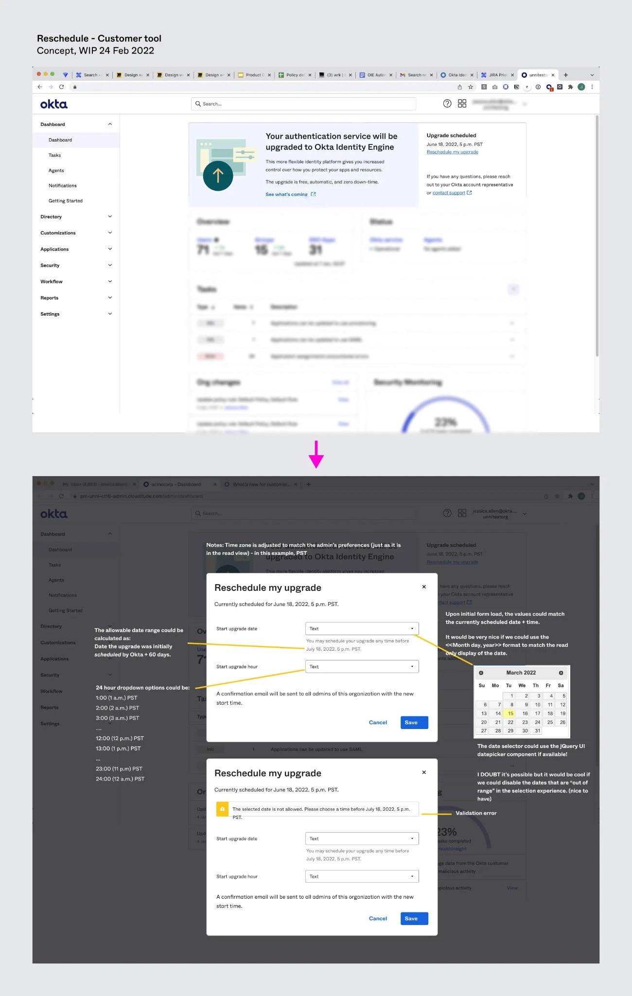
Upon review with Support, we learned that Admins would need the ability to reschedule.
Upon review with Support, we learned that Admins would need the ability to reschedule.
While we wanted to avoid a reschedule to make sure that all of our customers were upgraded and reduce the cost of maintaining two versions of the product, it was too risky to cause anxiety or potential disruption to our customers.
While we wanted to avoid a reschedule to make sure that all of our customers were upgraded and reduce the cost of maintaining two versions of the product, it was too risky to cause anxiety or potential disruption to our customers.
There were several factors that led to our inclusion of a reschedule:
There were several factors that led to our inclusion of a reschedule:
Varying customer security postures
Varying willingness to accept risk
We couldn't know internal state of affairs for customers
Some customers were still using features that conflicted with the new Identity Engine
The final reschedule flow allows for Admins to schedule the upgrade to the hour and to reschedule as many times as they need. This gives them plenty of time to learn about the upgrade, plan for it and resolve any conflicts. Eventually, a cancellation was even added to mitigate risk and Admin agitation.
Completed designs
Completed designs
Thanks to Self-Service Upgrades, Okta saw a significant increase in velocity of customer upgrades. Although getting all customers upgraded is still a heavy lift, being able to automate most significantly reduced the workload for Support and allowed Okta to enable new feature flags for many customers. For smaller and less complex organizations, this meant an upgrade in capabilities with no additional costs or downtime.
Thanks to Self-Service Upgrades, Okta saw a significant increase in velocity of customer upgrades. Although getting all customers upgraded is still a heavy lift, being able to automate most significantly reduced the workload for Support and allowed Okta to enable new feature flags for many customers. For smaller and less complex organizations, this meant an upgrade in capabilities with no additional costs or downtime.
Last minute addition: documentation
Last minute addition: documentation
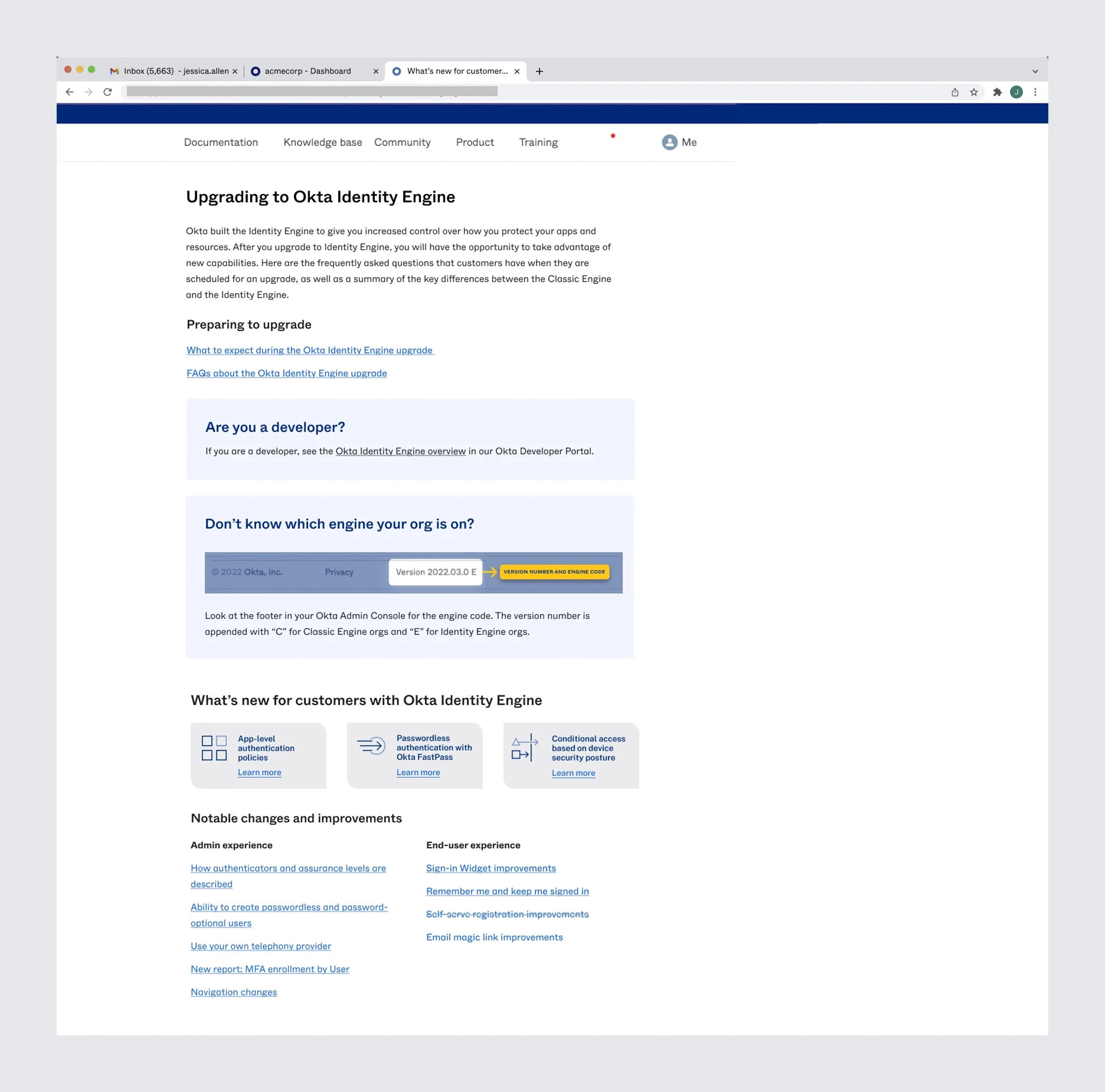
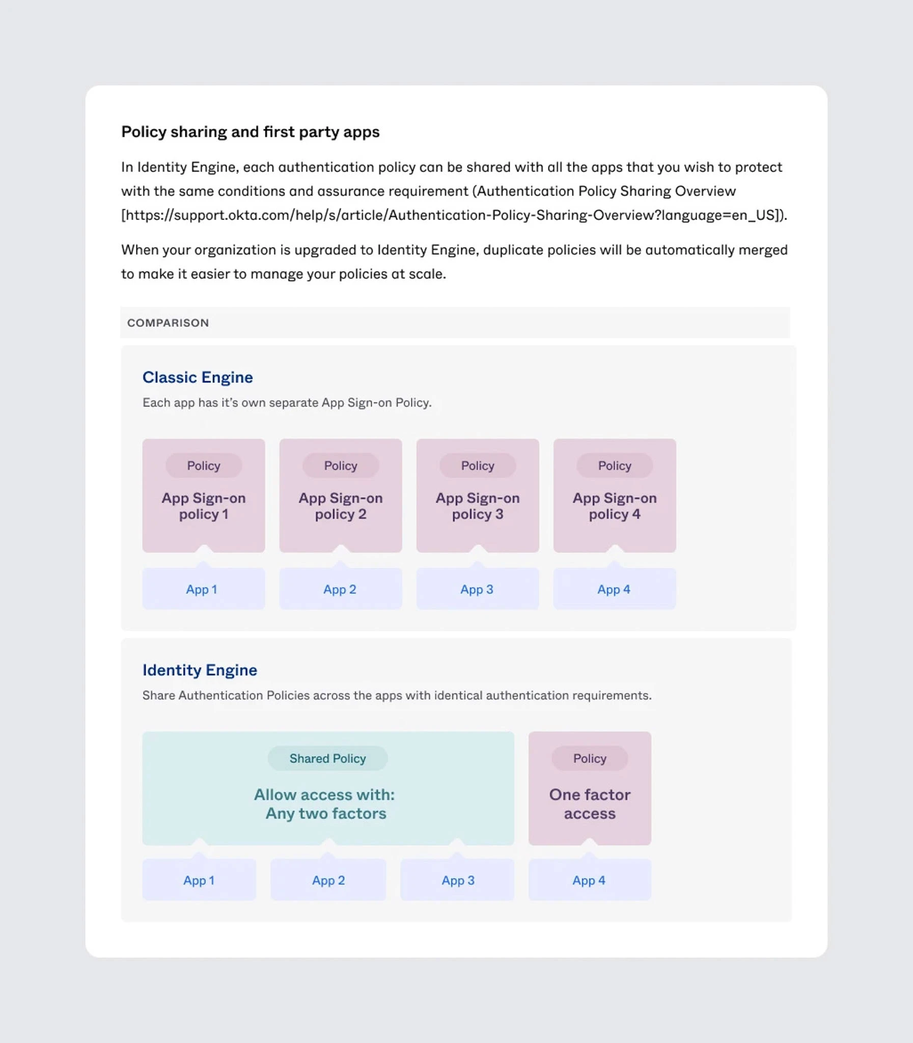
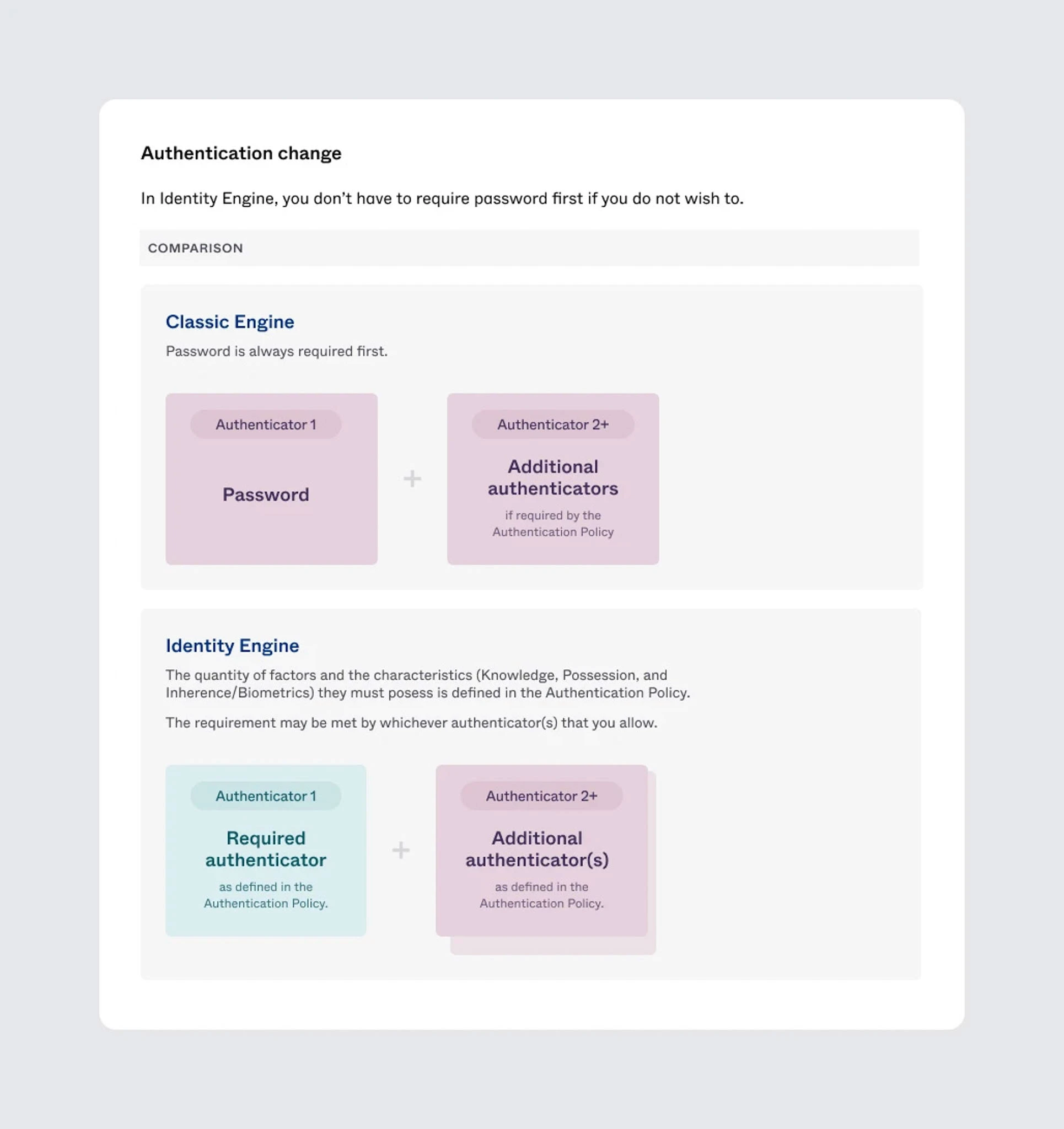
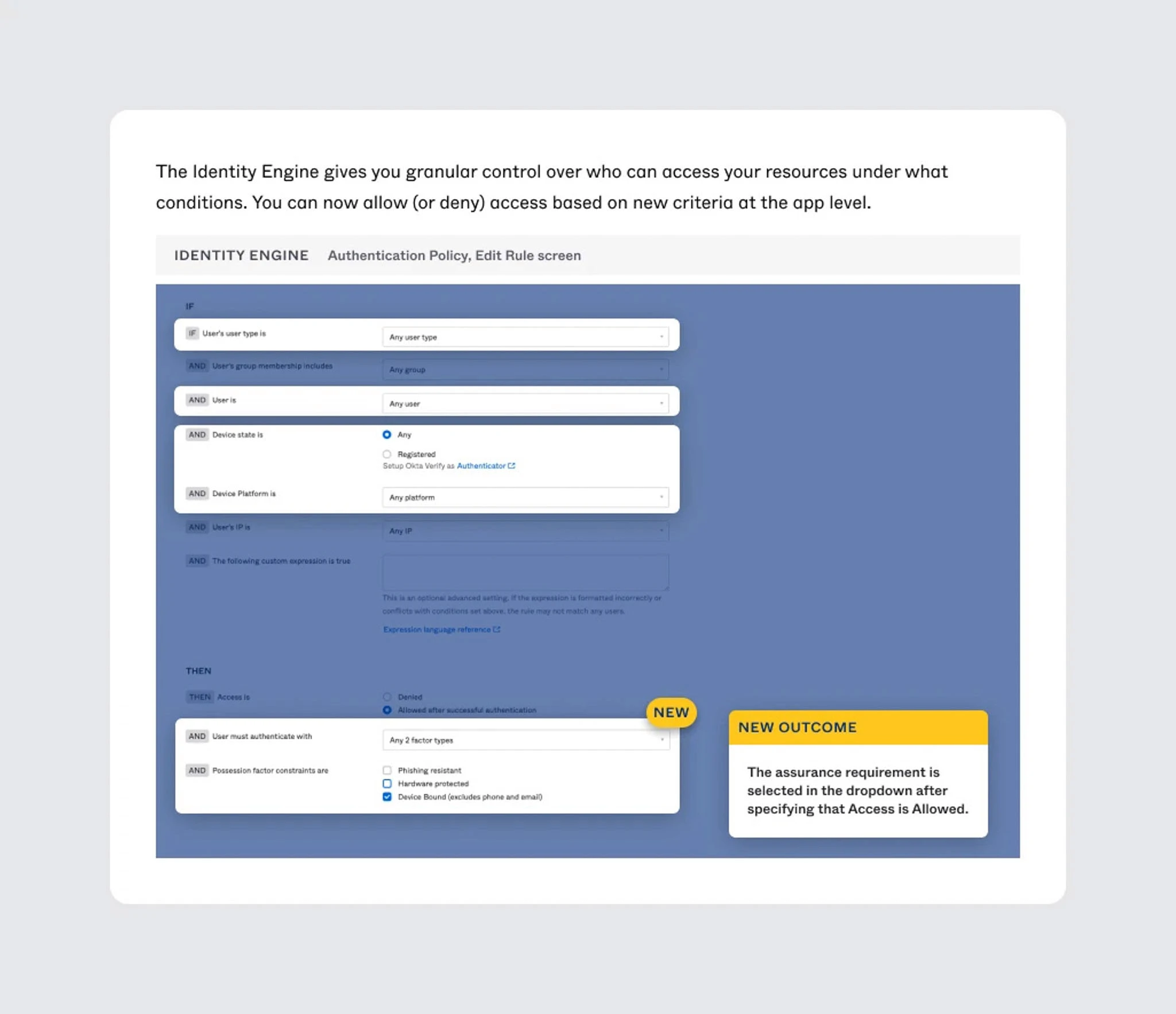
Although my initial scope was only help with the in-product widget, I had already leant my help to the emails so it was natural that the team reached back out for help with the documentation. This time, my scope was limited to creating diagrams and illustrations.
Although my initial scope was only help with the in-product widget, I had already leant my help to the emails so it was natural that the team reached back out for help with the documentation. This time, my scope was limited to creating diagrams and illustrations.
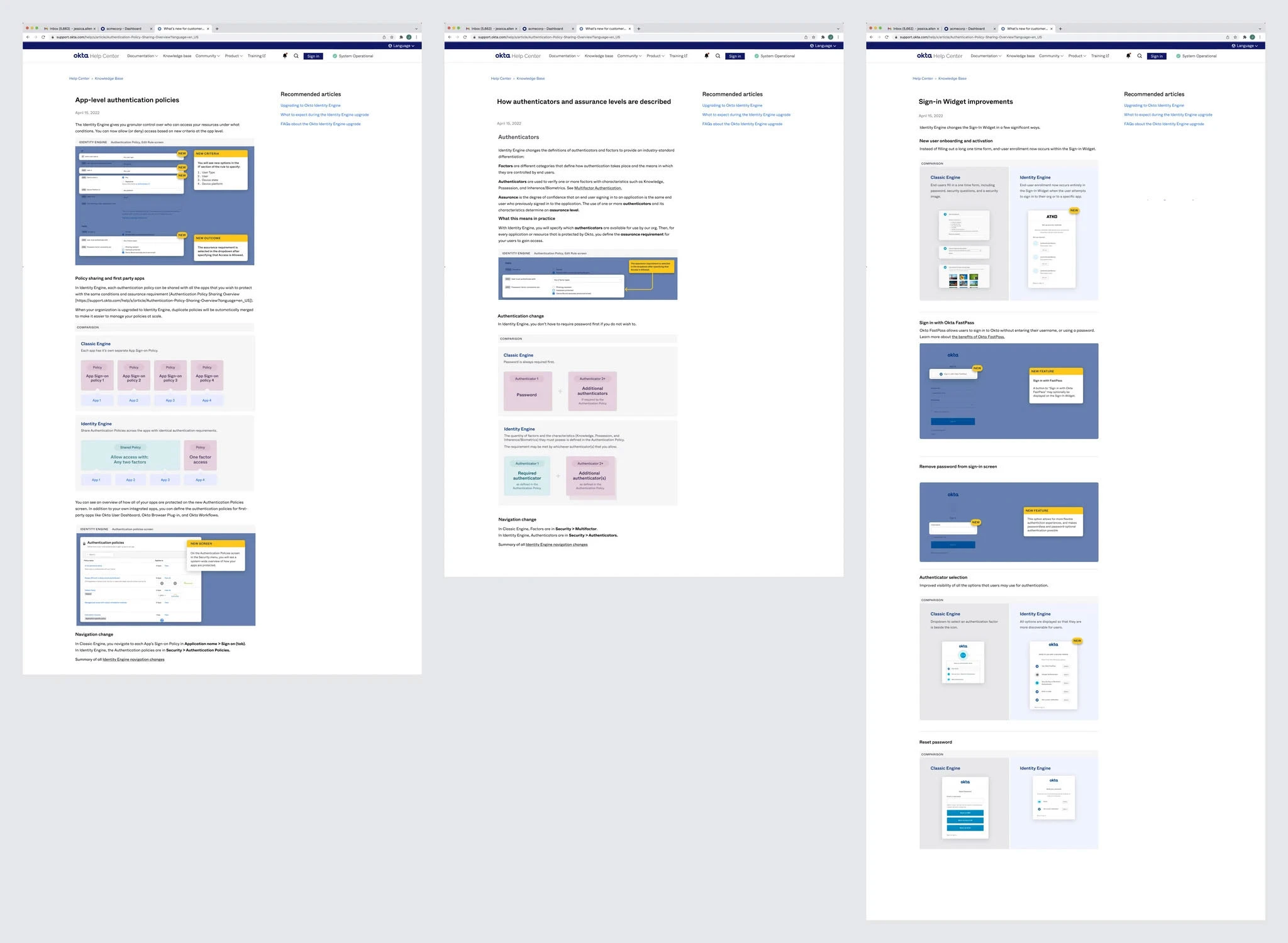
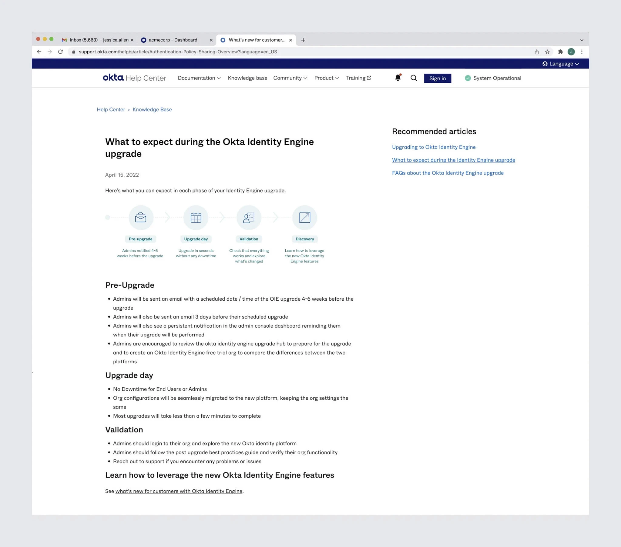
I used the Visual Design team's new diagram styles
I used the Visual Design team's new diagram styles
This was our first test of the system, and it served to break up text-heavy content and add clarity. The result is pleasing on the eye, and a large upgrade over the diagrams elsewhere in the documentation.
This was our first test of the system, and it served to break up text-heavy content and add clarity. The result is pleasing on the eye, and a large upgrade over the diagrams elsewhere in the documentation.
Font credits: IBM Plex | Bruphy Text by Very Cool Studios